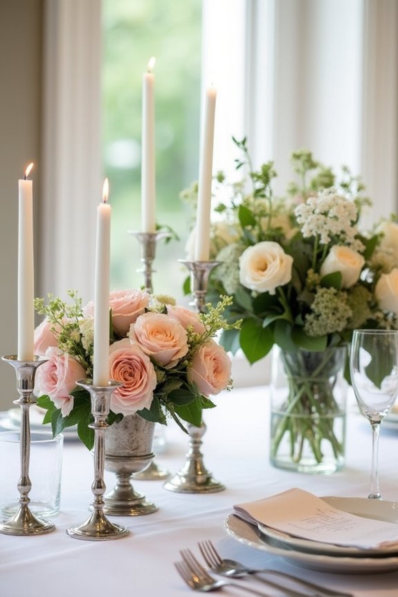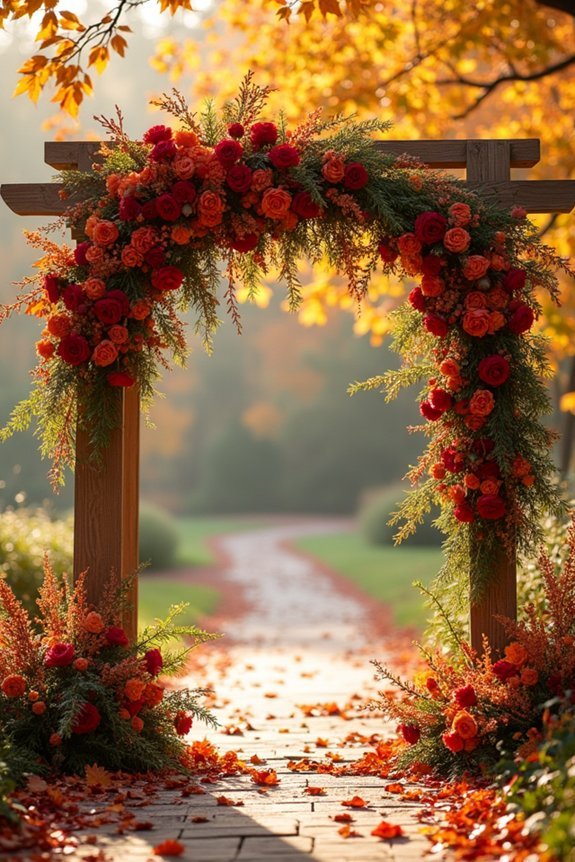
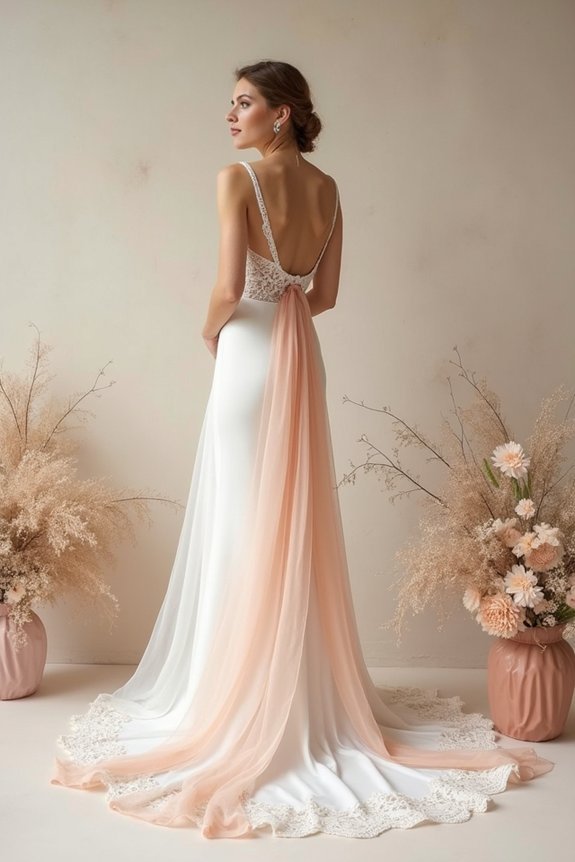
We can build a timeless vintage wedding palette by choosing soft, naturally-inspired colors like blush, sage, and dusty gold that photograph beautifully for decades. The secret? Understanding how undertones and muted saturation levels create sophistication rather than harshness. Consider your venue’s lighting, your personal style, and how each hue makes you feel. Then we’ll extend these colors thoughtfully through every wedding detail—from invitations to cake design—creating a cohesive, elegant vision. Discovering how to truly capture this aesthetic in mood boards and find the right vendors reveals even deeper possibilities.
At a Glance
- Start with nature-inspired, muted colors like dusty rose, sage green, and champagne for timeless sophistication and elegance.
- Consider undertones and saturation levels carefully, as soft, desaturated hues photograph beautifully and feel authentically vintage rather than trendy.
- Account for your venue’s natural lighting and seasonal factors when selecting colors to ensure they appear as intended.
- Extend your chosen palette consistently across invitations, bridesmaid dresses, groomsmen accessories, and cake design for cohesive visual storytelling.
- Prioritize personal style and emotional connections to colors over current trends to create meaningful, timeless wedding aesthetics.
What Makes Vintage Color Palettes Feel Timeless
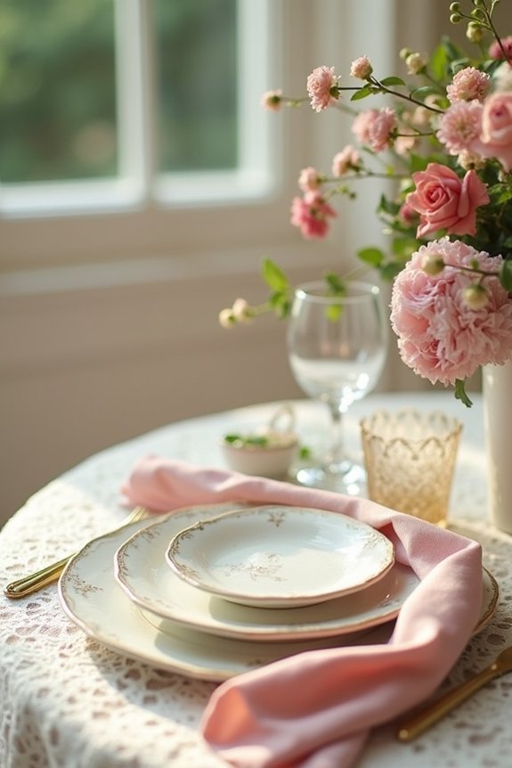
When we think about color palettes that never seem to go out of style, vintage combinations have a special quality that sets them apart from trendy colors that fade after a season or two.
These timeless hues work because they’re rooted in nature and history—think soft blush, sage green, and dusty gold. They don’t shout for attention; instead, they whisper elegance.
Vintage palettes draw from decades of proven beauty, creating a sense of sophistication that feels both familiar and intentional.
We’re drawn to them because they create warmth without feeling dated.
Pairing these classic colors with timeless bridal jewelry ensures your entire wedding aesthetic feels cohesive and enduring, allowing you to cherish your wedding style for years to come.
Five Signature Vintage Palettes and How to Spot Them
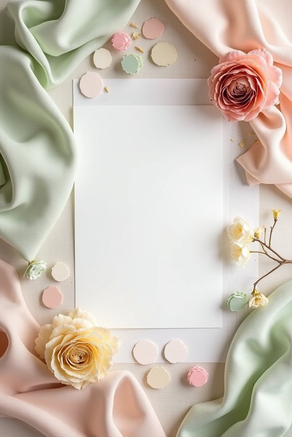
Now that we comprehend why vintage palettes feel so enduring, let’s explore the specific color combinations that show up again and again in elegant weddings.
These five classic palettes will help you identify what resonates with your vision:
- Soft Pastels: Blush, ivory, sage, and champagne create romantic, gentle elegance.
- Rich Jewel Tones: Deep emerald, sapphire, and burgundy convey luxury and sophistication.
- Muted Neutrals: Taupe, greige, cream, and soft gray offer understated refinement.
- Garden Romance: Dusty rose, mauve, soft green, and warm white feel naturally beautiful.
- Classic Bridal: Ivory, gold, blush, and pearl deliver timeless, formal grace.
Recognizing these combinations helps you build your own cohesive vision confidently. Pairing your chosen vintage palette with complementary jewelry, such as AAA-grade freshwater pearl sets, ensures your complete bridal look maintains elegant cohesion from dress to accessories.
Why Undertones and Saturation Matter for Vintage Schemes
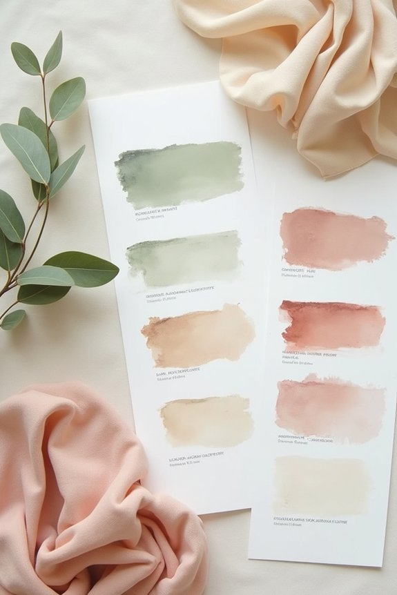
The difference between a vintage palette that feels timeless and one that looks dated comes down to two powerful details: undertones and saturation.
Undertones—those subtle warm or cool hints beneath a color—determine whether your palette feels authentic to a specific era. A dusty rose with golden undertones evokes the 1920s, while cooler-toned mauve suggests the 1950s.
Saturation matters equally. We love muted, soft colors in vintage schemes because they photograph beautifully and feel sophisticated. Highly saturated, bright colors can cheapen the look. When selecting your venue’s outdoor setting, consider how weather protection features in your gazebo choice will preserve these delicate color tones throughout your celebration.
Understanding these nuances helps us create cohesive, elegant palettes that truly capture vintage romance.
Choosing the Right Palette for Your Wedding Aesthetic
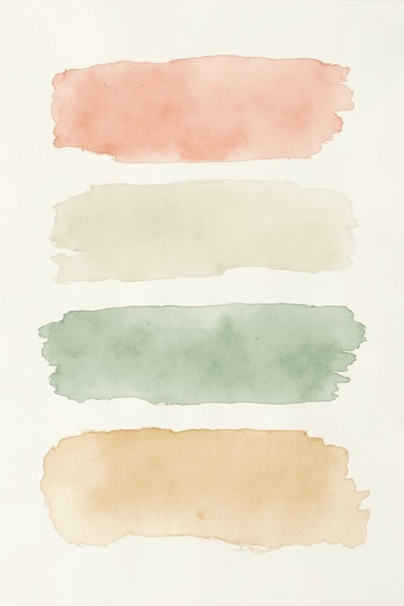
Armed with your understanding of undertones and saturation, you’re ready to select a palette that genuinely reflects your vision.
Consider these essential factors:
- Your venue’s natural lighting shapes how colors appear throughout the day.
- Season and weather influence which hues feel authentic to your moment.
- Personal style preferences matter more than fleeting trends.
- Guest experience includes ensuring colors photograph beautifully.
- Emotional connection to each shade creates meaningful choices.
We recommend starting with two to three anchor colors, then building supporting tones around them.
This approach gives your wedding cohesion while allowing flexibility across flowers, linens, and décor. Your palette should feel like an extension of who you are. Review Tiny Luxe Weddings’ 12-month timeline to ensure your color decisions align with your overall wedding planning schedule.
How to Capture Your Palette in Mood Boards and Swatches
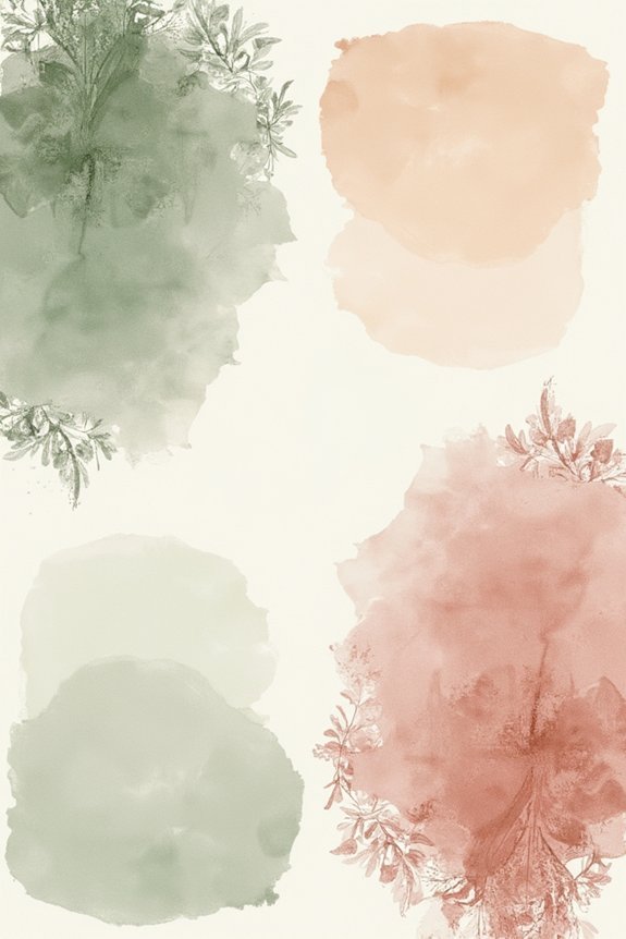
Once you’ve chosen your palette, it’s time to bring those colors to life in tangible ways—and that’s where mood boards and swatches become your best planning tools.
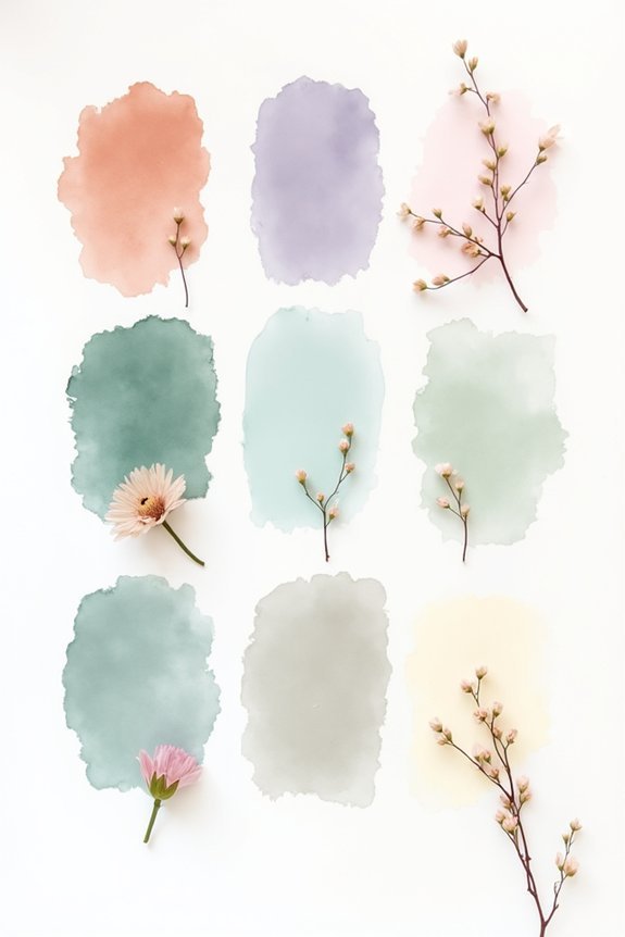
Gather paint samples, fabric scraps, and photographs that showcase your vintage hues together. This visual collection helps you see how colors interact and whether they truly feel cohesive.
Digital mood boards work wonderfully too; we love Pinterest for collecting inspiration. Physical swatches matter most, though—hold them next to your dress, venue photos, and lighting conditions.
You’ll discover what actually resonates rather than what looks good on screen, ensuring your palette translates beautifully throughout your day. Organizing these visual elements alongside your other wedding details using a master planning checklist will keep all your design decisions coordinated and accessible throughout the planning process.
Extending Your Colors Beyond Florals and Linens
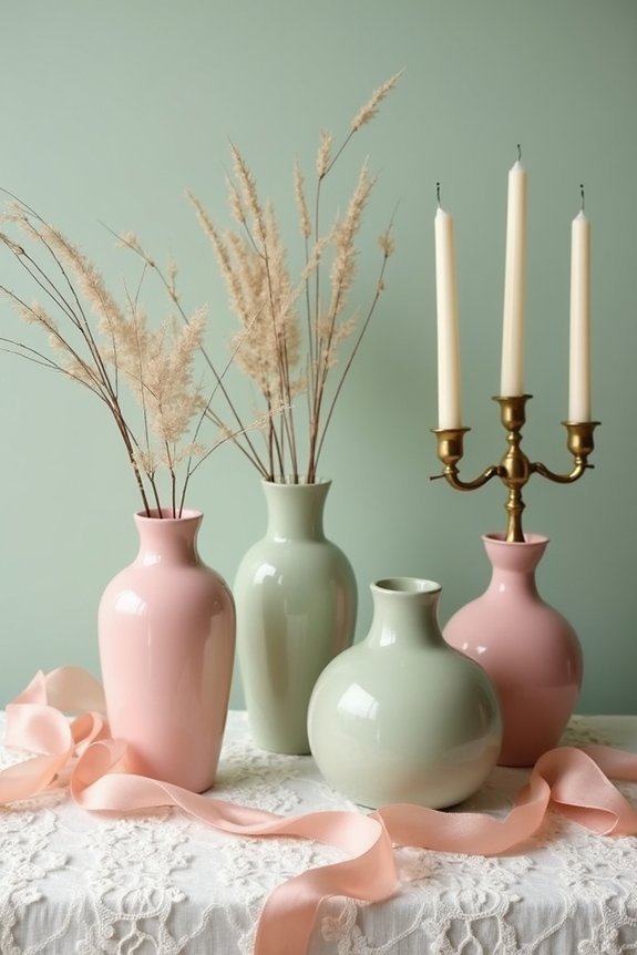
How can you weave your chosen vintage palette throughout every detail of your wedding day?
The magic happens when we extend beyond flowers and table linens into unexpected places that strengthen your overall aesthetic.
Consider these beautiful applications:
- Invitations and stationery printed in coordinating shades
- Bridesmaid dresses in complementary vintage tones
- Groomsmen accessories like ties, pocket squares, and boutonnieres
- Ceremony programs and place cards featuring your palette
- Cake design and dessert displays echoing your color scheme
When color flows cohesively through every element, we create a sophisticated, intentional celebration that feels completely unified and utterly memorable.
Vintage Palettes That Balance Timeless and Trendy
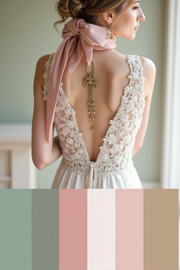
The beauty of vintage color palettes lies in their ability to feel both timeless and fresh at the same time. We can achieve this balance by pairing classic hues with unexpected modern touches.
Consider blending dusty rose with sage green and cream, then adding a pop of contemporary gold or blush. Soft, muted tones ground your palette in vintage elegance, while strategic accent colors keep things current and exciting.
This approach honors the past while respecting today’s design sensibilities, creating a wedding that’ll feel just as stunning in photos ten years from now as it does on your big day.
Finding Vendors Who Specialize in Vintage Visions
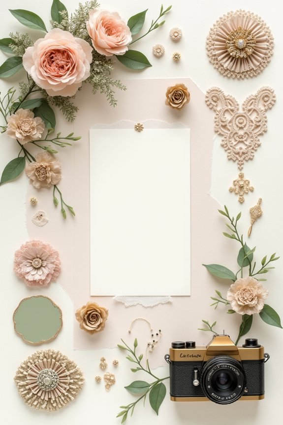
Now that you’ve crafted your ideal vintage color palette, finding the right vendors to bring it to life becomes essential.
We recommend seeking professionals who understand your aesthetic vision:
- Florists experienced in garden-style arrangements and muted tones
- Photographers with portfolios showcasing warm, film-inspired imagery
- Stationery designers skilled in letterpress and vintage typography
- Venue coordinators familiar with period-appropriate décor styling
- Caterers offering classic presentation styles that complement your palette
Ask potential vendors specific questions about their vintage experience.
Request references and detailed mood boards.
We’ve found that vendors genuinely passionate about vintage design create cohesive, magazine-quality results that reflect your thoughtful color choices perfectly.
Frequently Asked Questions
How Do I Know if My Vintage Palette Will Photograph Well in Natural Light?
We recommend testing your palette in natural light before finalizing. Photograph fabric swatches and inspiration images outdoors during golden hour and midday. Notice how muted tones photograph versus how they appear in person.
Can I Use a Vintage Color Palette for a Modern Wedding Venue?
Absolutely—we love pairing vintage palettes with modern venues. The contrast creates stunning visual interest. Choose muted, sophisticated vintage tones that complement sleek architectural lines, and you’ll achieve that coveted modern-meets-timeless aesthetic effortlessly.
What’s the Best Way to Update Vintage Colors Without Losing Their Timeless Feel?
We’ll soften dusty jewel tones with crisp whites and introduce unexpected metallics—think rose gold or brushed brass. This keeps that romantic vintage whisper while feeling fresh and current without compromising authenticity.
How Many Colors Should I Include in My Vintage Wedding Palette?
We recommend sticking with three to four colors for your vintage palette. This keeps your scheme cohesive and elegant while giving you flexibility in florals, decor, and fashion without overwhelming your aesthetic.
Will My Vintage Palette Still Feel Relevant in Five Years?
Like a well-worn velvet dress that never goes out of style, yes—your vintage palette will absolutely feel relevant. We’re drawn to timeless hues because they’ve transcended trends; they’re eternally sophisticated.