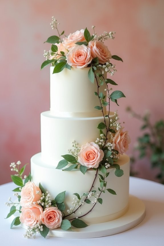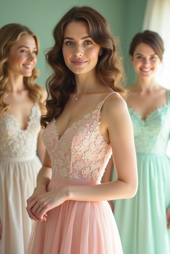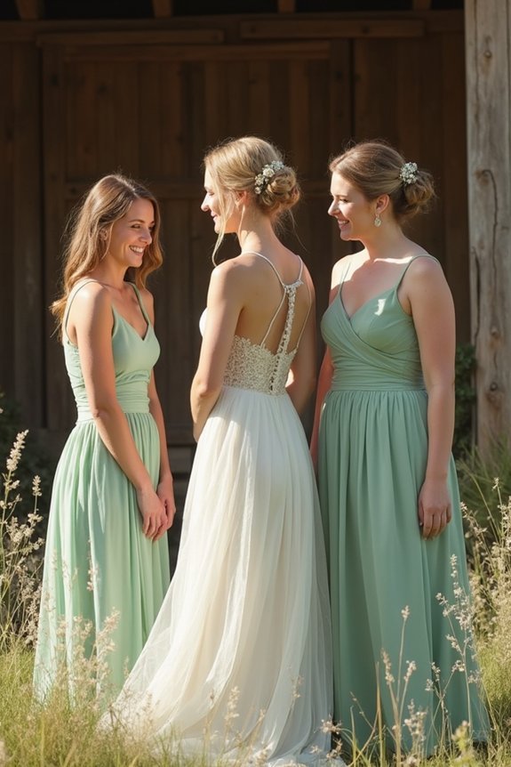
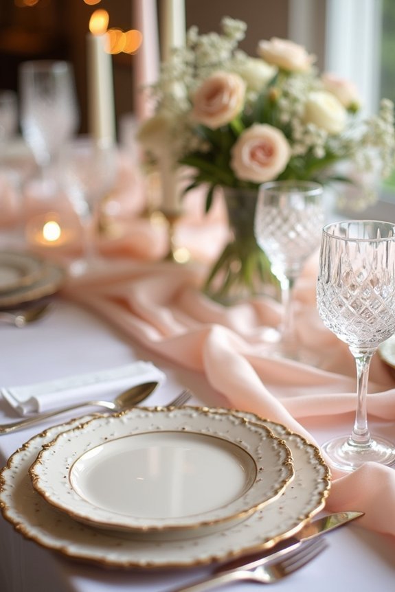
It is understood that choosing a classic wedding color palette creates the foundation for timeless elegance. Consider blush and ivory for romance, navy and gold for luxury, sage green and cream for modern sophistication, or charcoal and champagne for dramatic restraint. Each palette works beautifully across florals, linens, and lighting. We recommend testing your chosen colors in your venue’s actual lighting and keeping three to five hues for cohesion. Neutrals photograph especially well and feel fresh for decades. The right palette makes everything click together perfectly.
At a Glance
- Blush and ivory creates romantic sophistication, enhanced with metallic gold or copper accents for timeless elegance.
- Navy and gold delivers refined luxury suitable for any season, complementing various skin tones beautifully.
- Sage green and cream balances classic elegance with modern sophistication using natural textures and brass accents.
- Charcoal and champagne embraces dramatic restraint, allowing personal details to shine through the sophisticated pairing.
- Neutral color backdrops create timeless photographs that feel fresh, adaptable to lighting and seasonal accent shifts.
Blush and Ivory: Romance Without the Saccharine
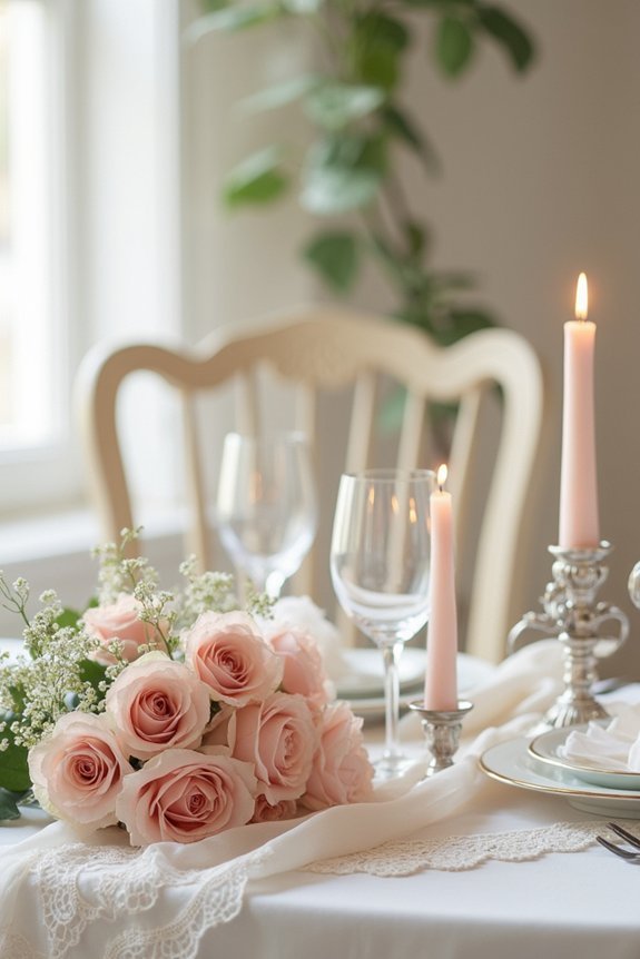
Blush and ivory create a wedding palette that feels romantic and timeless without veering into overly sweet territory.
We love this combination because it’s sophisticated yet warm, offering the perfect balance for modern brides. Blush—a soft, muted pink—pairs beautifully with crisp ivory, creating depth and visual interest.
You can incorporate these colors through florals, linens, and bridesmaid dresses without overwhelming your space. Add metallic gold or copper accents to elevate the elegance further.
This palette photographs gorgeously, works across seasons, and feels effortlessly chic. It’s the romantic choice for brides seeking polish over frills. Consider complementing your color scheme with pearl hair accessories that enhance your bridal look while maintaining the soft, sophisticated aesthetic.
Navy and Gold: Elegant Depth With Luxury Accents
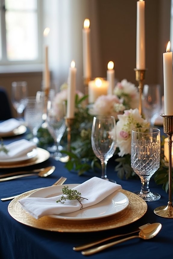
If you’re drawn to something bolder and more dramatic than soft pastels, navy and gold offer a wedding palette that feels refined and luxurious. Navy brings sophisticated depth, while gold accents add warmth and glamour without feeling over-the-top.
We love pairing this combination with marble, velvet, and metallic details for maximum elegance. The richness works beautifully in both formal ballrooms and intimate venues.
Navy suits any season, and gold complements various skin tones in your bridal party. Consider incorporating these hues through linens, florals, lighting, or jewelry for a cohesive, polished aesthetic that’ll photograph beautifully. A gold hair vine can serve as the perfect finishing touch to complete your bridal look while harmonizing with your wedding color palette.
Sage Green and Cream: Modern Classics for the Refined Bride
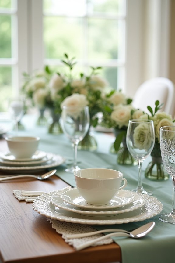
Sage green and cream create a color story that feels both timeless and wonderfully current, striking the perfect balance between classic elegance and modern sophistication.
This palette works beautifully for intimate gatherings and grand celebrations alike. The soft, muted green brings natural warmth and calm, while cream provides crisp contrast and brightness.
We love pairing sage with natural textures—think linen, wood, and greenery—to enhance the organic feel. Gold or brass accents elevate the look without overwhelming it. For outdoor celebrations, consider hosting your sage and cream wedding under a classic white gazebo that provides both protection and a clean backdrop for your refined color palette.
This combination feels effortlessly refined, allowing your personal details and florals to truly shine as the stars of your wedding day.
Charcoal and Champagne: Drama Meets Understated Glamour
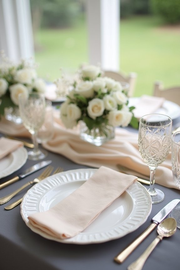
When you’re ready to embrace drama with restraint, charcoal and champagne deliver the sophistication you’re craving. This pairing creates visual depth while maintaining elegance—charcoal grounds your palette with rich intensity, while champagne adds luminous warmth.
We love how this combination works across every wedding element, from florals to linens to lighting.
Consider these applications:
- Deep charcoal bridesmaid dresses paired with champagne-toned shoes and accessories
- Charcoal linens with champagne-colored candlelight for dramatic table settings
- Charcoal calligraphy on champagne invitation cards for refined contrast
- Charcoal and champagne florals mixed with greenery for textured arrangements
This timeless duo feels both modern and classic, letting your personality shine beautifully. To enhance your charcoal and champagne aesthetic, consider pairing this color palette with a pergola structure as your ceremony backdrop, which can be decorated with coordinating florals and climbing plants that complement your sophisticated palette.
How to Choose the Right Palette for Your Wedding
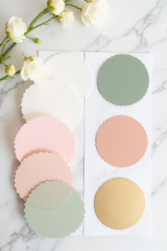
Now that you’ve explored stunning color combinations, the real magic happens when you find the palette that feels authentically *you*.
Consider your wedding venue—does it need softening or enhancing? Think about your personal style and what colors make you feel confident and joyful.
We recommend pulling inspiration from places that matter: your favorite art, nature scenes, or even meaningful objects.
Test your palette in different lighting, since colors shift dramatically from daylight to evening.
Trust your instincts. Your wedding should reflect your vision, not fleeting trends.
Use our master wedding planning checklist to ensure your color palette decisions are documented and coordinated with all other wedding elements throughout your planning timeline.
Testing Your Palette Before the Final Commitment
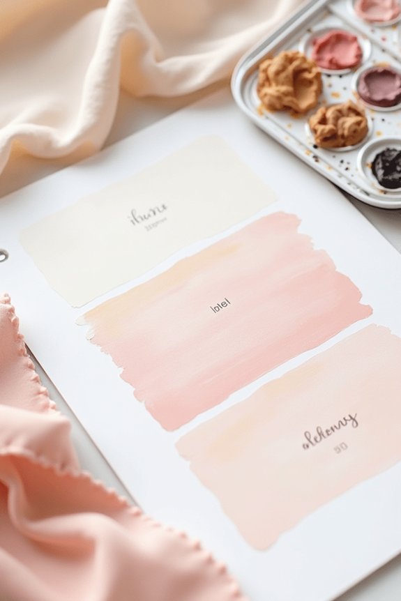
Three things happen when you commit to a color palette without testing it first: you might discover the dusty rose looks orange in your venue’s lighting, the navy feels too heavy in person, or the whole combination simply doesn’t spark the joy you felt on your mood board.
We encourage you to gather fabric swatches, paint samples, and printed images before finalizing your choices.
Here’s what to test:
- View colors under your venue’s actual lighting conditions
- Hold fabric swatches against your skin tone
- See how colors photograph together
- Observe them at different times of day
This simple step prevents costly regrets and guarantees your palette truly works.
Bringing Your Palette to Life: Florals, Linens, and Lighting
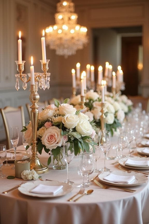
Once you’ve settled on your color palette, it’s time to translate those carefully chosen hues into the tangible elements that’ll fill your wedding day—and that’s where the real magic happens.
Your florals become the primary vehicle for color, so we recommend selecting blooms that naturally reflect your palette’s depth and mood.
Linens anchor your design across tables and ceremony spaces, creating visual cohesion.
Lighting transforms everything, warming or cooling your colors as the day progresses.
Together, these three elements work in harmony, bringing dimension and life to your vision while ensuring every guest experiences your carefully curated aesthetic.
Adapting Your Palette by Season
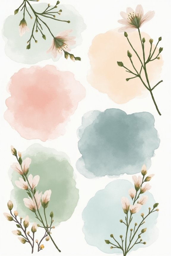
Your wedding’s season shapes what colors feel right and what’ll actually work with nature’s backdrop, so adapting your palette to the time of year guarantees your vision harmonizes with the world around you rather than fighting against it.
We’re excited to help you leverage seasonal color opportunities:
- Spring: Soft pastels like blush, mint, and pale yellow echo blooming flowers
- Summer: Jewel tones and vibrant hues complement abundant natural light beautifully
- Fall: Warm terracottas, burgundy, and gold reflect changing foliage naturally
- Winter: Deep jewels, crisp whites, and metallics create elegant sophistication
Choosing season-appropriate colors ensures your palette feels intentional and effortlessly elegant.
Executing Your Wedding Palette on Any Budget
Because choosing colors doesn’t require choosing between your vision and your wallet, we’re here to show you exactly how to bring your palette to life at whatever price point feels right for your celebration.
Prioritize color in high-impact areas like flowers, linens, and stationery. Digital invitations and printed programs offer affordable ways to showcase your palette.
Consider incorporating your colors through lighting, which transforms spaces dramatically without breaking budgets. DIY elements like painted signs or hand-dyed fabrics add personality affordably.
Strategic splurges on photography guarantee your colors shine in lasting images.
Avoid These Color Mistakes
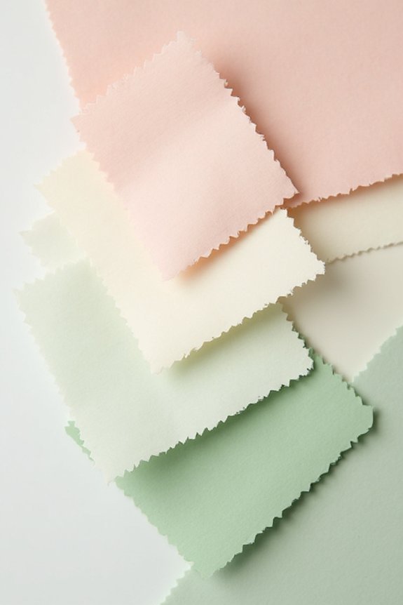
Even the most thoughtfully chosen palette can lose its magic when common color mistakes derail the vision, so we’ve identified the pitfalls that trip up engaged couples most often.
We want to help you sidestep these costly errors that compromise your wedding’s elegance:
- Using too many colors – Stick with three to five hues for cohesive sophistication
- Ignoring lighting conditions – Test colors under your venue’s actual lighting before finalizing
- Clashing warm and cool tones – Keep undertones consistent throughout your palette
- Overlooking fabric and texture – Colors shift dramatically across different materials and finishes
These adjustments guarantee your palette translates beautifully from inspiration to reality.
Why Neutrals Feel Timeless (And Photograph Beautifully)
Neutral colors—think warm beiges, soft grays, creamy whites, and earthy taupes—offer something that bold palettes can’t quite deliver: they let your wedding story unfold without competing for attention.
When we choose neutrals, we’re investing in photographs that’ll feel fresh years from now, not dated by trendy hues. These understated tones create a sophisticated backdrop that showcases your flowers, décor, and genuine moments.
They’re forgiving in different lighting conditions too, so your indoor ceremony and outdoor reception both look equally stunning.
We find that neutrals also give us flexibility to shift accent colors seasonally or evolve our style without feeling like the palette needs updating.
What to Do If Your Palette Isn’t Working
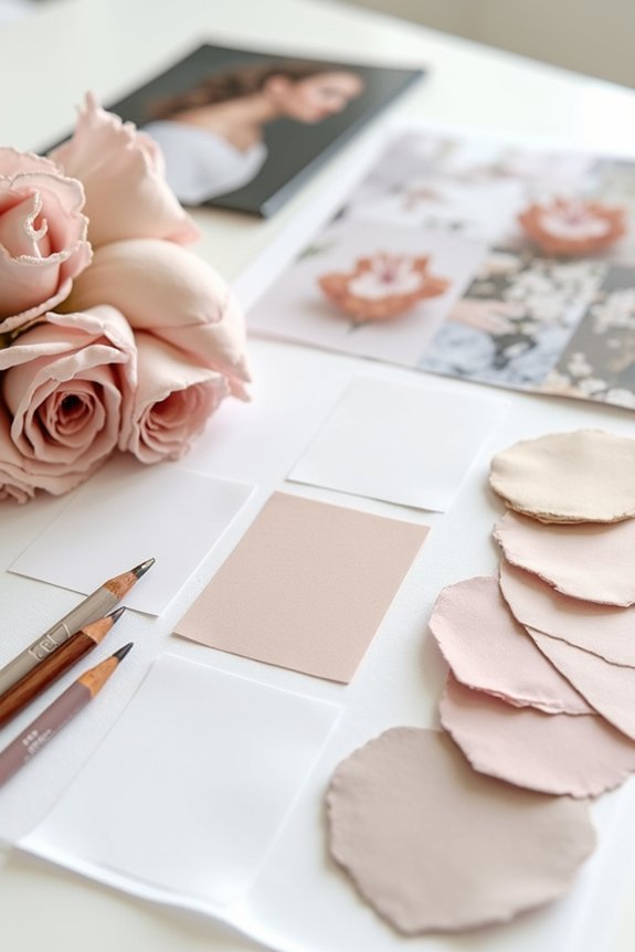
Most couples discover—somewhere between Pinterest boards and fabric swatches—that their original color palette isn’t sparking the joy they’d hoped for.
That’s completely normal, and we’ve got solutions.
Consider these adjustments:
- Swap one accent color for something that resonates more deeply with your vision
- Adjust the ratio of colors; perhaps your secondary shade needs more prominence
- Test combinations in natural light where your ceremony or reception will actually happen
- Pull inspiration from your favorite photograph or artwork to redirect your palette
Trust your instincts.
Your wedding should feel authentically yours, and pivoting now saves regret later.
Frequently Asked Questions
How Do I Incorporate My Favorite Color if It Doesn’t Fit My Chosen Palette?
We recommend using your favorite color as an accent in smaller doses—think florals, linens, or bridesmaid details. This way you’re honoring your love for it while maintaining your palette’s cohesive elegance.
Can I Use Multiple Classic Palettes Together Without Clashing?
We’ve found that 60% of weddings successfully blend two palettes when they share a common neutral. You can absolutely combine classic palettes—just guarantee they overlap through shared tones, creating cohesive elegance without visual chaos.
What’s the Best Way to Communicate My Color Palette to Vendors?
We recommend creating a visual mood board with actual fabric swatches, paint samples, and photos showing your palette in action. Share this with each vendor so they’re seeing exactly what you’re envisioning, not interpreting descriptions.
How Do Metallic Accents Like Silver or Rose Gold Fit In?
We’ve all seen weddings where metallics look like a disco ball exploded—but here’s the truth: silver and rose gold elevate any palette when we use them as accents, not stars. They’re our secret weapon for sophisticated shimmer.
Should My Wedding Party Attire Match or Complement the Color Palette?
We recommend your wedding party complement rather than match your palette—it creates visual depth and keeps focus on you. Bridesmaids in jewel tones or soft neutrals work beautifully alongside metallics while maintaining cohesion.