Your beach wedding’s color palette shapes everything—from how flowers photograph against the ocean to the mood your guests experience. We’ve gathered seven stunning combinations to match your vision: soft neutrals for timeless elegance, tropical brights for vibrant joy, dusty pastels for romance, jewel tones for bold sophistication, navy and white for crisp contrast, and sunset warmth for luxe appeal. Each palette works beautifully with coastal backdrops and natural lighting. Discover which combination resonates with your dream day as we explore each option’s unique charm and styling possibilities.
At a Glance
- Soft neutrals like ivory, cream, and champagne create timeless beach wedding aesthetics that photograph beautifully against ocean backdrops.
- Tropical brights including coral, turquoise, and hot pink celebrate coastal vibrancy while styled thoughtfully to avoid appearing costume-like.
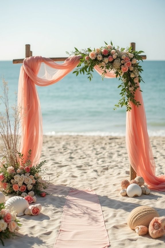
- Dusty pastels with sage, blush, and muted lavender establish romantic moods that enhance natural coastal textures and scenery.
- Jewel tones provide bold statements with deep colors that contrast stunning against sandy shores for striking wedding photography.
- Navy and white combinations, plus sunset-inspired coral and gold, deliver classic coastal elegance with warm, luxurious atmospheres.
How to Choose Your Beach Wedding Color Palette
When you’re planning a beach wedding, your color palette sets the tone for everything from your flowers to your invitations to the overall feeling guests experience when they arrive at your ceremony.
We recommend starting by considering the natural backdrop—sand, ocean, and sky provide a stunning foundation. Think about the time of day your wedding occurs, as lighting dramatically shifts color perception.
Ask yourself what mood you want to create: serene and calming, vibrant and energetic, or romantic and intimate. Your palette should feel authentic to you while harmonizing with the coastal landscape surrounding your celebration.
Consider complementary bridal accessories like hair vines with colored accents to tie your color theme together and add sparkle to your overall look.
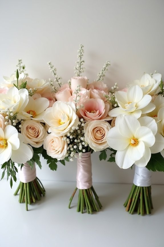
Soft Neutrals and Sand: The Timeless Classic
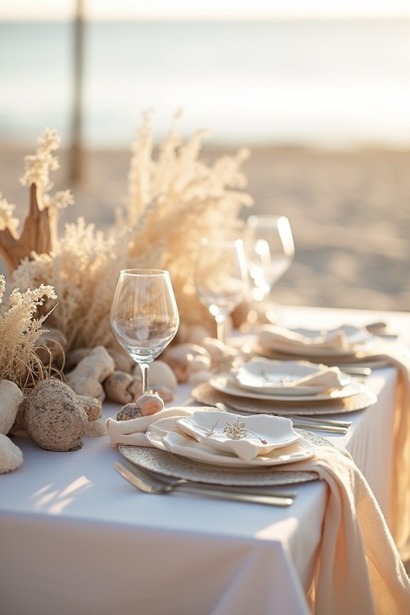
Soft neutrals and sand tones represent the ultimate beach wedding classic—and for good reason.
These colors work beautifully with ocean backdrops, creating naturally cohesive photos that feel timeless rather than trendy.
We love pairing warm beiges with ivory, cream, and soft taupe for depth without drama.
Consider adding pale gold or champagne accents to catch light elegantly.
These palettes complement all skin tones in your wedding party and photograph gorgeously in golden hour light.
The best part? We find soft neutrals incredibly forgiving—they’re hard to get wrong and easy to personalize with textures and details that reflect your style.
For comprehensive planning guidance, consult our 12-month wedding timeline to ensure all color and design decisions align with your overall wedding preparation schedule.
Tropical Brights: Vibrant and Bold by the Ocean
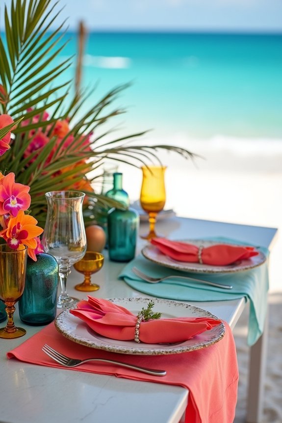
If soft neutrals feel too understated for your vision, tropical brights offer a completely different energy—one that celebrates the natural vibrancy surrounding your beach location.
These bold palettes let your personality shine through vibrant hues that photograph beautifully against ocean backdrops.
Consider these stunning combinations:
- Coral, turquoise, and cream for warm, inviting sophistication
- Hot pink, lime green, and gold for playful energy
- Sapphire blue, orange, and ivory for striking contrast
- Magenta, teal, and white for modern boldness
Tropical brights work wonderfully with natural beach settings, creating dynamic visual interest.
We love how these palettes feel joyful without appearing costume-like when styled thoughtfully with elegant touches.
Pair your vibrant color palette with bridal jewelry sets featuring complementary metallic tones and sparkling stones to complete your cohesive beach wedding aesthetic.
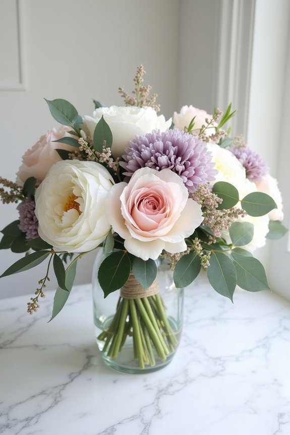
Dusty Pastels: Romance Meets Coastal Elegance
Muted, dreamy hues create an entirely different mood than tropical brights—one that whispers rather than shouts.
We love how dusty pastels bring romance to coastal settings without competing with natural beauty. Think soft sage, pale blush, dusty blue, and muted lavender layered together.
These colors feel sophisticated and timeless, perfect if you want your wedding to feel like a storybook come to life. They photograph beautifully in golden hour light and pair wonderfully with natural textures like linen, wood, and greenery.
Dusty pastels let your ocean backdrop shine while wrapping everything in gentle, elegant warmth. Consider complementing your soft color palette with delicate jewelry featuring high-luster white pearls in understated designs that enhance rather than overpower your refined aesthetic.
Jewel Tones: Rich Sophistication by the Sea
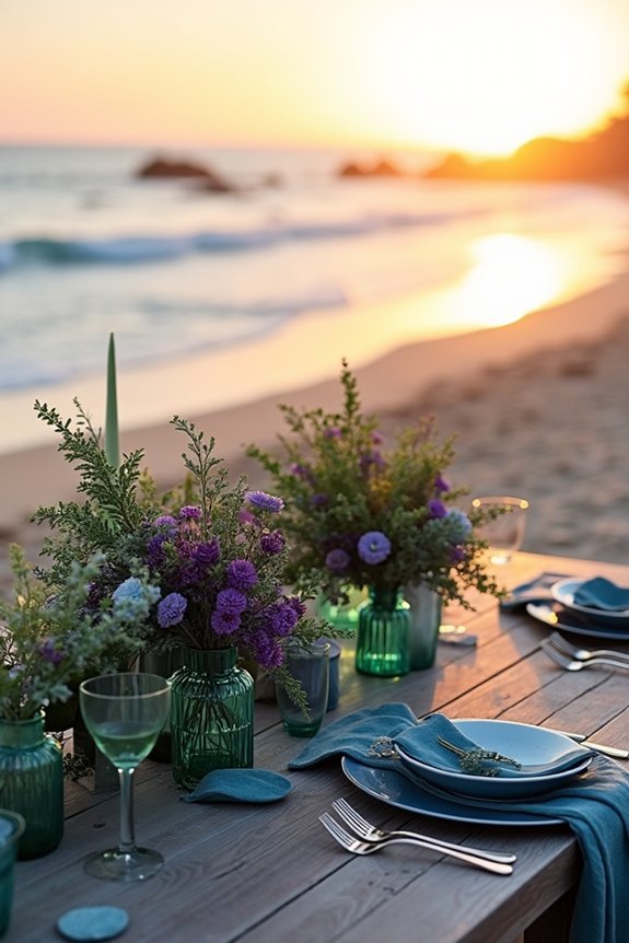
When you’re ready to make a bold statement with your beach wedding, jewel tones deliver exactly that—deep emerald, sapphire blue, rich burgundy, and amethyst create a sense of luxury and drama that feels entirely different from pastels.
These sophisticated hues work beautifully against sandy shores and ocean backdrops, creating stunning contrast in your photos.
Consider these approaches:
- Pair jewel tones with gold or copper accents for warmth
- Use them in bridesmaids’ dresses or groomsmen’s suits
- Incorporate jewels through florals, linens, and décor elements
- Balance richness with white or cream for breathing room
This palette suits evening celebrations and destination weddings perfectly. Complete your jewel-toned look with Austrian crystals in your bridal headpiece to add sparkle and sophistication that complements this rich color scheme.
Navy and White: Crisp Coastal Contrast
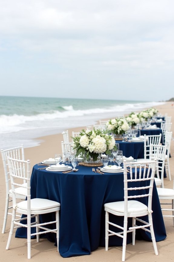
There’s something timelessly elegant about pairing navy with white—two colors that feel both classic and effortlessly fresh at the beach.
We love how this combination works beautifully for any coastal setting, from sandy shores to seaside cliffs. Navy grounds your palette with sophistication while white keeps everything light and airy.
Think navy bridesmaids’ dresses with white flowers, or a white gown against navy décor. Add metallic gold or silver accents for extra polish.
This pairing photographs gorgeously and never feels trendy or dated, making it perfect if you want your wedding to feel timeless and refined.
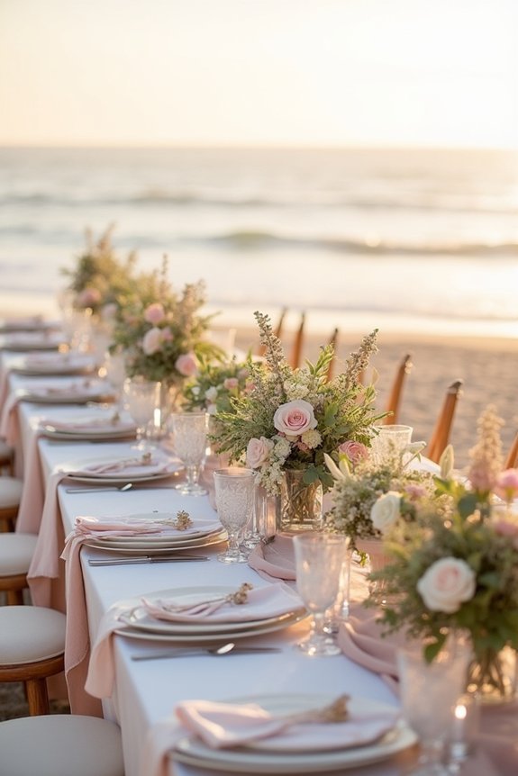
Sunset Warmth: Coral, Gold, and Peachy Hues
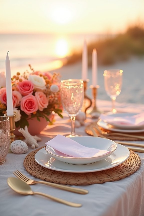
If you’re drawn to warmth rather than cool sophistication, coral, gold, and peachy hues offer a completely different energy—one that captures the magic of golden hour and wraps your celebration in romantic, glowing light.
We love how these colors create an effortlessly luxe atmosphere that feels both vibrant and timeless.
Consider these stunning combinations:
- Coral bridesmaid dresses with gold jewelry and accents
- Peachy florals paired with champagne linens and gold chargers
- Sunset-inspired ombré cakes evolving from coral to gold
- Golden hour photography with warm-toned lighting throughout
These hues photograph beautifully and complement most skin tones, making everyone feel radiant on your special day.
Frequently Asked Questions
How Do I Adjust My Beach Wedding Colors if the Weather Doesn’t Cooperate?
We recommend leaning into moody, saturated tones like deep navy, emerald, or burgundy if clouds roll in. These jewel tones photograph beautifully in softer light and create sophisticated drama that gray skies actually enhance rather than diminish.
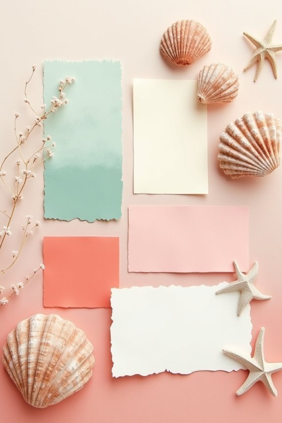
What’s the Best Way to Incorporate My Color Palette Into Wedding Invitations and Stationery?
We recommend printing your palette on cardstock that matches your primary color, using accent hues for borders or typography. Watercolor washes and metallic accents elevate beach themes beautifully while keeping designs sophisticated and readable.
How Can I Ensure My Chosen Colors Photograph Well in Different Lighting Conditions?
We’ll help you sidestep photo disappointments by shooting samples during golden hour and midday, checking your palette against different backdrops, and consulting your photographer about lighting conditions they’re anticipating.
Should My Bridal Party’s Attire Match or Complement My Overall Color Scheme?
We recommend complementing rather than matching your color scheme—it creates visual interest and lets your bridal party support your vision while maintaining their own style. This approach photographs beautifully and feels intentionally designed.
How Do Seasonal Timing and Sunset Hours Affect Which Colors Work Best for My Beach Wedding?
As the saying goes, timing is everything—and we’ve found that golden hour light transforms pastels beautifully in spring, while jewel tones pop against summer’s bright sun. Winter’s softer glow flatters muted palettes; autumn demands warmer hues.