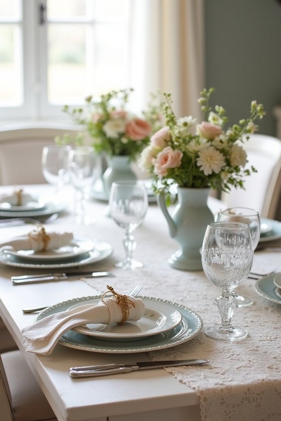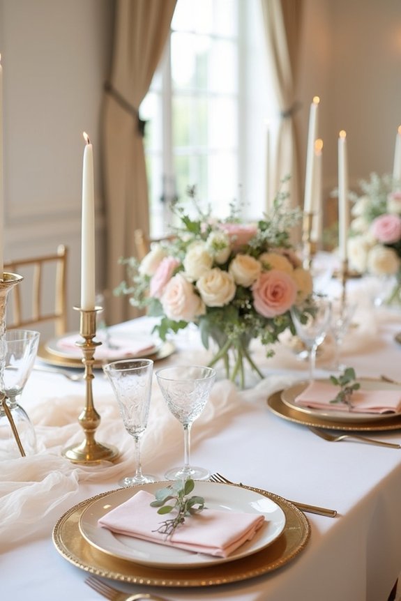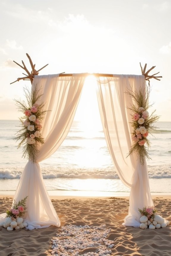
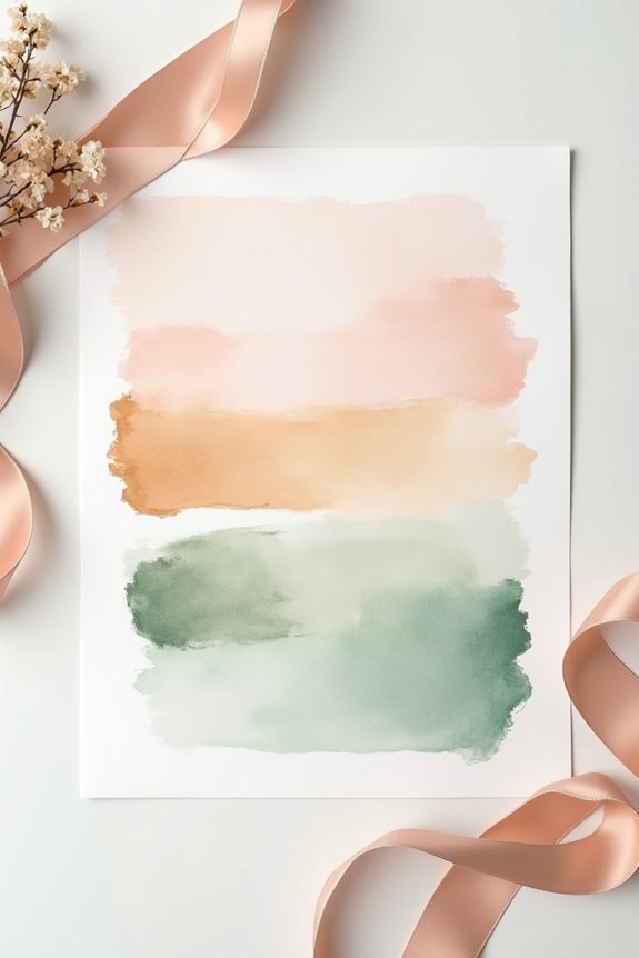
We’d love to help you craft an elegant wedding palette that’ll make your day truly shine. Start by picking one dominant color that resonates with you emotionally and photographs beautifully. Then add complementary secondary colors and one or two accent shades for sophistication. Consider your venue’s lighting, your wedding style, and how your bridal party’s attire ties everything together. Test your colors in real wedding photos and get feedback from your photographer and florist. When you explore the specifics of color theory and common mistakes to avoid, your vision becomes clear.
At a Glance
- Select a single dominant color that resonates emotionally and photographs well under your venue’s lighting conditions.
- Pair the dominant color with 1–2 secondary colors and 1–2 accent colors for visual interest without chaos.
- Coordinate groomsmen’s attire, including ties and boutonnières, to reinforce the aesthetic and create a polished, intentional look.
- Research real wedding photography on Pinterest and Instagram to see how your chosen palette performs under different lighting.
- Consult photographers, florists, and designers to verify color authenticity, ensure visual cohesion, and spot potential clashes early.
Start With Your Wedding Style and Venue
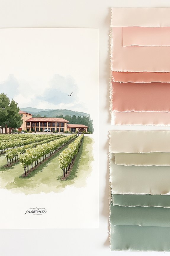
Before you plunge into color swatches and Pinterest boards, let’s ground your palette in two foundational elements: your wedding style and your venue.
Your style—whether modern, romantic, classic, or bohemian—naturally suggests certain color families. A minimalist wedding thrives with neutrals and one accent color, while a garden celebration might embrace florals and soft jewel tones.
Your venue matters equally. Natural light in a bright ballroom makes different colors pop than candlelit evenings. Outdoor settings shift with seasons, affecting how colors appear. For comprehensive guidance on planning your wedding timeline and design elements, consult the Master Wedding Planning Checklist PDF to ensure all aesthetic decisions align with your overall wedding vision.
Learn the One-Color Rule: Your Dominant Shade
Now that you’ve anchored your palette to your style and venue, it’s time to build from a single, powerful choice: your dominant color. This shade becomes the visual foundation of your wedding, appearing in flowers, linens, and décor throughout your celebration.
We recommend selecting a color that genuinely moves you, one you’ll love seeing in photos for years. Your dominant color should complement your venue’s existing tones and reflect your personal style.
Think about how natural and artificial lighting will affect it. Consider pairing your dominant color with artificial flower wall panels to create a cohesive backdrop that maintains color consistency throughout your venue. This foundational choice simplifies decision-making for every design element that follows.
Pick Secondary Colors That Complement, Not Compete
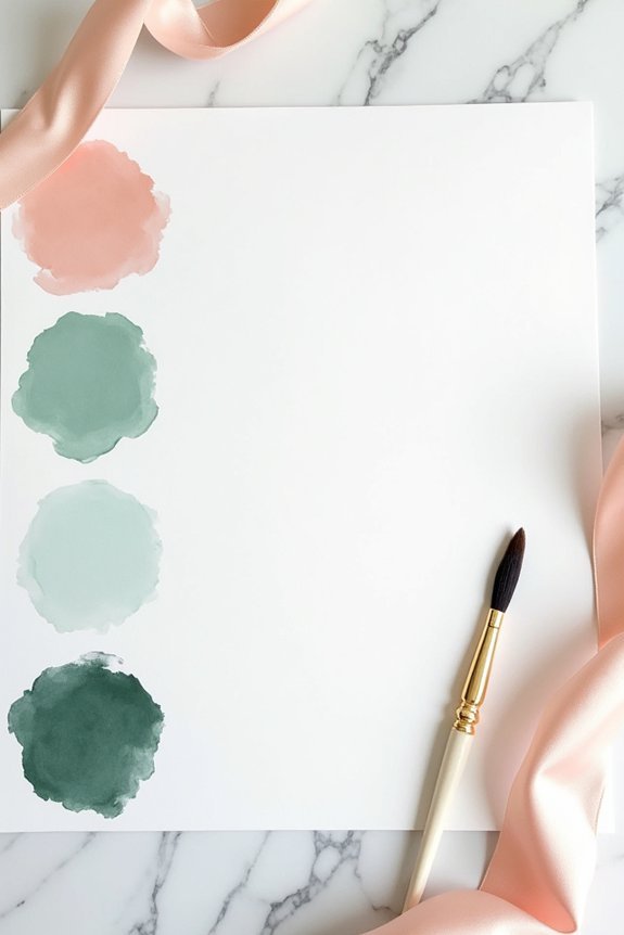
With your dominant color locked in, we’re ready to build the supporting cast of your palette—and this is where many couples stumble.
We want to choose colors that enhance your primary shade rather than fight for attention. Think about using tints, shades, or tones of your dominant color for harmony.
Alternatively, we can select complementary colors from opposite sides of the color wheel for sophisticated contrast. Neutrals like cream, gray, or gold work beautifully as anchors, letting your main color shine. Your choice of bridal jewelry materials, such as silver-plated or gold options, can also reinforce your color palette and tie the overall aesthetic together.
We’re aiming for a cohesive feel where every shade has a purpose and works together seamlessly.
Add 1–2 Accent Colors for Sophistication
Your palette’s foundation is set, and here’s where we bring visual interest and personality into the mix—accent colors are the secret to elevating a wedding from pretty to unforgettable.
Think of accents as the jewelry of your color scheme. Choose one or two colors that complement your primary and secondary selections, then use them sparingly in florals, linens, or décor details.
Gold, blush, or deep jewel tones work beautifully as accents, adding richness and dimension. Consider pairing these accent colors with bridal pearl jewelry to create a cohesive and sophisticated look throughout your wedding day. This restraint prevents your palette from feeling chaotic while creating those magazine-worthy moments that make guests pause and admire.
Color Theory for Weddings: The Basics That Matter
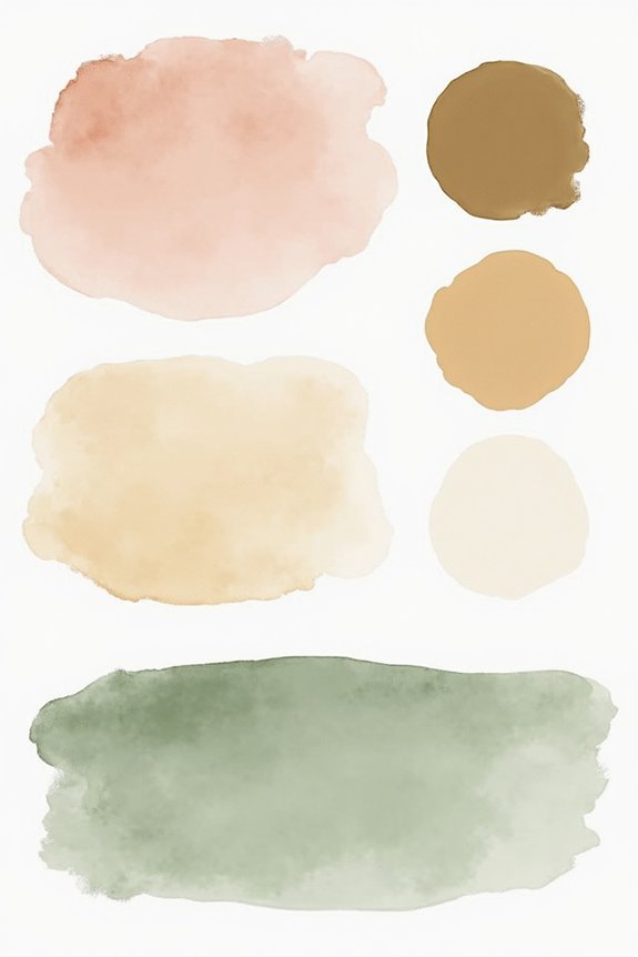
Understanding how colors work together is what separates a cohesive, polished wedding from one that feels scattered—and we’re about to reveal that knowledge for you.
We’ll explore the fundamentals that matter most:
- Complementary colors sit opposite each other on the color wheel, creating natural contrast and visual excitement.
- Analogous colors sit beside each other, offering harmony and a soothing, unified feel.
- Color temperature (warm versus cool tones) influences mood—warm hues feel intimate, while cool tones feel fresh and modern.
These principles guide our palette choices, ensuring your wedding feels intentional and beautifully balanced. Once you’ve selected your colors, organize all the details—from guest preferences to meal preference tracking—to ensure every element of your celebration aligns with your vision.
How Lighting Changes Your Palette (And How to Account for It)
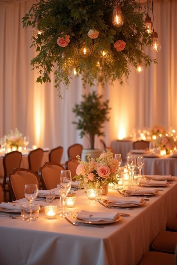
The most stunning color palette can shift dramatically the moment your venue’s lighting kicks in, which is why we can’t skip this essential step in your planning process.
Natural daylight makes colors appear brighter and truer, while warm artificial lighting can deepen jewel tones and flatten pastels. Cool fluorescent lights shift everything toward blue undertones.
We recommend visiting your venue at the same time of day as your event, bringing fabric swatches, and observing how they transform.
This simple action guarantees your carefully chosen palette looks absolutely gorgeous in every photo and moment.
Adjust for Season: Why Timing Impacts Your Choices
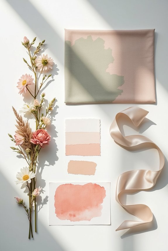
Just as lighting transforms color, so does the season in which you’re marrying. We need to evaluate how nature’s backdrop influences our palette choices.
- Spring invites soft pastels and fresh florals that echo blooming gardens.
- Summer supports bold, saturated jewel tones and bright whites that pop against sunshine.
- Fall and winter call for deep burgundies, forest greens, and metallics that feel rich and warm.
Your venue’s natural surroundings matter too. A beach wedding thrives with ocean-inspired blues, while a winter venue benefits from contrast against snow.
Match your colors to what’s already there, and you’ll create something that feels intentional and effortlessly cohesive.
Where Each Color Goes: Assign Your Palette
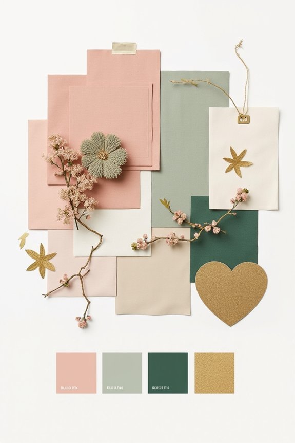
Once you’ve chosen your palette, the real magic happens when you decide where each color actually goes—because slapping your three colors everywhere equally won’t create that sophisticated, intentional look you’re after.
We recommend anchoring your primary color in major elements: the bridesmaids’ dresses, ceremony backdrop, or florals.
Your secondary color works beautifully in accents like linens, signage, or bouquet ribbons.
Save your third color—often a neutral or metallic—for delicate touches: calligraphy, place cards, or jewelry details.
This hierarchy creates visual balance and guides guests’ eyes naturally through your celebration.
The result? Cohesive elegance that feels intentional, not accidental.
Don’t Forget Florals: Working With What Blooms When
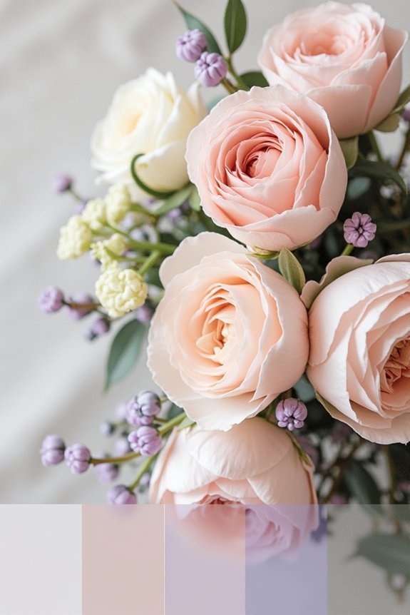
How do we create a color palette that actually works with nature’s timeline? Your flowers anchor everything, so let’s build around what’s available during your wedding month.
Consider these strategies:
- Research seasonal blooms in your location and wedding date
- Choose a primary flower, then select complementary colors from its natural hues
- Plan backup options for unpredictable growing seasons
Work with your florist to understand which flowers peak when.
A spring wedding opens doors to peonies and tulips, while summer brings roses and dahlias.
Fall offers dahlias and chrysanthemums.
Winter features evergreens and amaryllis.
This approach guarantees your palette feels organic, achievable, and absolutely stunning.
Bridesmaid Dresses and Menswear: Staying On-Brand
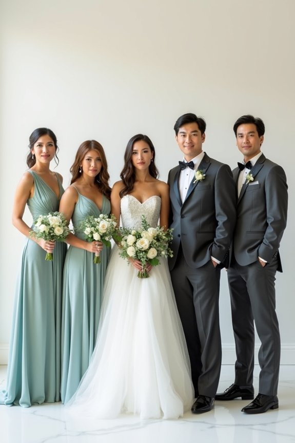
Your bridesmaids and groomsmen are walking advertisements for your wedding aesthetic, so their attire deserves just as much thoughtfulness as your flowers and décor.
We recommend selecting fabrics and silhouettes that complement your color palette while honoring your overall design vision. Consider metallic accents, fabric textures, or subtle patterns that echo your theme without competing for attention.
For menswear, coordinate tie colors, pocket squares, and boutonnières with your palette. These details create visual cohesion throughout your wedding party.
When everyone’s attire harmonizes with your chosen colors, you’ll achieve that polished, intentional look you’re seeking.
Spot the Common Mistakes Before They Derail You
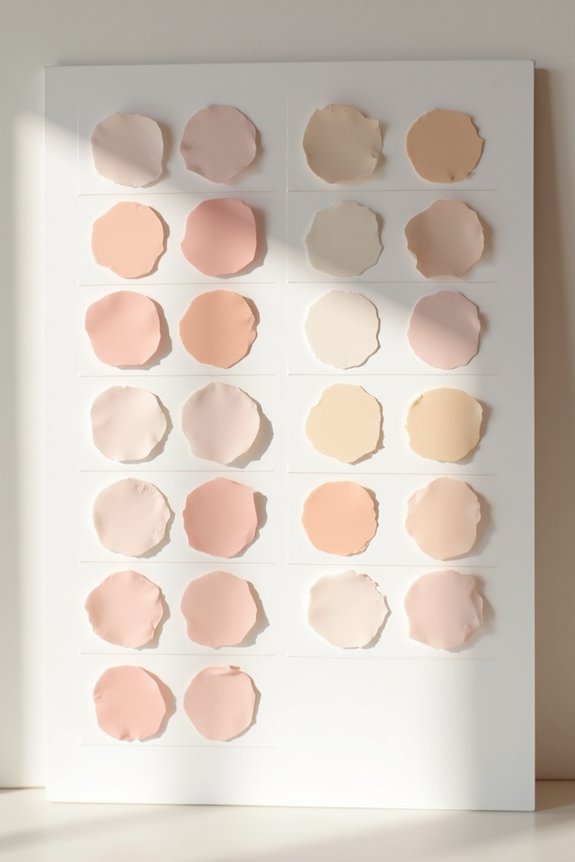
Even with the best intentions, couples often stumble into color palette pitfalls that undermine their carefully planned vision.
Let’s navigate around these common mistakes:
- Choosing too many colors – More than four hues creates visual chaos instead of sophistication.
- Ignoring lighting conditions – Colors shift dramatically under different venue lighting, so we recommend viewing swatches on-site.
- Forgetting about seasonal timing – Winter weddings need warmth, while summer events benefit from cooler tones.
Preview Your Colors in Real Wedding Photos
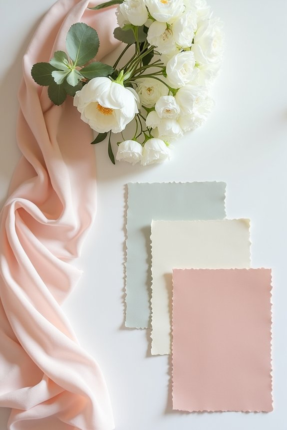
The magic of seeing your colors come to life happens when we look beyond paint chips and fabric swatches—we need to study them in actual wedding photography.
Search Instagram and Pinterest for real weddings featuring your chosen palette, paying close attention to how lighting affects each hue. Notice which combinations feel timeless versus trendy, and observe how professionals style them with florals, linens, and decor.
This visual research reveals how your colors perform in different settings, from indoor ceremonies to outdoor receptions, helping us make confident decisions before committing our budget.
Refine Your Palette With Professional Feedback

While studying real wedding photos gives us valuable insight into how colors perform in practice, we benefit greatly from expert eyes examining our specific choices.
Getting professional feedback helps us refine our palette with confidence:
- Share your colors with your photographer to verify they’ll photograph beautifully in your venue’s lighting
- Consult your florist about which blooms authentically match your chosen hues
- Review your palette with your designer to confirm cohesion across all visual elements
These professionals work with color daily, spotting combinations that elevate your vision while catching potential clashes we might miss alone.
Frequently Asked Questions
How Do I Choose Colors That Photograph Well for Professional Wedding Photos?
We recommend choosing jewel tones, soft neutrals, and saturated colors—they’ll pop in photos. Avoid pale pastels and neon shades that wash out. Test your palette in natural and indoor lighting before committing.
What’s the Best Way to Communicate My Color Palette to My Vendor Team?
We recommend creating a shared digital mood board with color swatches, hex codes, and real photos showing your palette in action. Send this to florists, stylists, and your photographer so everyone’s on the same page from day one.
Can I Change My Color Palette if I Regret My Initial Choices?
Absolutely, you can pivot. Picture your vision shifting, colors dancing differently in your mind’s eye—we’re here to help you evolve your palette. Contact vendors early; most accommodations are possible when we’re intentional about change.
How Many Colors Is Too Many for a Cohesive Wedding Palette?
We recommend sticking to three to four colors maximum for a cohesive palette. This keeps your wedding feeling intentional and sophisticated while giving you enough variety to create visual interest throughout your design.
Should My Engagement Photos Match My Wedding Day Color Scheme?
We recommend coordinating your engagement photos with your wedding palette—it creates visual continuity across your wedding content and strengthens your overall aesthetic. That said, don’t stress if they don’t perfectly match.