We’ve gathered five fall wedding color palettes that’ll make your big day absolutely stunning. Choose jewel tones like emerald and sapphire for sophistication, warm neutrals with terracotta and rose gold for timeless grace, or moody burnt orange and plum for drama. Blush, sage, and rust create an earthy, organic feel that photographs beautifully. Each palette pairs differently with venues—rustic barns call for warm golds while modern lofts favor jewel tones. Your venue and personal vision guide which combination will feel just right for you, and we’ve got the perfect details waiting to help you decide.
At a Glance
- Jewel tones like emerald, sapphire, and burgundy provide sophisticated fall elegance with excellent photography results.
- Warm neutrals combining terracotta, cream, and rose gold create versatile, graceful palettes for any autumn venue.
- Burnt orange and deep plum deliver dramatic, luxurious effects perfect for evening fall celebrations.
- Blush, sage, and rust create organic, nature-inspired combinations that photograph beautifully during golden hour.
- Match your palette to venue type: rustic barns suit warm terracottas; modern spaces favor jewel tones.
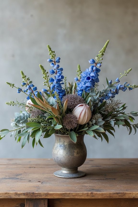
Jewel Tone Wedding Palettes: Emerald, Sapphire & Burgundy
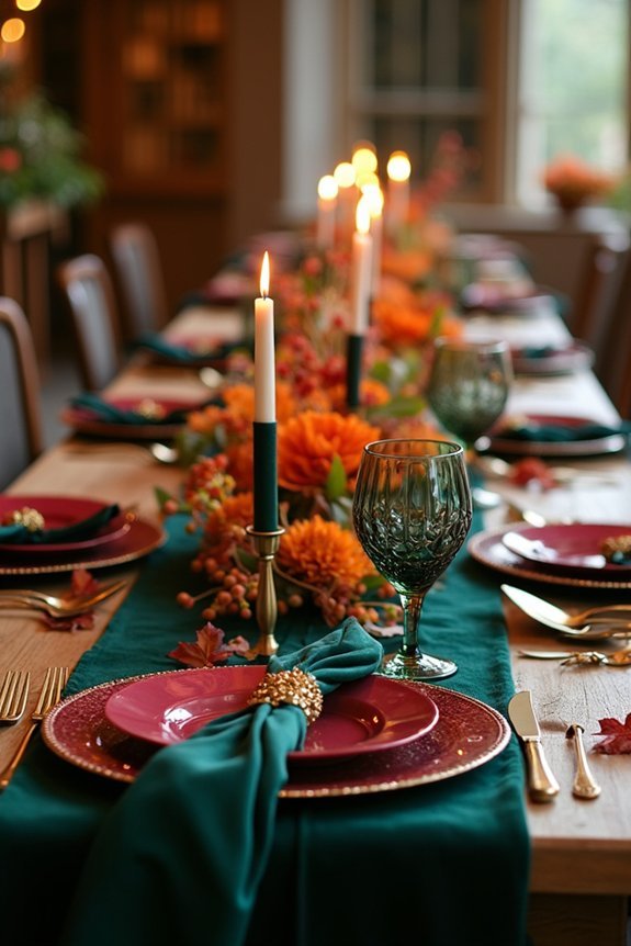
When you’re ready to move beyond pastels and neutrals, jewel tones offer a sophisticated alternative that feels both timeless and on-trend.
Emerald brings natural elegance and luxury, sapphire adds classic depth, and burgundy creates warmth and romance.
We love how these rich colors photograph beautifully in natural light, making your wedding images genuinely stunning.
They work wonderfully with gold accents, blush florals, or deep greenery.
Whether you choose one dominant shade or blend all three, jewel tones elevate your wedding aesthetic instantly.
Consider pairing your jewel tone palette with AAA-grade freshwater pearls to add timeless sophistication and brilliance to your bridal jewelry.
Your guests will appreciate the refined, intentional feeling these colors create throughout your celebration.
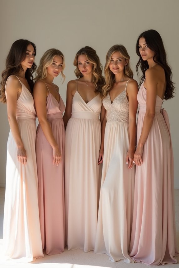
Warm Neutral Wedding Colors: Terracotta, Cream & Rose Gold
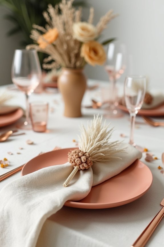
If jewel tones feel too bold for your vision, warm neutrals offer a graceful middle ground that’s equally sophisticated and far more versatile.
Terracotta brings earthy warmth reminiscent of autumn landscapes, while cream provides a clean, timeless foundation.
Rose gold ties these elements together with subtle glamour and modern appeal. This palette works beautifully across seasons and adapts to various venues—from rustic barns to elegant ballrooms.
We love how these colors photograph gorgeously in natural light, creating soft, romantic imagery.
You’ll find endless styling possibilities with metallics, greenery, and textures that complement without competing for attention.
Consider pairing this warm neutral palette with gold leaf crowns to add a vintage and elegant touch that perfectly complements autumn wedding aesthetics.
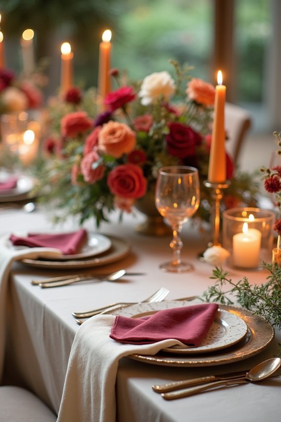
Burnt Orange & Deep Plum: A Moody Autumn Palette
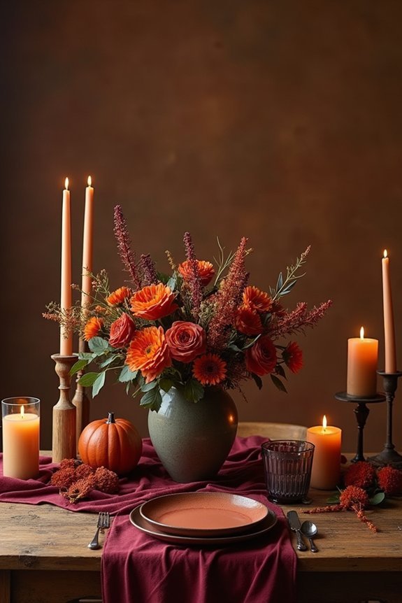
Since warm neutrals celebrate softness and restraint, we’re ready to explore a palette that embraces deeper, moodier tones—burnt orange paired with deep plum creates an undeniably dramatic effect that feels both luxurious and intentional.
This combination works beautifully for evening celebrations, particularly outdoor autumn weddings. The burnt orange brings warmth and energy, while plum adds mystery and sophistication.
Together, they’re rich without feeling heavy. Consider incorporating gold accents or cream linens to balance the intensity.
This palette suits jewel-toned florals, candlelit receptions, and venues with natural wood or stone elements. A metal pergola structure can serve as an elegant focal point that complements these moody tones while providing architectural interest to your ceremony space. It’s perfect when you want your wedding to feel bold, elegant, and distinctly seasonal.
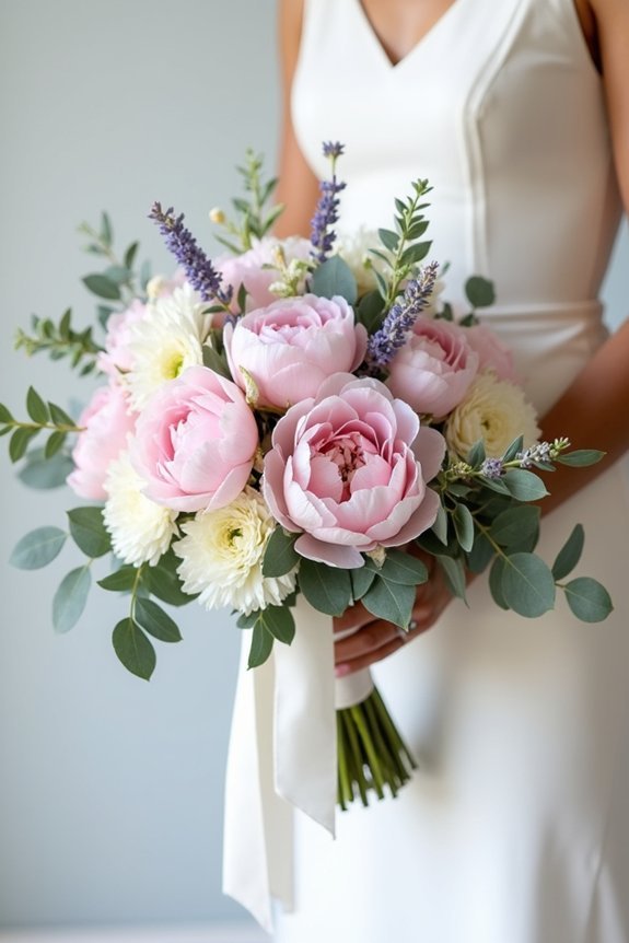
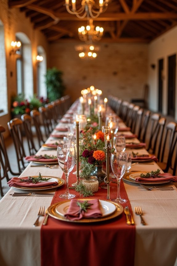
Blush, Sage & Rust: Earthy Wedding Color Inspiration
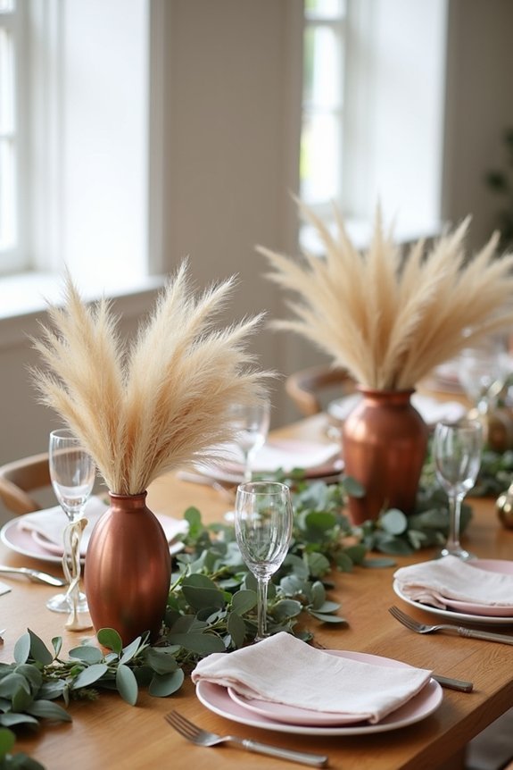
There’s something grounding about a palette that pulls directly from nature—blush, sage, and rust create a warm, organic combination that feels both timeless and thoroughly modern.
This trio works beautifully for fall weddings because it balances softness with earthy richness. Blush provides delicate femininity, sage adds calming greenery, and rust brings autumn warmth.
We love how these colors photograph incredibly well in natural light, especially during golden hour. You can incorporate them through florals, linens, bridesmaid dresses, and décor elements.
The result? A sophisticated, cohesive aesthetic that feels intentional and utterly elegant without requiring trendy flourishes. Consider complementing your color palette with outdoor wedding games that align with these warm, natural tones to enhance the overall ambiance and guest experience.
Choose Your Palette: Venue & Vision?
Your venue and personal vision are the two anchors that’ll guide every color choice you make, so let’s start there. A rustic barn naturally calls for warm terracottas and deep golds, while a modern loft begs for sophisticated jewel tones.
Think about the light your space receives too—natural sunlight transforms colors throughout the day.
Next, consider what moves you emotionally. Are you drawn to moody, dramatic hues or soft, romantic tones? Your palette should feel authentically *you*, reflecting your style and making you genuinely excited when you walk down the aisle.
This foundation makes every decision easier. Using a comprehensive wedding checklist helps ensure your color decisions align with all other planning elements throughout your event.
Frequently Asked Questions
How Do I Test Fall Color Palettes Before Committing to My Entire Wedding Design?
Want to see your fall palette in action before you commit? We recommend creating a mood board with fabric swatches, flowers, and stationery samples. Test combinations in your venue’s lighting to verify they’ll photograph beautifully.
What’s the Best Way to Incorporate Fall Colors if My Wedding Is Indoors?
We recommend layering fall colors through florals, linens, and lighting rather than relying on seasonal décor. Focus on jewel tones in your arrangements and uplighting to create warmth indoors without feeling too autumnal.
Can I Mix Multiple Fall Palettes Together Without Looking Chaotic or Uncoordinated?
We absolutely can blend multiple fall palettes if we anchor them with a unifying neutral—think warm cream, soft taupe, or rich chocolate. This ties everything together while letting burgundy, burnt orange, and gold coexist beautifully.
How Do Seasonal Flower Availability and Costs Affect My Fall Color Palette Choices?
We’ve seen brides pivot entire palettes when dahlias peaked—they’re pricey September through October. Smart couples choose colors around what’s naturally abundant: burgundy, blush, and gold won’t drain your budget.
Which Fall Colors Photograph Best in Different Lighting Conditions and Times of Day?
We’ve found that jewel tones—deep burgundy, emerald, and sapphire—pop beautifully in golden hour light, while warm terracottas and burnt oranges photograph best in soft morning or overcast conditions. Avoid blacks in shade; they’ll disappear.