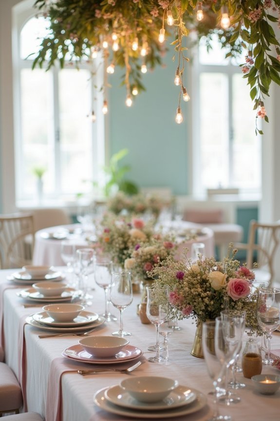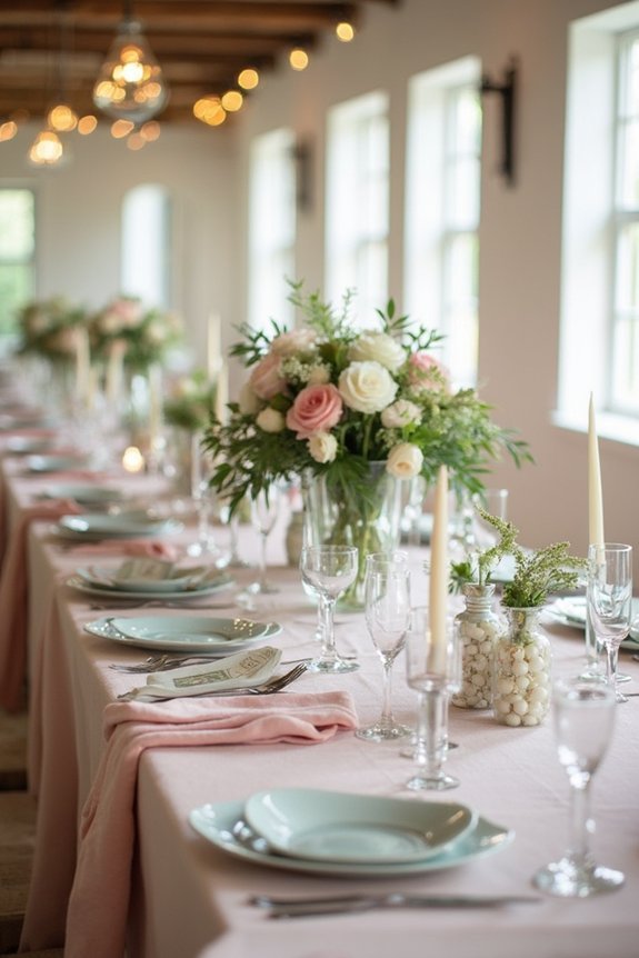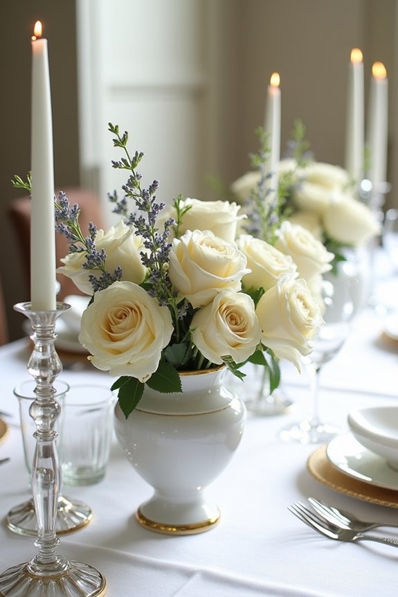
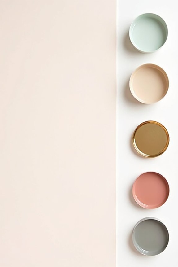
We’re moving away from soft pastels toward palettes that feel authentically you. Jewel tones like emerald and sapphire bring luxury and drama. Soft dopamine palettes combine blush, cream, and sage for calm joy. Minimalist schemes use charcoal, white, and warm gray for sophisticated elegance. Terracotta delivers warmth through burnt orange and chocolate. Monochrome greige creates understated cohesion. Coastal and romantic palettes round out trending options that work across seasons. Each palette tells a different story about who you are as a couple, and we’ve got the details on making each one shine.
At a Glance
- Jewel tones like emerald, sapphire, and gold deliver luxury and timeless elegance perfect for modern weddings.
- Soft dopamine palettes combining blush, cream, and sage create calming, joyful atmospheres for contemporary celebrations.
- Minimalist designs using charcoal, white, and warm gray offer sophisticated elegance across all seasons and venues.
- Terracotta palettes featuring burnt orange, cream, and chocolate bring warmth inspired by natural landscapes and sunsets.
- Monochromatic greige layering provides understated elegance with visual interest while allowing metallic accents without disruption.
Jewel Tone Palette: Emerald, Sapphire, and Gold
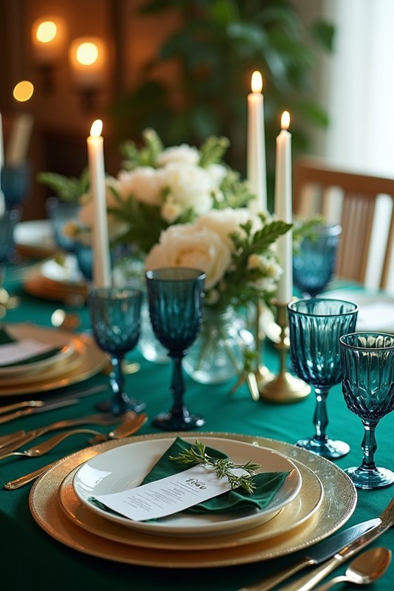
If you’re drawn to luxury and timeless elegance, jewel tones offer us a sophisticated foundation that feels both current and enduring.
Emerald brings natural richness and romance, while sapphire adds depth and refined drama. Gold accents tie everything together, creating warmth and glamour throughout your celebration.
We love how this palette photographs beautifully in candlelight and natural settings. The combination works wonderfully for intimate gatherings or grand affairs.
You can incorporate these colors through florals, linens, stationery, and décor. This palette whispers confidence and taste, giving your wedding that coveted magazine-quality feel without requiring elaborate execution.
Consider pairing this jewel tone palette with Austrian crystals and rhinestones in your bridal headpiece to enhance the luxurious aesthetic and add sparkle that complements your sophisticated color scheme.
Soft Dopamine Palette: Blush, Cream, and Sage
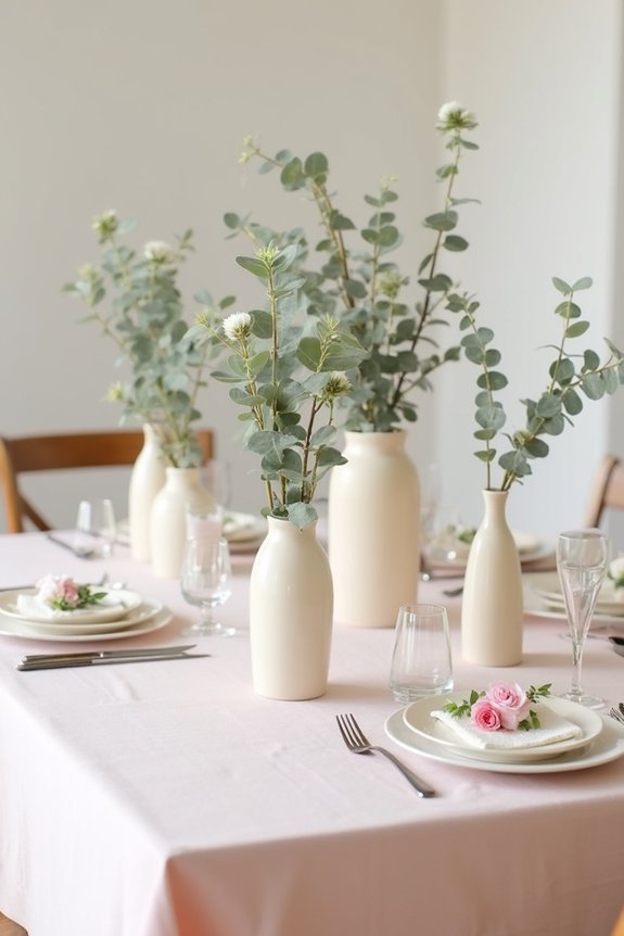
For those seeking a palette that feels both calming and joyful, blush, cream, and sage create a soft dopamine effect that’s wonderfully modern yet timeless.
This combination lifts your mood while maintaining sophistication. Blush brings warmth and romance, cream offers elegance and light, and sage adds natural, grounding serenity.
We love how these colors work beautifully in florals, linens, and décor. They photograph gorgeously in natural light, creating dreamy wedding imagery.
This palette suits outdoor and indoor venues equally well. You’ll find it incredibly versatile for personalizing your wedding’s unique style and aesthetic vision. Consider pairing this soft color scheme with delicate bridal jewelry to enhance your overall wedding aesthetic with timeless elegance.
Minimalist Palette: Charcoal, White, and Warm Gray
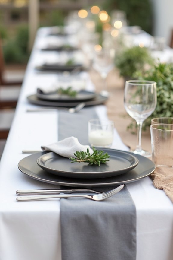
Three colors—charcoal, white, and warm gray—create a sophisticated minimalist palette that feels effortlessly elegant and timelessly chic.
We love how this combination brings modern refinement to your wedding day. Charcoal grounds the palette with depth and drama, while white provides crisp contrast and brightness. Warm gray bridges these two beautifully, adding softness without losing edge.
This palette works wonderfully in any season and suits various venues, from industrial lofts to garden settings.
You’ll find it photograph beautifully in natural light, creating images that feel both contemporary and timeless—exactly what we’re after for 2026.
Pair this elegant color scheme with high-quality materials like genuine crystals and refined metals in your bridal accessories to enhance the sophisticated aesthetic throughout your wedding day.
Terracotta Palette: Burnt Orange, Cream, and Chocolate
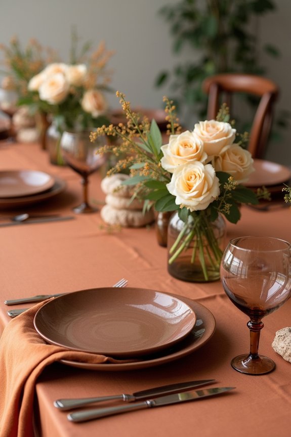
When you’re ready to bring warmth and richness to your wedding, the terracotta palette delivers exactly that—burnt orange, cream, and chocolate work together to create an inviting, earthy elegance that feels both grounded and luxurious.
This combination draws inspiration from natural landscapes and sunset hues, making it perfect for couples who want sophistication with soul. The burnt orange energizes your design, while cream softens the intensity and chocolate grounds everything beautifully.
We love how versatile this palette works across seasons and venues, from intimate garden ceremonies to modern urban celebrations. It’s warm, intentional, and undeniably elegant. Consider pairing this color scheme with outdoor wedding games featuring earth-toned designs to enhance the cohesive aesthetic throughout your celebration.
Monochrome Palette: Layered Greige in Every Shade
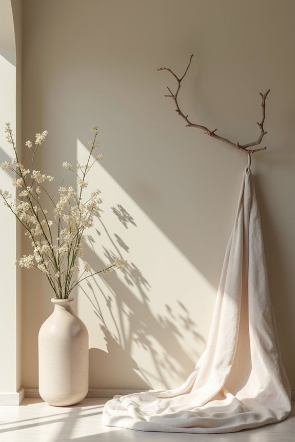
Greige—that beautiful blend of gray and beige—creates a monochromatic palette that whispers sophistication while feeling warm and approachable.
We love how this trend works beautifully for modern couples seeking understated elegance. Layer different greige tones throughout your wedding: soft greige linens, deeper greige bridesmaid dresses, and lighter greige florals create visual interest without jarring contrast.
This cohesive approach feels intentional and gallery-worthy. Greige photographs exceptionally well, translating beautifully across digital and print formats.
The versatility means you can incorporate metallic accents—gold or silver—without breaking the palette’s serene, unified aesthetic. Consider pairing your monochromatic greige palette with bridal robes in complementary neutral tones for your wedding morning preparations.
Coastal Palette: Navy, Coral, and Neutral Anchors
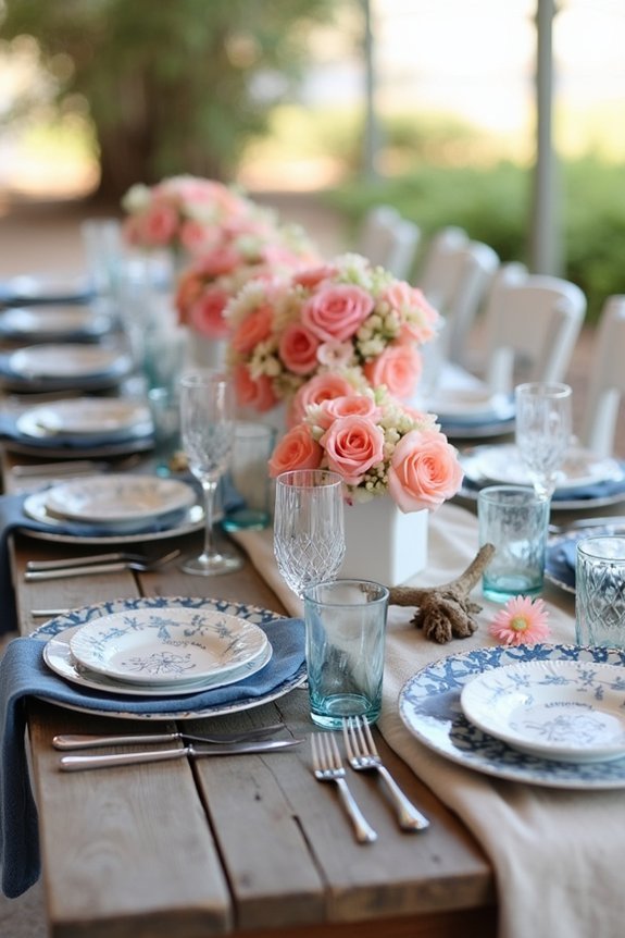
If you’re craving a palette that feels fresh and naturally balanced, coastal inspiration offers a stunning alternative to monochromatic schemes.
Navy anchors the palette beautifully, providing sophisticated depth that photographs wonderfully. Coral brings warmth and personality, softening the navy’s formality.
We recommend layering in creams, sand, and whites to let these colors breathe. This combination feels modern yet timeless, working equally well for beach venues or urban spaces.
The palette naturally evokes relaxation and elegance, creating an atmosphere where guests feel genuinely welcomed.
Navy, coral, and neutrals together capture contemporary sophistication with an effortlessly breezy spirit.
Romantic Palette: Dusty Rose, Taupe, and Muted Olive
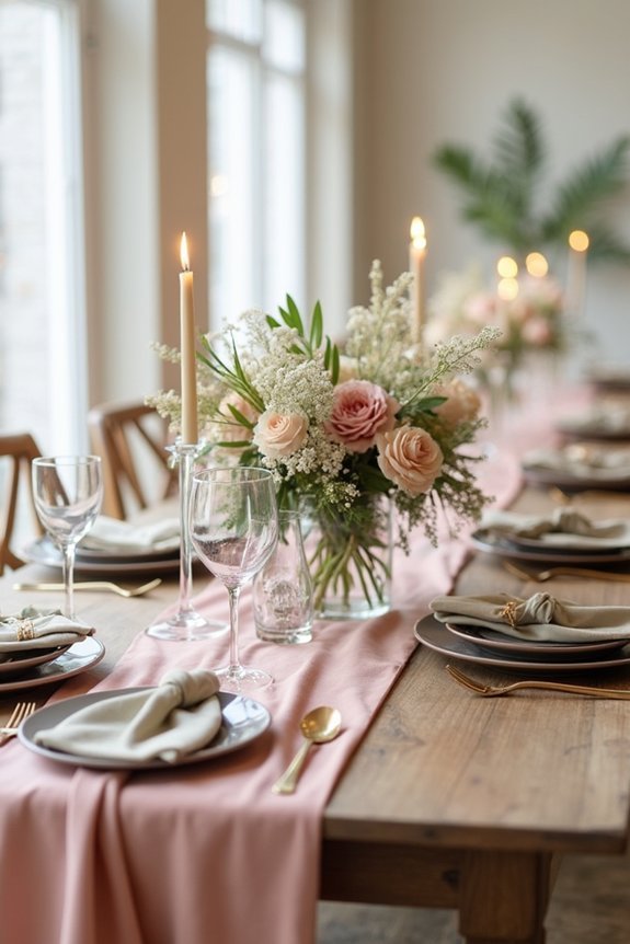
Softness and sophistication blend beautifully in this romantic palette, which draws its power from muted, complex tones that feel both intimate and refined.
Dusty rose brings warmth and femininity without being overly sweet, while taupe grounds the scheme with neutral elegance. Muted olive adds unexpected depth, creating visual interest and modern appeal.
We love how these colors work together—they’re calming yet distinctive, timeless yet trendy. This palette works wonderfully for ceremonies, receptions, and florals.
You’ll find it photographs beautifully in natural light, making your wedding images feel naturally romantic and magazine-worthy without requiring heavy editing.
Frequently Asked Questions
How Do I Choose a Wedding Color Palette That Matches My Personal Style and Venue?
We’ll weave your personal preferences and venue’s visual vibrancy together by gathering inspiration photos you love, noting recurring colors, then matching those hues to your space’s existing architecture and aesthetic.
Can I Blend Two Color Palettes Together, or Should I Stick With One Cohesive Scheme?
We absolutely recommend blending two palettes—it’s how we create sophisticated, personalized weddings. You’ll layer complementary colors throughout your space, ensuring they share undertones so they don’t clash. This approach gives you more creative freedom while maintaining visual harmony.
What’s the Best Way to Test Color Palettes Before Committing to Flowers and Décor?
We recommend creating a mood board—your visual compass—before ordering anything. Test swatches against your venue’s lighting, photograph them in different times of day, and see how they interact with your dress. This reveals what actually works for you.
How Should I Incorporate My Chosen Palette Into Photography, Invitations, and Wedding Attire?
We’ll weave your palette throughout every touchpoint: choose photography that emphasizes your colors, design invitations reflecting your scheme, and select attire that complements—not matches—your palette for visual harmony and cohesion.
Will Trendy 2026 Color Palettes Still Look Timeless in My Wedding Photos Years Later?
We’ll tell you straight: the most timeless 2026 palettes—soft neutrals, moody jewel tones, classic blacks—absolutely will. Avoid neon or ultra-saturated trends if longevity matters to you.