Start by exploring your venue’s existing colors and natural elements—they’ll anchor your entire palette. Next, identify which hues bring you joy and confidence, then pair them with your partner’s preferences. Spring colors like soft blush, sage green, and dusty rose symbolize renewal and create emotional connections. Test your combinations in different lighting conditions to guarantee they photograph beautifully. Consider how contrast between pastels and deeper tones adds polish and visual interest. When you carry these thoughtful choices through invitations, signage, and décor, you’ll discover how strategic layering transforms a color palette into your celebration’s heartbeat.
At a Glance
- Start with your venue’s existing colors and natural elements to establish an intentional foundation for your palette direction.
- Identify personal color preferences that evoke confidence and happiness, then align them with your partner’s natural inclinations.
- Test palette colors under various lighting conditions—natural, indoor, and flash—to ensure accurate representation in photographs.
- Pair contrasting tones like light pastels with deep accents to create visual interest while maintaining spring freshness.
- Maintain color consistency across all design elements including invitations, programs, linens, and decor for unified aesthetic impact.
Choose Your Venue and Season First
Before we immerse ourselves in color swatches and Pinterest boards, let’s start with the foundation of your palette: your venue and season.
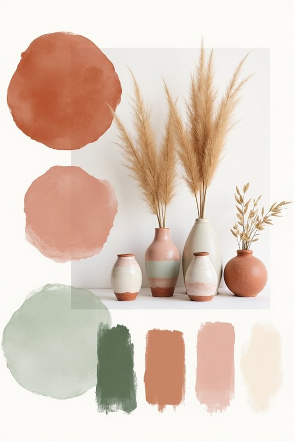
Your spring wedding‘s setting—whether that’s a garden, barn, or ballroom—naturally suggests certain color directions. A blush garden venue practically whispers pastels, while industrial lofts welcome bolder, modern hues.
Spring’s blooming flowers and fresh greenery offer brilliant inspiration too. Consider what colors already exist in your space, then build around them rather than against them. A well-designed pergola serves as a focal point that can anchor your color scheme while complementing your venue’s existing aesthetic.
This approach creates harmony that feels intentional and effortless, not forced.
Identify Your Personal Color Style
Now that you’ve anchored your palette to your venue and season, it’s time to turn inward and consider what colors actually speak to you. Your wedding should feel authentically *you*, not like you’re borrowing someone else’s dream.
Think about:
- Colors you wear and feel confident in
- Hues that make you genuinely happy
- Shades that remind you of meaningful moments
- Tones that match your home’s aesthetic
- Colors your partner gravitates toward naturally
Notice patterns in what draws your eye. Do you love jewel tones or pastels? Warm or cool undertones?
Your instinctive preferences matter. Consider how your chosen palette coordinates with key wedding elements like your bridal robe selection, which can complement and enhance your overall color scheme. They’ll guide you toward a palette that feels right—one you’ll treasure forever.
Why Spring Colors Feel Fresh and Emotional
Spring colors carry a particular magic—they’re tied to renewal, growth, and the world literally coming back to life around us.
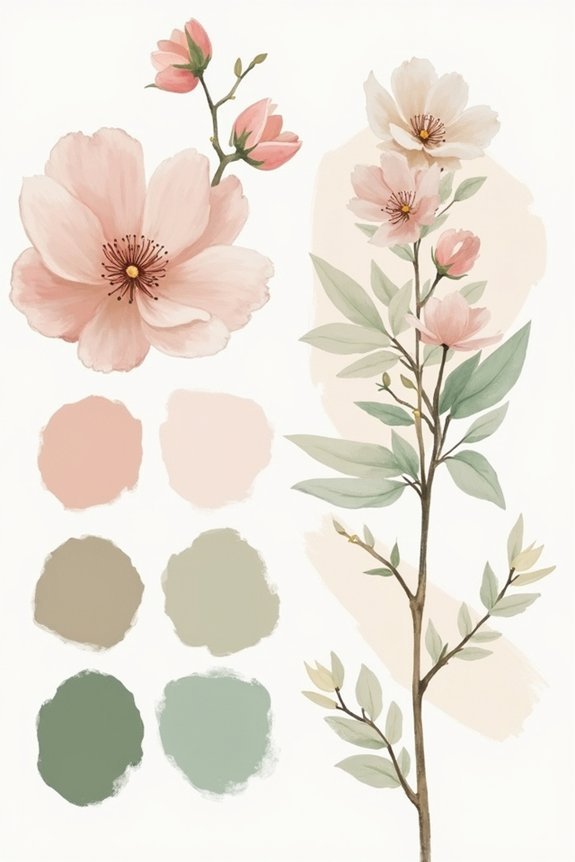
We’re drawn to pastels, soft greens, and warm neutrals because they mirror the season’s awakening. These hues evoke hope and fresh beginnings, which naturally resonates with wedding celebrations.
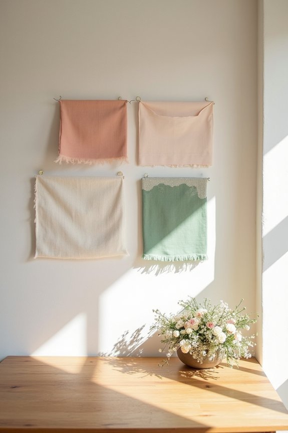
Pale blush, sage, and buttery cream feel gentle yet intentional. When we surround ourselves with spring palettes, we’re tapping into something deeply emotional—the promise of new chapters and possibility.
That’s why spring color schemes feel so meaningful for weddings; they’re not just beautiful, they’re symbolically perfect for your new journey together. Consider complementing these soft hues with adjustable brightness neon signs to add a modern, luminous accent to your celebration décor.
Spring Color Combinations That Always Work
The magic happens when we pair the right hues together—those combinations that feel effortlessly elegant and never go out of style.
We’ve found that certain spring pairings consistently create that sophisticated, magazine-worthy feeling we’re after:
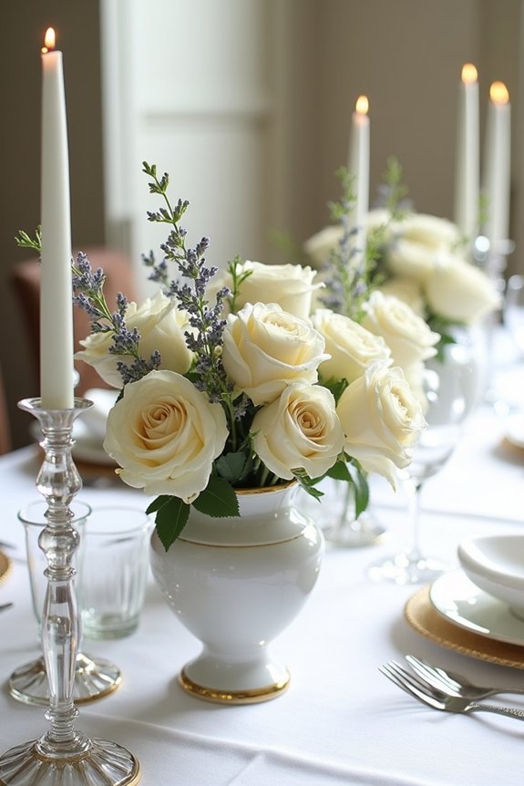
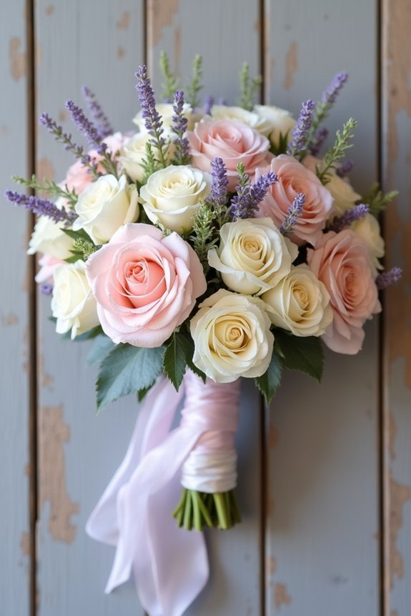
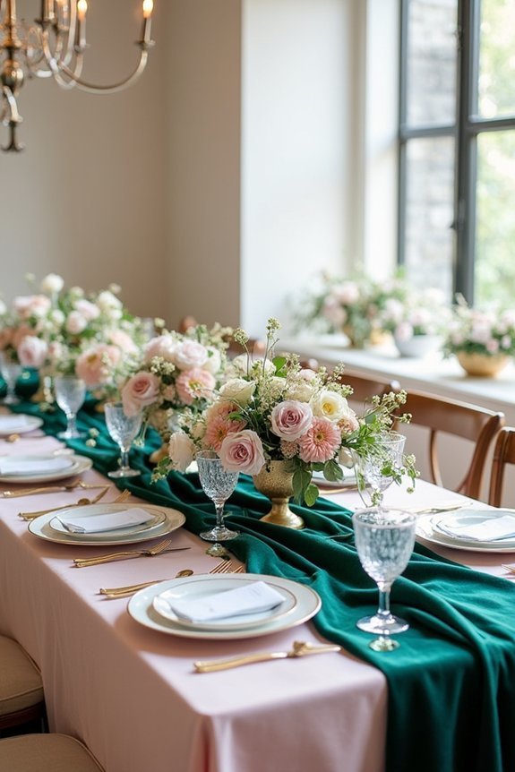
- Soft blush with sage green for romantic freshness
- Cream with warm terracotta for understated warmth
- Powder blue with dusty rose for dreamy elegance
- Ivory with eucalyptus for modern simplicity
- Champagne with mauve for timeless sophistication
These combinations work because they balance softness with depth, allowing each color to enhance the other.
We can confidently build our entire wedding design around these proven pairings, knowing they’ll photograph beautifully and feel intentional. Consider complementing your color palette with hair vine accessories in coordinating metallics like silver, gold, or rose gold to add sparkle and elegance to your bridal look.
Add Depth: Pairing Pastels With Jewel Tones
While soft pastels create that dreamy, romantic feel we love, pairing them with jewel tones is where we reveal real depth and sophistication.
Think blush pink with emerald green, or pale lavender with sapphire blue. These combinations balance delicate femininity with rich elegance, creating visual interest that photographs beautifully. The jewel tones anchor your palette, preventing it from feeling too sweet or one-dimensional.
We recommend using pastels as your dominant colors, then introducing jewel tones through accent pieces like florals, linens, or bridesmaid dresses. This approach gives us that magazine-worthy sophistication we’re seeking without sacrificing the romantic spring aesthetic we adore. Consider complementing your color palette with bridal jewelry sets featuring jewel-toned stones that echo your accent colors and enhance the overall elegance of your wedding look.
Pull Colors From Your Venue’s Natural Setting

Your venue’s natural surroundings offer an incredible palette you’ve already fallen in love with—so why not let them guide your color choices?
When we draw inspiration directly from the location, we create a wedding that feels authentic and connected to the space.
Consider these elements:
- Flowering trees and blooming gardens
- Stone, brick, or wood textures
- Sky tones at your chosen season
- Water reflections and surrounding landscape
- Seasonal foliage and greenery
This approach transforms your venue into your color story.
The result feels effortless and intentional, allowing your celebration to harmonize beautifully with its natural backdrop rather than competing against it.
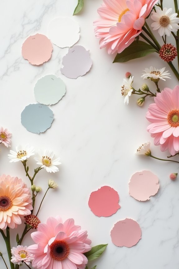
Test Your Palette Across Different Lighting
Have you ever chosen a paint color at the store, only to discover it looks completely different once it’s on your walls at home?
Wedding colors work the same way. We need to test our palette in various lighting conditions because natural daylight, evening light, and indoor artificial light all shift how colors appear.
Request fabric swatches from your vendors and view them throughout your venue at different times. Notice how morning sunlight highlights certain hues while evening golden light warms others.
This careful observation guarantees your chosen palette looks intentional and beautiful in every moment of your celebration.
Monochromatic Versus Multi-Color: Which Suits You
Now comes one of the most defining decisions in your color journey: do we want all the richness of a single hue, or do we embrace the complexity of multiple colors working together?
Monochromatic palettes offer:
- Timeless elegance and sophisticated simplicity
- Visual harmony that feels intentional and polished
- Easy coordination across flowers, linens, and décor
- A canvas that lets other design elements shine
- Calming cohesion throughout your celebration
Multi-color palettes deliver personality and dimension. They let we express different facets of our style, create visual interest, and feel more dynamic.
Consider what resonates with your vision. Both approaches work beautifully when executed thoughtfully.
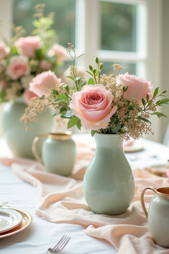
Coordinate Your Spring Palette With Florals and Greenery

Once we’ve settled on our color palette, the real magic happens when we bring it to life through flowers and greenery—because nature’s palette is where our wedding colors truly come alive.
We’ll work with our florist to select blooms that complement our chosen hues, whether we’re drawn to soft pastels or bold jewel tones.
Spring offers abundant options: peonies, tulips, and ranunculus in various shades pair beautifully with eucalyptus, dusty miller, and Italian ruscus.
These combinations ground our vision in reality, transforming abstract color swatches into tangible, gorgeous arrangements that define our wedding’s entire aesthetic and atmosphere.
Adjust Your Colors for Morning, Afternoon, or Evening
Lighting transforms everything—and we mean *everything*—about how our wedding colors actually look on the day itself.
Natural light shifts dramatically throughout the day, affecting how guests perceive your palette.
Consider these timing adjustments:
- Morning ceremonies benefit from soft pastels that glow in gentle sunlight
- Afternoon weddings need saturated colors that won’t fade in bright rays
- Evening events shine with jewel tones and metallics that catch candlelight
- Golden hour calls for warm neutrals and blush hues
- Indoor venues require testing colors under actual lighting conditions
We recommend visiting your venue at your ceremony time, bringing fabric swatches to see exactly how your chosen colors perform in that specific light.
Make Your Colors Stand Out: Contrast Techniques
You’ve chosen your wedding colors, tested them in your venue’s lighting, and now it’s time to make them truly sing—and that’s where contrast comes in.
Contrast creates visual interest and helps your palette feel intentional rather than flat. Pair light colors with deep tones, or combine warm hues with cool ones. If you’re using pastels, add a bold accent color to anchor the design.
Think about how your florals, linens, and décor will interact. Strong contrast draws the eye exactly where you want it, making your wedding feel polished and thoughtfully designed.
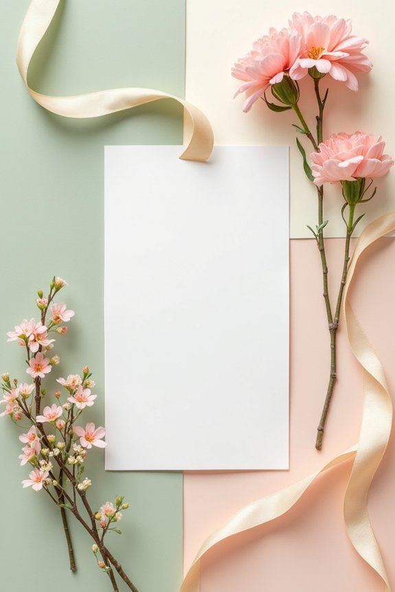
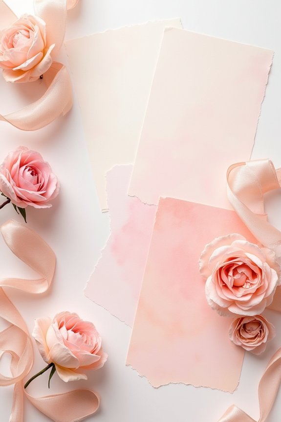
Carry Your Palette Through Invitations and Design
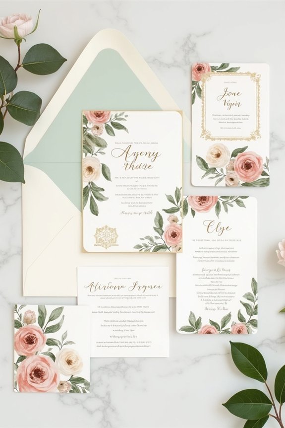
Your wedding color palette deserves to make an entrance before guests even arrive at your ceremony, and that journey begins with your invitations.
We recommend carrying your colors through every design touchpoint, creating a cohesive visual story that builds anticipation.
Consider these elements:
- Invitation cardstock in your primary color
- Envelope liners featuring secondary hues
- Typography treatments that complement your palette
- Accent details like wax seals or ribbons
- Digital save-the-dates reflecting your color scheme
When we extend your palette consistently across stationery, programs, and signage, guests experience a unified aesthetic.
This intentional approach transforms individual design pieces into a sophisticated narrative that prepares them for the elegance ahead.
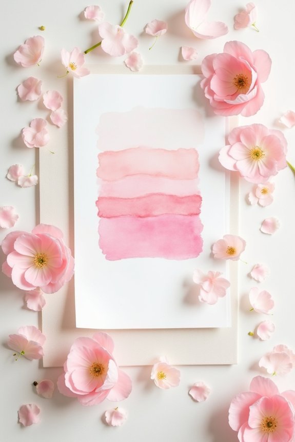
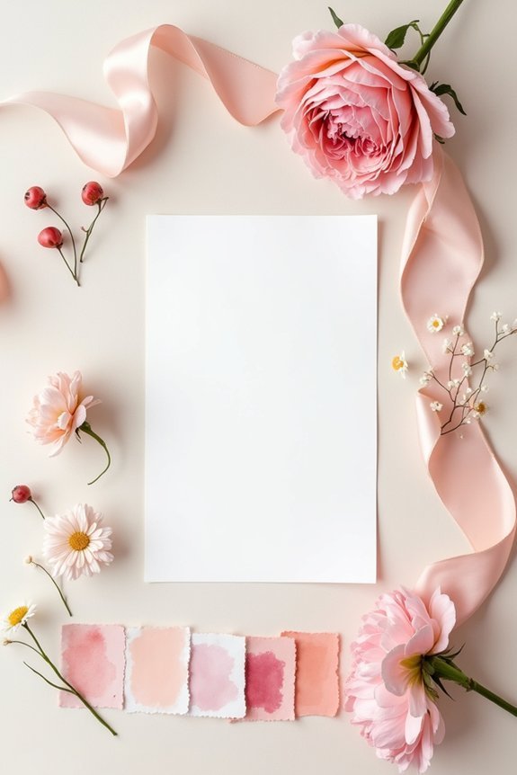
Verify Your Colors Photograph Beautifully
Before we commit fully to a palette, we need to see how it translates through the camera lens—because what looks stunning in person can shift dramatically in photos, especially when natural light, flash, and different venues come into play.
Test your colors by photographing fabric swatches and flowers in various lighting conditions. Snap photos with natural light, indoor lighting, and flash to understand how each setting affects your palette.
Review images on your phone and computer screens, not just in print. This step guarantees your colors will look as beautiful in your wedding album as they do in your venue.
Finalize Your Palette: A Decision Checklist

Now that we’ve tested our colors in various lighting conditions and confirmed they photograph beautifully, it’s time to make our final decision.
Let’s use this checklist to guarantee we’re confident in our choice:
- Does each color evoke the mood we want our guests to feel?
- Will our palette work with our venue’s existing aesthetic?
- Can we source flowers, linens, and decor in these shades?
- Do the colors complement our skin tones in photos?
- Does our palette feel authentically us?
Trust your instincts here.
You’ve done the work, and now we’re simply confirming what feels right for your special day.
Frequently Asked Questions
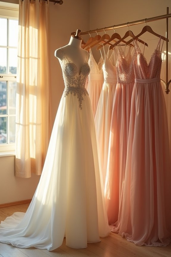
How Do I Ensure My Spring Color Palette Works With My Wedding Dress and Bridal Party Attire?
We’d recommend pulling fabric swatches of your dress and bridesmaids’ attire to test against potential colors. Hold them together in natural light to see how they harmonize, then narrow down palettes that complement—not compete with—your gown.
What’s the Best Way to Communicate My Color Palette to My Vendors and Wedding Team?
We recommend creating a visual mood board with fabric swatches, paint samples, and photos that you’ll share with each vendor. Include hex codes and specific flower names so everyone’s interpreting your palette identically.
How Many Colors Should I Actually Include in My Final Wedding Palette?
We recommend sticking with three to five colors: one dominant hue, two supporting shades, and one or two accents. This keeps your palette cohesive without feeling flat or monotonous throughout your celebration.
Can I Change My Color Palette if I’m Not Completely Satisfied After Choosing It?
Absolutely, you can change your palette. We recommend reassessing after you’ve sourced a few key pieces—florals, stationery, or venue photos—to see how colors actually work together in practice.
How Do I Adapt My Spring Colors if My Wedding Date Gets Postponed to Another Season?
We’ve got good news: your palette doesn’t need a complete overhaul. Swap spring’s pastels for autumn’s jewel tones, deepen florals for winter, or brighten for summer. Your core color story stays intact while we shift the season’s energy.