Tuscan wedding color palettes capture warmth, romance, and timeless elegance through earthy hues like terracotta, sage green, and cream. I’d love to help you discover palettes that work beautifully across every season—from spring’s blush tones to autumn’s burnt orange drama. These colors photograph gorgeously in natural light and feel luxurious yet approachable. Whether you’re drawn to deep wine and gold or coral and muted teal, you’ll find combinations that transform your venue into a sophisticated masterpiece. Keep exploring to uncover which palette truly speaks to your vision.
At a Glance
- Tuscan color palettes feature earthy hues like terracotta, warm gold, sage green, and cream for timeless elegance.
- Seasonal adaptations include blush and pale golds for spring, rich burgundy and forest green for fall and winter.
- Notable combinations include warm terra cotta with sage and cream, or deep wine with gold and olive green.
- Color cohesion across florals, linens, and décor enhances magazine-quality photography and creates an inviting atmospheric ambiance.
- Tuscan palettes photograph beautifully in natural light and remain versatile across rustic vineyards and elegant ballroom venues.
Why Brides Choose Tuscan Palettes
Because a Tuscan color palette evokes warmth, romance, and timeless elegance, it’s become one of the most beloved choices for sophisticated weddings.
I find that brides gravitate toward these earthy hues—terracotta, warm gold, sage green, and cream—because they feel both luxurious and approachable.
They’re not trendy; they’re timeless, which means your wedding photos will feel beautiful for decades.
These colors photograph gorgeously in natural light, creating that coveted magazine-quality aesthetic.
Plus, they work across any season and venue, from rustic vineyards to elegant ballrooms, giving you flexibility while maintaining cohesion throughout your celebration.
Tuscan Palettes by Season
While Tuscan color palettes work beautifully year-round, the specific hues you emphasize can shift to honor each season’s natural light and mood.
I find that adapting your palette creates cohesion with nature’s backdrop, making your wedding feel intentional and timeless.
- Spring: Soften your palette with blush tones, pale golds, and fresh greens alongside traditional terracotta
- Summer: Deepen your warmth with rich golds, burgundy accents, and vibrant olive greens
- Fall: Embrace deep browns, burnt orange, and burgundy for maximum warmth and drama
- Winter: Balance cool grays with creamy ivory and jewel-tone accents for sophistication
This seasonal approach guarantees your colors photograph beautifully in natural light while honoring the landscape around you.
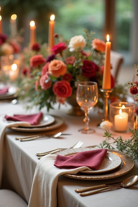
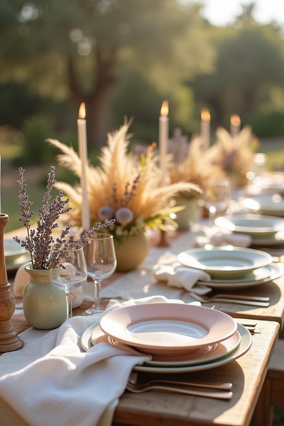
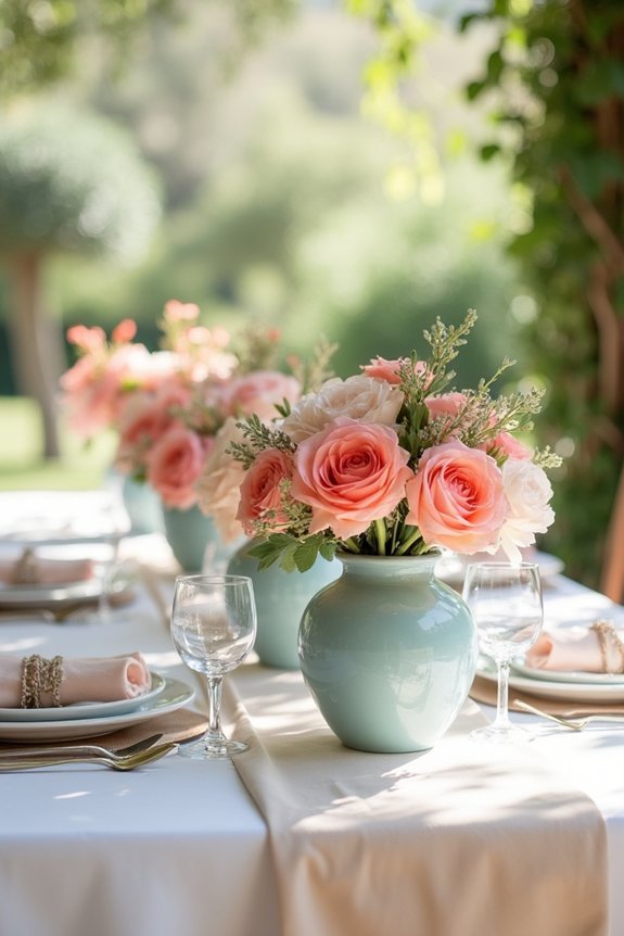
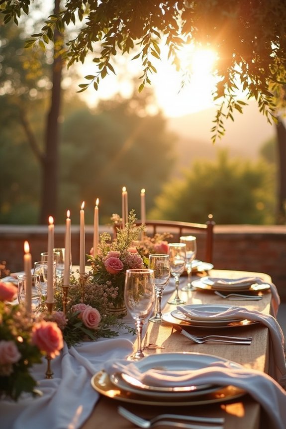
Warm Terra Cotta, Sage, and Cream
This trio—terra cotta, sage, and cream—creates a palette that feels both grounded and ethereal, striking the balance many couples crave.
Terra cotta brings warmth and earthiness, evoking Tuscan hillsides and rustic elegance. Sage softens the intensity with its muted, sophisticated green tone, adding depth without overwhelming your space. Cream acts as your neutral anchor, keeping everything cohesive and bright.
Together, these colors work beautifully across seasons—they feel natural in spring gardens, stunning against summer golden hour light, and richly romantic during fall and winter celebrations.
I find this combination especially versatile for florals, linens, and décor elements.
Deep Wine, Gold, and Olive Green
If you’re drawn to drama and richness, deep wine, gold, and olive green offer a completely different energy than the softer palettes—one that feels luxe, moody, and undeniably sophisticated.
This combination creates an atmosphere of timeless elegance:
- Deep wine as your primary color brings romance and depth to your wedding.
- Gold accents add glamour and warmth throughout your décor and details.
- Olive green grounds the palette with earthy sophistication and natural beauty.
- Together they evoke European countryside charm with modern polish.
I find this palette particularly stunning for evening celebrations, intimate venues, and couples who want their wedding to feel like a curated gallery.
You’ll achieve that magazine-quality aesthetic you’re seeking with this refined, intentional approach.
Blush, Terracotta, and Dusty Blue
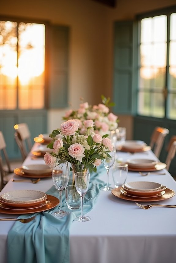
Blush, terracotta, and dusty blue create a palette that feels both romantic and grounded, offering the perfect balance between soft femininity and earthy warmth.
I love how these colors work together seamlessly across your entire wedding. Blush tones bring delicate beauty to florals and linens, while terracotta adds richness through accent pieces and table settings. Dusty blue grounds the palette, appearing in bridesmaid dresses or stationery.
This combination works beautifully indoors and outdoors, adapting to any season. You’ll achieve an effortlessly sophisticated aesthetic that photographs wonderfully, giving your celebration that coveted, intentional elegance your guests will absolutely admire.
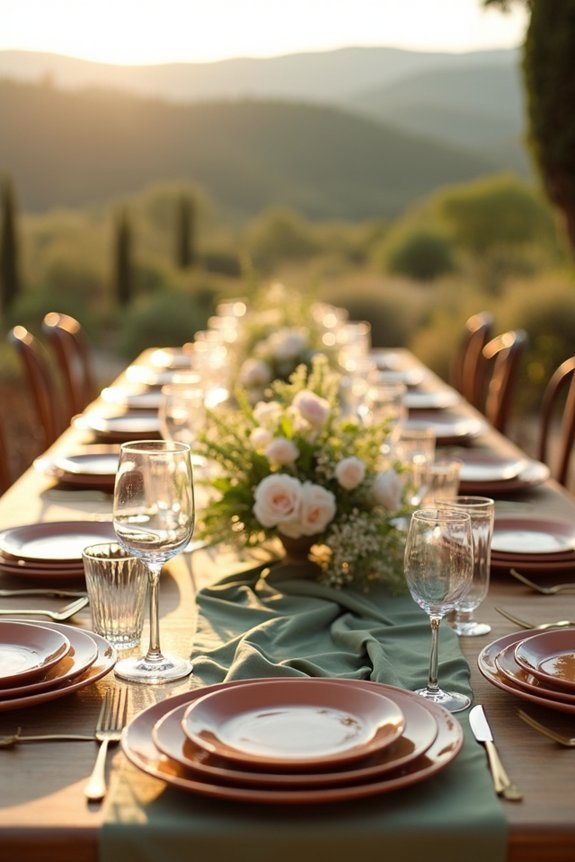
Charcoal, Ivory, and Burnt Orange
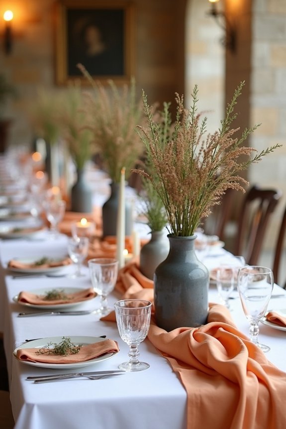
When you’re drawn to drama and warmth in equal measure, charcoal, ivory, and burnt orange deliver a palette that feels both modern and timeless. This sophisticated combination creates stunning visual contrast while maintaining an inviting atmosphere throughout your celebration.
Here’s why this palette works beautifully:
- Charcoal grounds the design with depth and elegance, preventing the palette from feeling too light.
- Ivory provides breathing room, allowing each color to shine without competing for attention.
- Burnt orange adds warmth and personality, making your wedding feel distinctive and memorable.
- The trio balances drama with approachability, creating an atmosphere that’s both luxe and welcoming.
You’ll find this palette photographs exceptionally well, translating beautifully across your wedding day images and creating magazine-quality results.
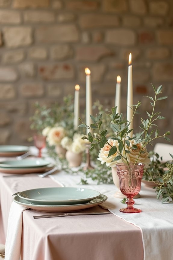
Soft Ochre, Lavender, and Taupe

This palette whispers sophistication through its unexpected harmony of warm and cool tones. I love how soft ochre brings earthy warmth, while lavender adds dreamy elegance and taupe grounds everything beautifully.
Together, they create a refined, modern feel that’s distinctly Tuscan-inspired. You can use ochre as your primary color, with lavender accents in florals or bridesmaid dresses, and taupe throughout linens and décor.
This combination works wonderfully for spring or fall weddings, photograph incredibly well, and feel both timeless and current. It’s a palette that celebrates understated luxury without demanding attention.
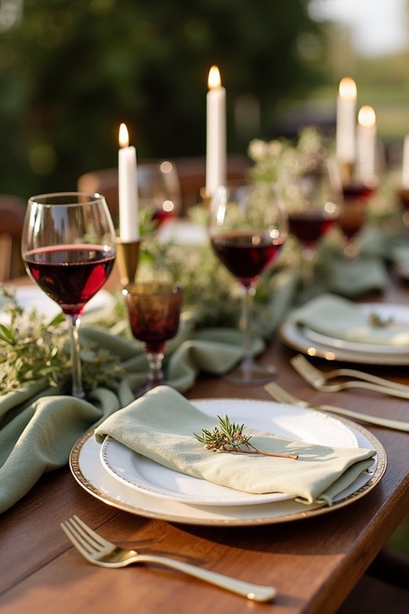
Rich Burgundy, Champagne, and Forest Green
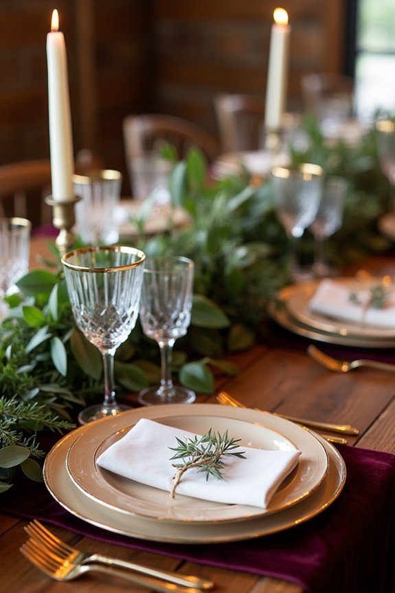
If you’re drawn to drama and depth, rich burgundy, champagne, and forest green offers the regal elegance you’re looking for. This sophisticated trio works beautifully for autumn and winter celebrations, creating an atmosphere of understated luxury.
I’d recommend incorporating these colors through:
- Deep burgundy florals paired with champagne linens for striking tablescapes
- Forest green in bridesmaid dresses or groomsmen attire for visual depth
- Champagne accents in lighting, signage, and metallic details throughout
- Rich burgundy as your ceremony backdrop or in dramatic floral installations
The interplay between warm and cool tones creates visual interest while maintaining an upscale, cohesive aesthetic that photographs gorgeously.
Coral, Cream, and Muted Teal
For a wedding that feels both modern and approachable, coral, cream, and muted teal create a rejuvenating palette that works across seasons. I find this combination strikes a perfect balance between playful and polished.
The warm coral brings energy and joy, while cream grounds everything with elegance. Muted teal adds depth without overwhelming guests. You’ll love how these colors photograph beautifully in natural light, whether you’re getting married in spring or summer.
They’re versatile too—pair them with natural wood and greenery for an organic feel, or incorporate metallic accents for added sophistication. This palette truly invites guests into a warm, welcoming celebration.
Golden Hour, Moody Plum, and Modern Tuscan: 3 Standalone Palettes
Romance, drama, and rustic elegance each deserve their own moment in your wedding story.
I’m showing you three distinct palettes that capture different moods beautifully.
Consider these approaches:
- Golden Hour: Warm peachy tones, soft golds, and creamy ivory create intimate, glowing ambiance.
- Moody Plum: Deep plum, charcoal, and burgundy deliver sophisticated drama and richness.
- Modern Tuscan: Terracotta, olive green, and warm neutrals blend rustic charm with contemporary polish.
Each palette stands alone, telling its own narrative.
You’ll choose based on your venue, season, and personal style.
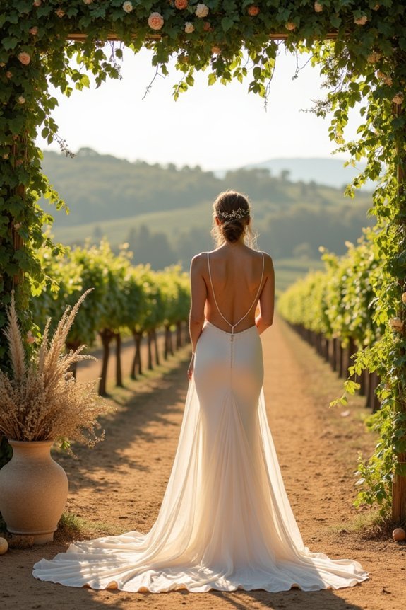
For your Tuscan ceremony, a wooden wedding arch can beautifully frame these color palettes while adding authentic rustic charm to your celebration.
These combinations work across photography, florals, linens, and décor, creating cohesive, magazine-worthy celebrations that feel authentically yours.
Frequently Asked Questions
How Do I Adapt Tuscan Palettes for a Modern or Minimalist Wedding Aesthetic?
I’d strip Tuscan palettes down to their essentials: pair warm terracotta or ochre with crisp whites and soft grays. You’ll keep that earthy sophistication while achieving clean, modern lines that feel intentionally curated rather than traditional.
What’s the Best Way to Incorporate Tuscan Colors Into My Wedding Invitations and Paper Goods?
I’d weave Tuscan hues like threads through your paper story by anchoring invitations in warm terracotta or sage, then layering complementary metallics—gold or copper—for sophistication. This grounds your aesthetic elegantly from day one.
Can Tuscan Color Palettes Work for Destination Weddings Outside of Italy?
Absolutely—I’ve seen Tuscan palettes work beautifully everywhere from Greece to California. The warm terracottas, sage greens, and golds translate universally. You’ll want to adapt them slightly to your destination’s natural lighting and surroundings for authenticity.
How Do I Balance Tuscan Colors With My Venue’s Existing Architecture and Décor?
Want to honor your venue’s bones while embracing Tuscan warmth? I’d pull your palette’s accent colors from existing architectural details—terracotta trim, stone walls, wood beams—then layer in softer Tuscan tones like sage and cream.
What Are the Most Budget-Friendly Ways to Achieve a Tuscan Palette Throughout My Wedding?
I’d focus on using natural materials like burlap, terracotta pots, and olive branches as centerpieces. Layer warm lighting, incorporate affordable fabric draping, and let your venue’s existing architecture carry the palette’s weight naturally.