Creating a whimsical wedding palette starts with choosing colors that feel authentically you—think dusty rose paired with sage green. We recommend using the 60-30-10 rule to distribute your colors evenly, keeping your palette to just four colors maximum. Decide whether soft pastels or bold brights suit your vision, then anchor everything with neutrals like cream or soft gray. When you extend these colors thoughtfully into flowers, linens, and paper goods, your vision truly comes alive across every detail.
At a Glance
- Blend playful yet polished tones that reflect your authentic personality rather than following wedding trends.
- Apply the 60-30-10 color distribution rule and limit your palette to a maximum of four colors for elegance.
- Choose between soft pastels for an ethereal feel or bold brights to convey joy and confidence.
- Use neutrals like cream or soft gray as a calm foundation to allow bold colors to stand out.
- Create a mood board with fabric swatches and inspirational images to communicate your vision clearly with vendors.
What Makes a Whimsical Wedding Palette (And Is It Right for You?)
When we think of whimsical wedding colors, we’re imagining something playful yet polished—a palette that captures wonder without sacrificing sophistication.
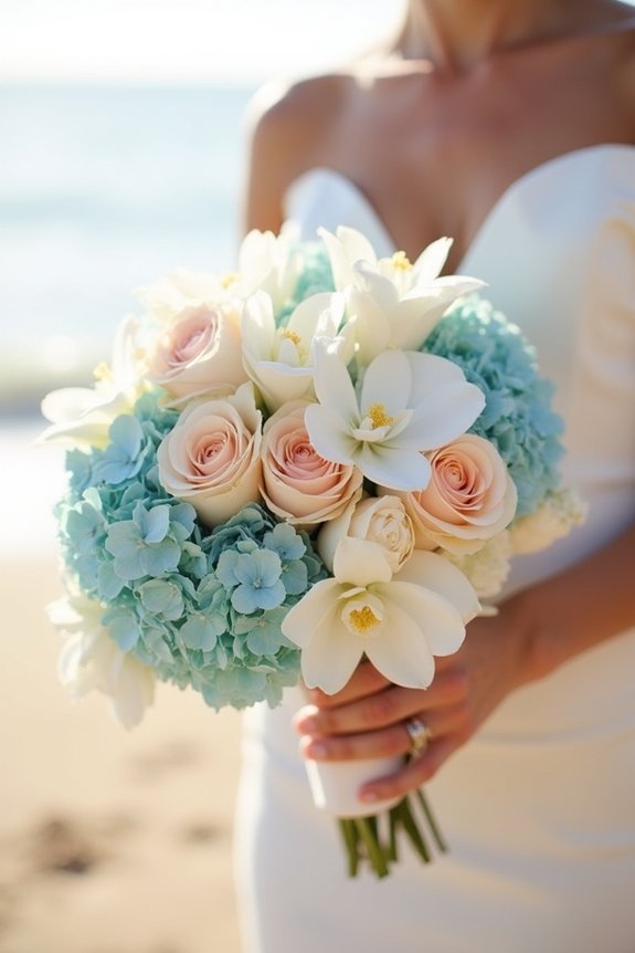
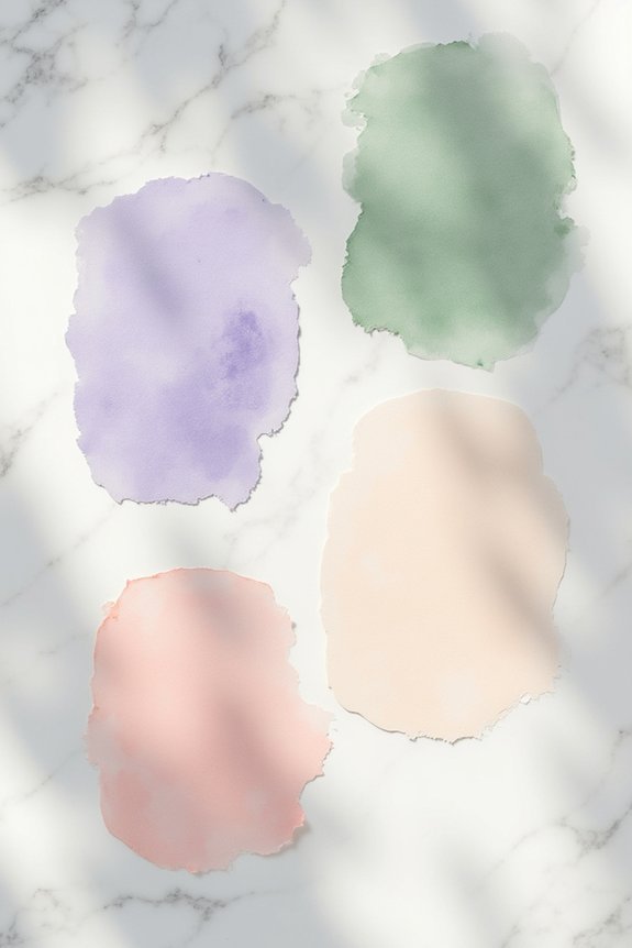
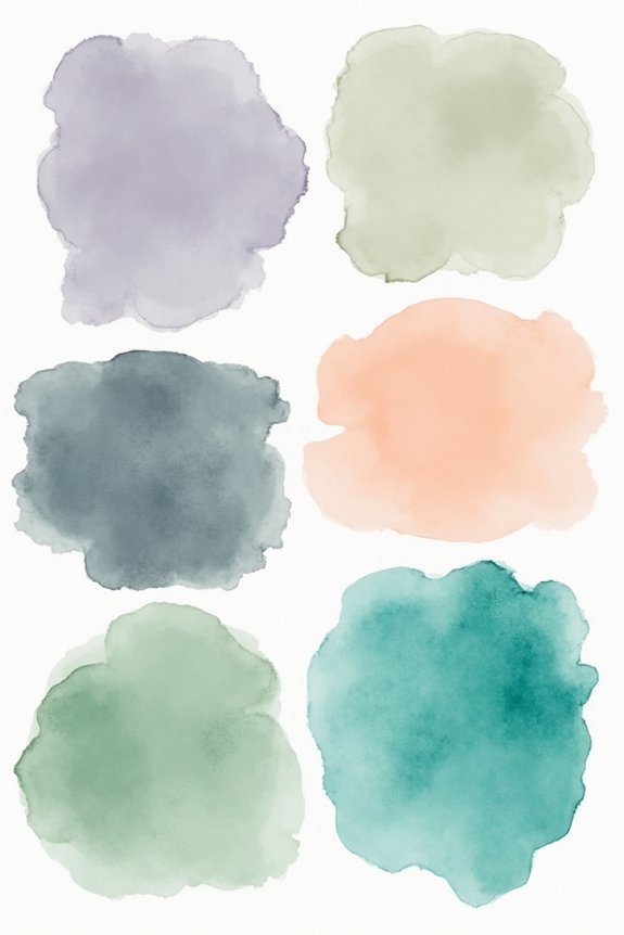
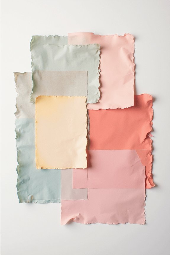
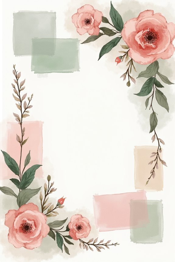
Whimsical palettes blend unexpected hues like dusty rose with sage green, or soft lavender with warm cream. They feel dreamy and imaginative while remaining elegant.
This style suits couples who want personality and charm in their design without looking childish or over-the-top.
If you’re drawn to fairy tales, nature-inspired romance, and soft textures rather than bold statements, whimsy might be your perfect match. Your palette should reflect who you actually are—not what trends suggest.
Consider complementing your whimsical color palette with delicate accessories like hair vines with pearls and crystals that enhance your bridal look with subtle sparkle and elegance.
The Three Color Harmony Rules That Keep Whimsy From Feeling Chaotic
Because whimsical palettes embrace soft, unexpected color combinations, we need a framework to keep them feeling intentional rather than scattered.
Three harmony rules guide us toward cohesive, beautiful results:
- The 60-30-10 rule: Let one color dominate, give another 30%, and use a third as your accent
- Stick to one color family: Choose pastels or jewel tones, not both mixed randomly
- Balance warm and cool tones: Pair blush with sage, or coral with dusty blue for visual harmony
- Limit yourself to four colors maximum: Restraint creates elegance and prevents overwhelming your guests
These guidelines transform whimsy into sophisticated design that feels both playful and polished. Consider how your bridal headpiece’s materials, such as Austrian crystals and pearls, can echo your color palette and enhance the overall cohesion of your wedding design.
Soft Pastels vs. Bold Brights: Which Whimsical Direction Suits Your Vision?
How do we choose between the dreamy softness of pastels and the striking energy of bold brights when both feel whimsical and beautiful?
Consider your venue and natural lighting first. Pastels shine in bright, airy spaces, creating an ethereal atmosphere. Bold brights command attention in any setting, making bold statements about your personality.
Think about your wedding’s mood: pastels whisper romance and softness, while brights announce joy and confidence. Neither choice is wrong. Your preference should reflect what makes you feel most like yourself.
Remember that your chosen palette should coordinate with your welcome sign design to create a cohesive visual experience for your guests. Trust that instinct, and your palette will feel authentically whimsical.
How to Use Pastels Without Looking Childish
We’ve all seen pastel palettes that feel more nursery than sophisticated wedding, and that’s because the secret to elegant pastels isn’t about the colors themselves—it’s about how we layer them with depth and maturity.
Consider these strategies:
- Pair pastels with neutrals like ivory, gray, or taupe to ground the palette
- Incorporate rich textures such as velvet, silk, and linen for visual sophistication
- Add metallic accents in gold or silver to elevate the overall aesthetic
- Choose deeper jewel tones as accent colors to create contrast and complexity
For a cohesive look, consider enhancing your pastel palette with artificial flower wall panels in soft hues like champagne or blush to create an elegant backdrop that reinforces your color scheme while maintaining sophistication.
This approach transforms soft hues into a genuinely refined celebration that feels grown-up and intentional.
Weaving in Unexpected Colors: So They Feel Intentional, Not Random
What transforms a wedding palette from safe to striking? Weaving in unexpected colors with intention.
We recommend choosing a dominant color story first—say, dusty blue and cream. Then, we add one accent color that surprises: perhaps terracotta or sage green. The key is repetition. Use this unexpected hue in multiple elements: florals, linens, and stationery. This creates cohesion rather than randomness.
We also suggest pulling inspiration from a single source—a painting, fabric, or nature scene. When all colors connect to one reference point, they feel deliberate and harmonious, elevating your entire design. Consider incorporating neon wedding signs that complement your chosen palette, as their customizable colors and brightness can enhance your color story while adding a modern, striking element to your celebration.
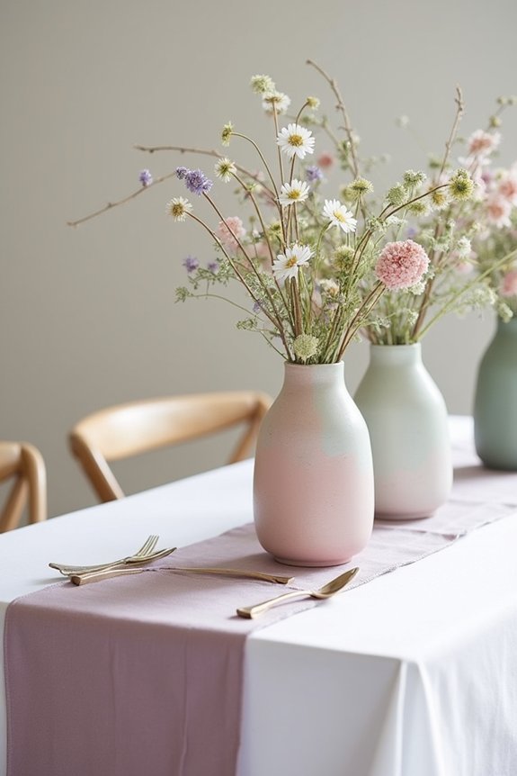
Why Your Whimsical Palette Needs Neutrals (And How to Use Them)
Once you’ve layered in those unexpected accent colors, you’re ready for the ingredient that’ll actually make your palette breathable: neutrals.
Think of them as the calm foundation that lets your bold choices shine without overwhelming the eye.
Neutrals serve several important purposes:
- Create visual rest so guests aren’t visually exhausted by color
- Allow unexpected colors to pop by providing contrast and balance
- Tie together disparate hues that might otherwise feel disconnected
- Ground your design in sophistication and elegance
We recommend using creams, soft grays, or warm beiges as your base, then letting your whimsical accents dance across them.
This approach guarantees your palette feels intentional and polished.
Prioritize: Which Wedding Elements Show Your Colors Best?

Now that you’ve built a sophisticated palette with neutrals as your foundation and unexpected accents as your stars, it’s time to decide where those colors actually show up in your wedding day.
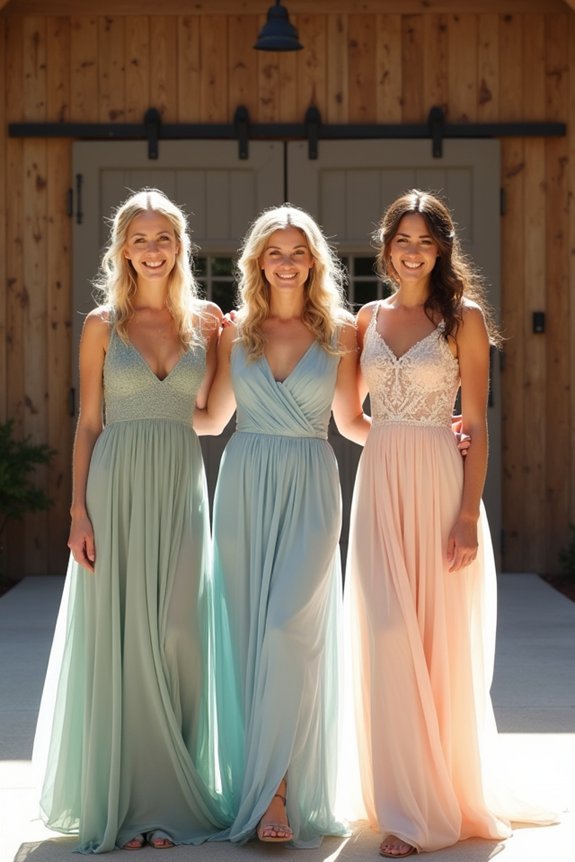
Not every element needs equal color intensity. We’d suggest prioritizing high-impact areas: your florals, bridesmaids’ dresses, and ceremony backdrop deserve your boldest shades.
Reserve softer tones for linens and smaller details. This strategic approach guarantees your whimsical palette feels intentional rather than scattered.
Your guests’ eyes naturally draw toward these focal points, so placing colors thoughtfully maximizes their visual effect throughout your celebration.
5 Palette Mistakes That Make Whimsical Weddings Feel Unpolished
How easily can a beautiful color story fall apart? Whimsical weddings deserve palettes that feel intentional, not scattered.
We often see these common missteps:
- Using too many colors without a unifying thread
- Choosing colors that don’t work together in natural light
- Neglecting neutral anchors that ground the design
- Picking trendy shades without considering your venue’s existing tones
The key? Stick to three to four core colors maximum.
Add neutrals like cream, gray, or blush to balance whimsy with sophistication.
Test your palette in your actual venue’s lighting before finalizing. This guarantees your dreamy vision translates beautifully in real life.
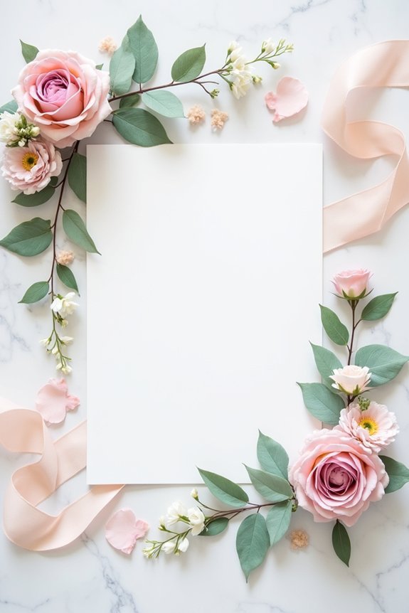
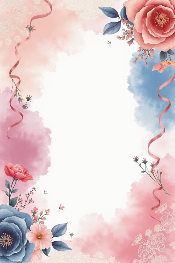
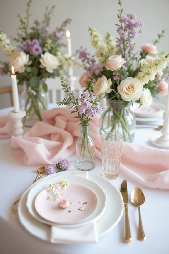
Bringing Your Color Palette to Life in Flowers, Fabric, and Paper
Your carefully curated color palette is ready—now comes the exciting part of watching it bloom across your wedding’s most visible elements.
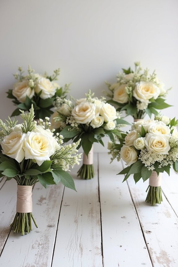
We recommend starting with florals, where your primary and secondary colors naturally shine through varied blooms and greenery. Next, layer your palette into fabrics through bridesmaid dresses, linens, and ceremony backdrops.
Finally, extend your colors into paper goods—invitations, programs, and place cards—creating visual consistency throughout every touchpoint.
Each element reinforces your vision, building a cohesive aesthetic that feels intentional and polished without requiring perfection in every detail.
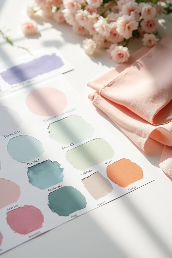
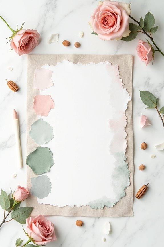
Mood Boards That Lock in Your Vision for Vendors
Once you’ve settled on your colors, it’s time to create a visual reference that’ll keep everyone on the same page—your vendors included. A mood board becomes your secret weapon for clear communication with florists, photographers, and designers.
We recommend gathering:
- High-quality images showing your palette in real settings
- Fabric swatches and paint samples for accurate color matching
- Inspiration photos of tablescapes, bouquets, and décor you love
- Written descriptions explaining the mood and feeling you’re creating
This visual guide prevents miscommunications and guarantees your florist understands whether you want soft pastels or jewel tones, giving you confidence that your vision’ll translate beautifully.
Frequently Asked Questions
How Do I Ensure My Whimsical Palette Photographs Well in Different Lighting Conditions?
We recommend testing your palette in natural light, golden hour, and indoor settings before your wedding day. Choose colors with depth—avoid pastels that fade in bright sun. Work with your photographer to scout venues and discuss lighting during your planning calls.
What’s the Budget Impact of Choosing Whimsical Colors Versus Traditional Neutral Wedding Palettes?
We’ve found that whimsical palettes don’t inherently cost more—they’re about creative choices. You’ll save money with bold florals instead of premium neutrals, though custom dyeing and specialty rentals can increase expenses if you’re not strategic.
Can I Use a Whimsical Color Palette if My Venue Has a Strong Existing Color Scheme?
Your venue’s existing palette becomes your canvas—we’re not fighting it; we’re dancing with it. Yes, layer whimsical colors as accents, letting them complement rather than compete with your space’s natural character.
How Do I Communicate My Whimsical Vision to Vendors Who Typically Work With Classic Palettes?
We’d recommend sharing mood boards and specific color swatches with your vendors upfront. Use concrete examples—designer inspiration, fabric samples, and Pinterest pins—so they’ll understand your whimsical aesthetic beyond traditional descriptions.
Will a Whimsical Palette Feel Dated in My Wedding Photos Five or Ten Years From Now?
We won’t sugarcoat it—trendy palettes do age faster. But timeless whimsy works beautifully. We’re talking soft pastels, botanical elements, and romantic textures that’ll feel just as gorgeous in ten years as they do today.