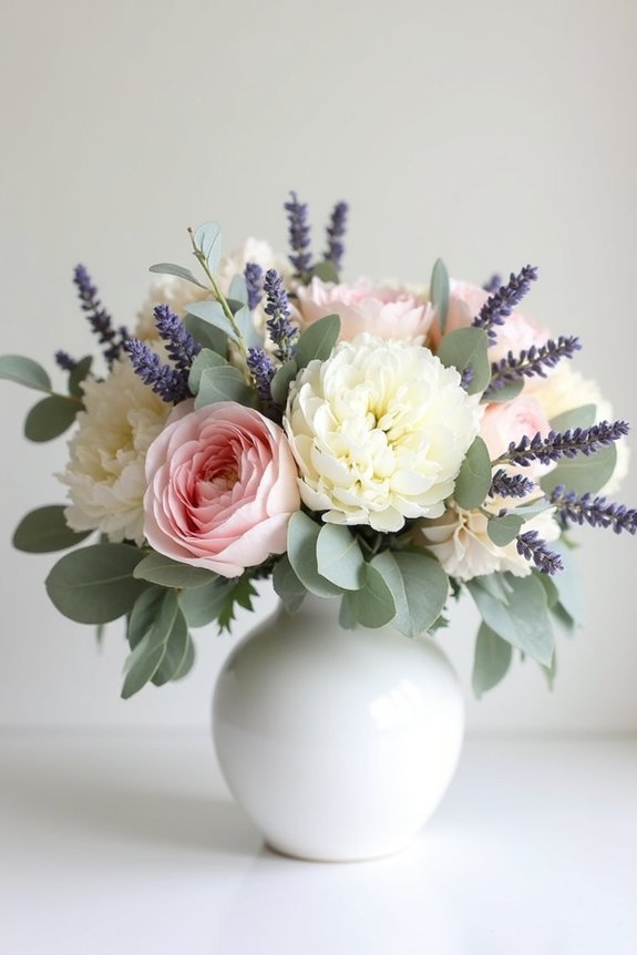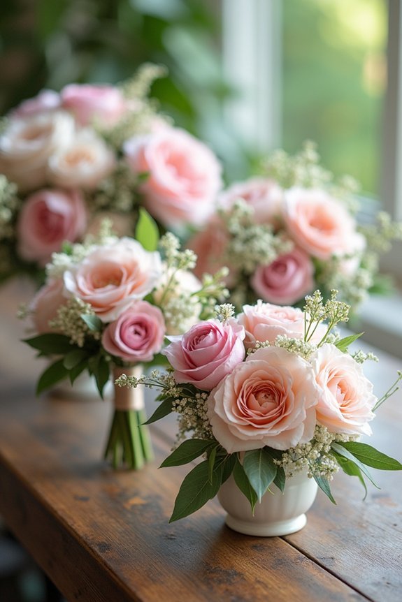
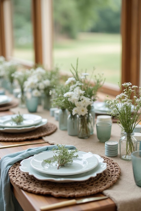
We’re excited to share three stunning palettes that’ll make your country wedding unforgettable. Burgundy, blush, and gold create timeless elegance with romantic warmth and glamorous touches perfect for fall and winter celebrations. Sage and cream offer a calming, grounded feel that harmonizes beautifully with farmhouse settings and natural light photography. Each palette works wonderfully with rustic textures like wood and linen, plus greenery that enhances your venue’s natural beauty. Discover how to layer these elements together for maximum impact.
At a Glance
- Burgundy, blush, and gold create a timeless, elegant palette with drama and sophistication perfect for country weddings.
- Sage and cream offer a refined, calming atmosphere that naturally complements rustic farmhouse venues and natural lighting.
- Select two to three main colors plus neutrals to ensure cohesion across all wedding design elements and details.
- Layer natural textures like wood, linen, and greenery to enhance your chosen color palette’s organic, rustic aesthetic.
- Consider seasonal influences when selecting colors—cooler tones for winter, vibrant hues for spring—to match the mood.
How to Choose Your Country Wedding Color Palette
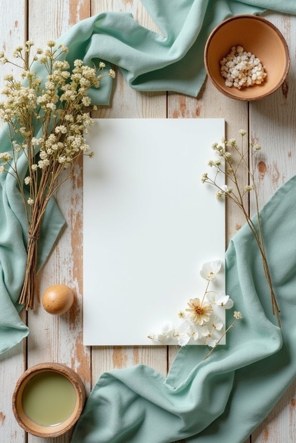
When you’re envisioning your country wedding, choosing the right color palette might feel like the most important decision you’ll make—and honestly, it really does matter.
We recommend starting by considering your venue’s natural backdrop. Does your location feature rolling green hills, rustic barns, or wildflower fields? Let the landscape guide your selections.
Next, think about the season and mood you’re creating—warm and romantic, or fresh and vibrant?
Finally, choose two to three main colors plus neutrals. This approach keeps things cohesive without feeling too matchy or predictable. Remember that your bridal jewelry sets should also coordinate with your selected color palette to create a unified and elegant overall wedding aesthetic.
Rustic Romance: Burgundy, Blush, and Gold
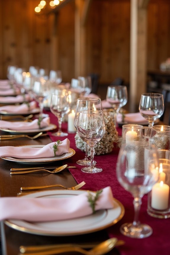
If you’re drawn to timeless elegance with a touch of drama, the burgundy, blush, and gold palette is absolutely worth your consideration.
Burgundy brings depth and sophistication, while blush softens the look with romantic warmth. Gold accents tie everything together beautifully, adding glamour without feeling overdone.
This combination works wonderfully for fall and winter weddings, though it translates across seasons. We love how versatile it is—you can lean into drama with deeper burgundy tones or keep things lighter and airier.
The palette feels both classic and current, making your wedding feel intentional and polished. Consider pairing this color scheme with pearls, crystals, and rhinestones in your bridal hair accessories to enhance the overall elegance of your look.
Sophisticated Sage and Cream for Farmhouse Weddings
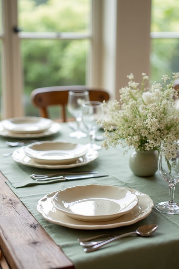
For those seeking a palette that feels both grounded and refined, sage and cream offers a beautiful solution that transforms farmhouse weddings into spaces of understated elegance.
This combination creates a calming atmosphere that works beautifully in barns, gardens, and rustic venues. Sage’s muted green tones pair naturally with cream’s soft warmth, evoking peaceful countryside aesthetics.
We love layering in natural wood, linen textures, and greenery to enhance the palette’s organic feel. This color combination photographs beautifully in natural light, making it perfect for capturing genuine, magazine-worthy moments throughout your celebration. Consider completing the look with bridal pearl jewelry sets in soft white or cream tones that complement the elegant simplicity of this color scheme.
Frequently Asked Questions
How Do I Incorporate My Country Wedding Colors Into Digital Invitations and Save-The-Dates?
We recommend using your palette’s dominant color as the background or border, then layer in secondary hues through text, graphics, or watercolor washes. This approach guarantees your invitations feel cohesive and intentional from first glance.
What’s the Best Way to Use Color Palettes Across Outdoor Ceremony Backdrops and Reception Décor?
We recommend anchoring your ceremony backdrop with one dominant color, then layering complementary accent hues throughout reception spaces. This creates visual flow while letting each area shine with its own design moment.
How Can I Adapt Trendy Country Colors to Flatter Different Skin Tones in Bridal Party Attire?
We’ve learned that choosing bridesmaids’ colors isn’t one-size-fits-all—like finding your wedding dress, we match warm country hues to warm undertones and cool shades to cool undertones for everyone’s most flattering look.
Should My Country Wedding Colors Appear in Florals, Linens, or Both for Maximum Impact?
We recommend layering your country colors through both florals and linens for maximum visual impact. This approach creates cohesion throughout your space while allowing each element to shine independently.
How Do Seasonal Changes Affect Which Country Color Palette Will Photograph Best for My Wedding?
We’ve found that spring palettes with pastels photograph luminously in natural light, while autumn’s rich jewel tones command the camera in golden hour shots. Summer demands cooler hues to avoid washed-out images. Winter’s darker schemes create stunning contrast.