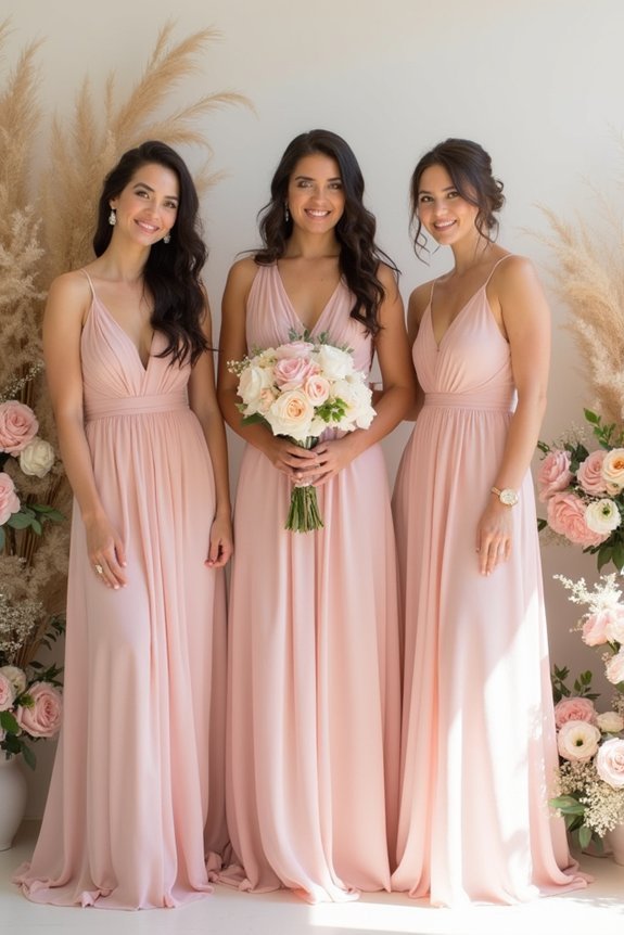
We’re excited to help you create a stunning blush pink wedding palette. This sophisticated color serves as the perfect foundation, flattering every skin tone while staying timeless. Pair it with ivory, soft gold, sage green, or dusty blue for elegance. Layer in mauve and dusty rose for depth, then add metallic accents and natural elements like wood and greenery to ground the sweetness. Consistent color use across flowers, linens, and décor guarantees cohesion throughout your celebration, and we’ll explore how to avoid common palette mistakes.
At a Glance
- Blush pink offers sophistication and romance while flattering various skin tones and pairing well with complementary colors.
- Combine blush with ivory, soft gold, sage green, dusty blue, or deeper mauve for elegant depth and contrast.
- Layer similar-toned dusty shades like mauve and dusty rose to create visual interest while maintaining color harmony.
- Incorporate metallics like gold or rose gold, natural textures including wood and greenery, and elegant fabrics for dimension.
- Ensure cohesive design by consistently applying color throughout florals, table settings, and décor while testing elements together beforehand.
Why Blush Pink Is the Perfect Wedding Color Foundation
When you’re choosing your wedding palette, blush pink offers something special—it’s sophisticated enough to feel grown-up and intentional, yet soft enough to create that dreamy, romantic atmosphere you’ve been imagining.
This gentle hue works beautifully across seasons and times of day, flattering skin tones in photos while remaining timeless rather than trendy.
Blush pink serves as an ideal foundation because it pairs seamlessly with nearly every complementary color, from crisp whites to deep jewel tones.
It creates elegance without feeling stuffy, allowing your personal style to shine while maintaining that polished, magazine-quality aesthetic you’re after.
To complete your blush pink bridal look, consider pairing it with bridal jewelry sets that feature silver or white gold finishes to enhance the overall sophistication of your color palette.
Which Colors Pair Best With Blush Pink?
Now that you’ve chosen blush pink as your foundation, the real magic happens when you layer it with complementary colors that amplify its romantic potential.
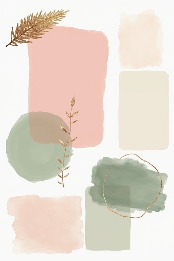
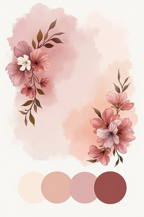
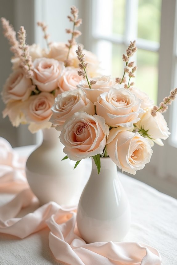
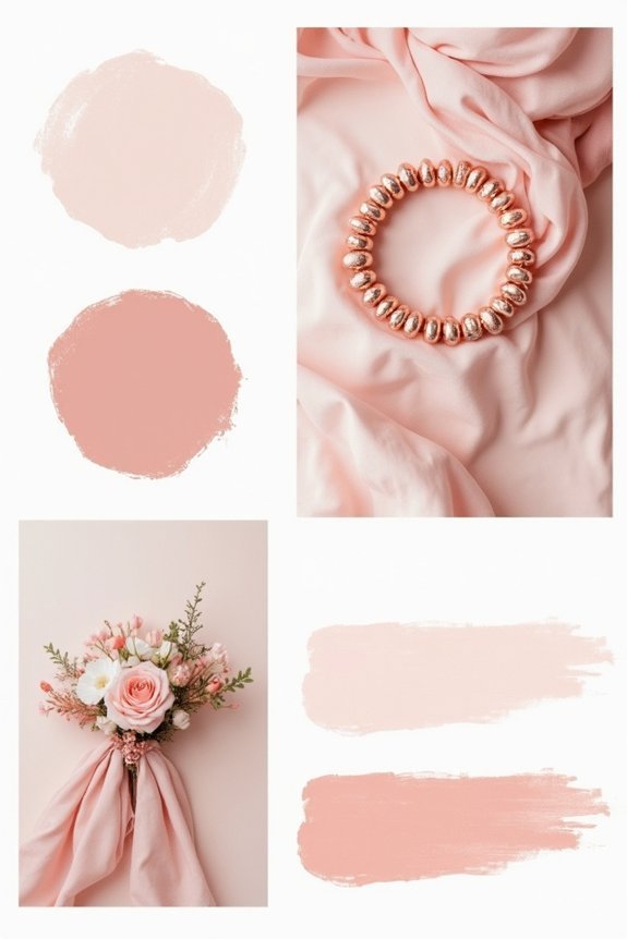
We recommend pairing blush with ivory or cream for timeless elegance, or try soft gold accents for warmth and sophistication. Sage green creates a natural, garden-inspired feel, while dusty blue offers subtle contrast.
For drama, incorporate deeper mauve or charcoal. Champagne and rose gold add glamorous shimmer. Consider completing your blush pink bridal look with rose gold hair vines that beautifully echo these metallic accents throughout your ensemble.
Each combination shifts your palette’s mood, so consider your venue and season when selecting partners for your blush base.
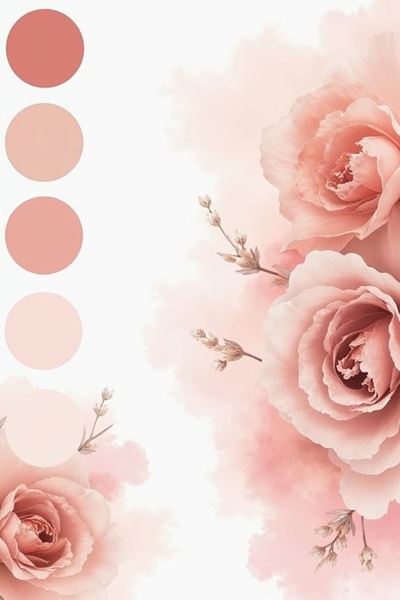
Creating Depth: Blush, Mauve, and Dusty Tones
While blush pink creates a stunning foundation, layering it with deeper, muted tones transforms your palette from pretty to truly sophisticated.
We recommend pairing blush with mauve, dusty rose, and soft taupe to build visual interest. These colors work together beautifully because they share similar undertones, creating harmony without monotony.
Think of mauve as your depth anchor, drawing the eye inward. Dusty tones add texture and elegance to florals, linens, and décor.
This approach lets blush remain your star while supporting players enhance its impact, giving your wedding that polished, intentional aesthetic you’re seeking. Consider incorporating warm vintage lighting through Edison bulb string lights to further enhance the sophistication of your blush and mauve color palette.
Metallic Accents for Sophisticated Shimmer
To elevate your blush palette from soft and sweet to genuinely glamorous, metallic accents are your secret weapon. We recommend incorporating these shimmering touches strategically throughout your wedding design:
- Gold for warmth — Pairs beautifully with blush, creating an inviting, luxe feel that photographs wonderfully.
- Rose gold for balance — Offers a modern twist that complements blush tones without competing for attention.
- Silver for freshness — Brings contemporary elegance and works especially well in minimalist or modern designs.
These metallics catch light and add dimension to your color story.
Start with one metallic throughout your décor, linens, and stationery for cohesive sophistication that feels intentional and polished. Consider complementing your metallic color scheme with bridal accessories like Austrian crystals and rhinestone tiaras that echo your chosen metal tone for a unified, sophisticated look from head to toe.
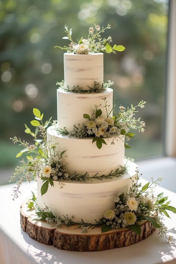
Natural Elements That Ground Blush Palettes
Blush pink shines brightest when it’s balanced with the organic textures and muted tones that nature provides.
We love incorporating wood elements—think wooden chairs, tables, or frames—that add warmth and stability to your palette. Greenery is essential too; eucalyptus, olive branches, or lush foliage soften the sweetness of blush and create visual depth.
Don’t forget natural materials like linen, burlap, and dried flowers, which ground your design beautifully. Stone, clay, and leather accents work wonderfully as anchors.
These earthy elements guarantee your blush palette feels intentional and sophisticated rather than overly romantic or one-dimensional. Consider pairing these natural textures with neon wedding signs featuring personalized text or soft lighting to add a modern touch while maintaining the grounded aesthetic of your blush color scheme.
Blush Pink for Modern, Romantic, and Minimalist Weddings
The beauty of blush pink lies in its remarkable versatility—it works as the foundation for virtually any aesthetic you’re drawn to.
We can shape this soft hue into different wedding styles by adjusting complementary colors and design elements.
- Modern weddings pair blush with crisp whites, metallics, and geometric details for clean sophistication.
- Romantic celebrations layer blush with ivory, gold accents, and flowing fabrics for timeless elegance.
- Minimalist designs combine blush with neutral tones and plenty of negative space for calm, intentional beauty.
Each approach honors blush’s gentle nature while reflecting your personal style and vision for your special day.
5 Blush Pink Mistakes Brides Actually Make
While blush pink’s flexibility makes it a forgiving choice, we’ve noticed that brides sometimes stumble when they don’t think through how their shade of blush interacts with their other colors and design choices.
Many overlook how lighting affects their blush—what looks perfect in photos can feel washed out in person. Others pair blush with too many competing pastels, creating visual chaos instead of elegance.
We recommend selecting one complementary color family, testing your palette in various lighting conditions, and remembering that blush works best when given breathing room alongside neutrals or deeper accents.
Testing Your Blush Palette Before You Commit
Before you finalize your blush pink palette, we recommend testing it in the actual spaces where your wedding will unfold—because what looks stunning on your phone screen might feel completely different when you’re standing in your venue under real lighting.
- Bring fabric swatches to your venue at different times of day, observing how natural and artificial light transforms the colors.
- Compare your blush selections alongside potential accent colors to guarantee they harmonize beautifully together.
- Take photos in your venue’s lighting to review later, helping you spot any unexpected color shifts.
This thoughtful approach prevents costly regrets and guarantees your palette performs flawlessly on your wedding day.
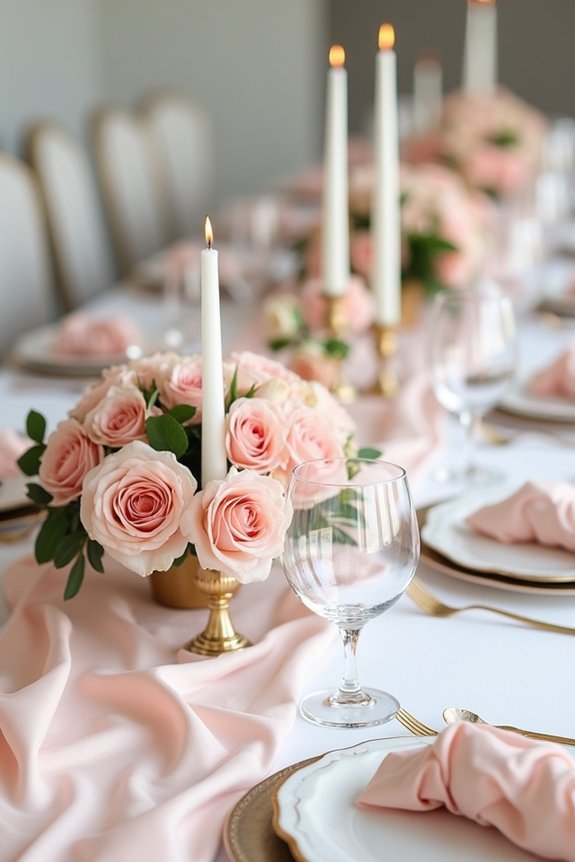
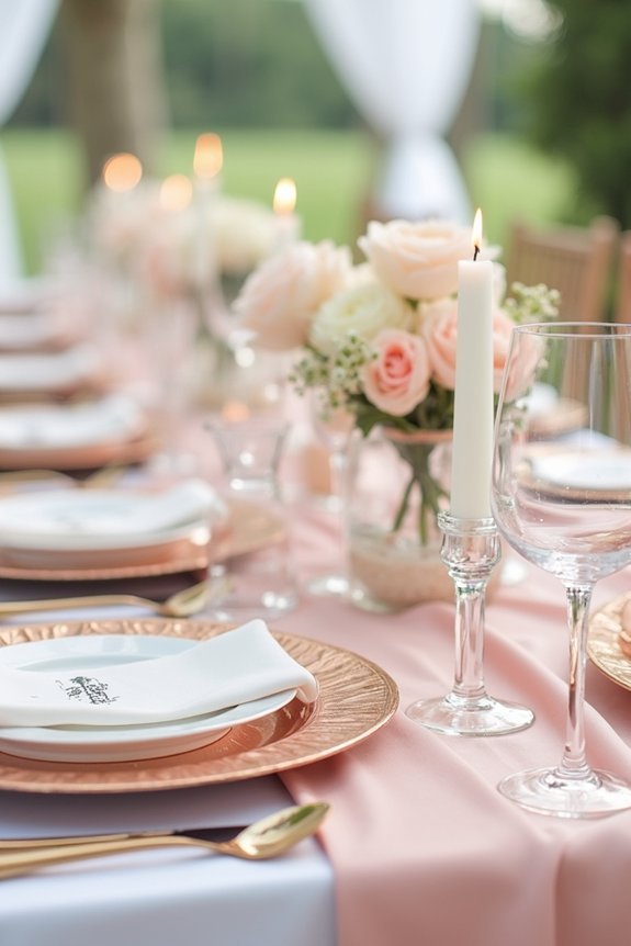
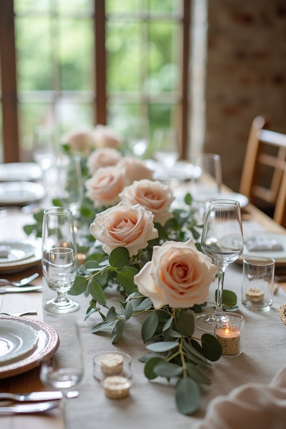
Using Blush in Your Flowers, Linens, and Decor
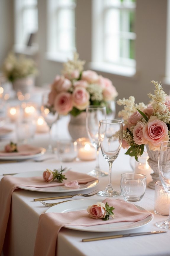
Now that you’ve confirmed your blush palette looks beautiful in your actual venue, it’s time to weave those colors throughout your wedding day through flowers, linens, and decor.
We recommend layering blush tones—pair deeper mauve with softer pinks for dimension. Choose blush blooms like garden roses, peonies, or ranunculus as your foundation flowers, then add complementary accents in white, cream, or sage.
For linens, drape blush tablecloths with ivory runners, or reverse the combination. In decor, incorporate blush through candles, chair cushions, or accent walls, ensuring each element feels intentional rather than scattered throughout your celebration.
Frequently Asked Questions
How Do I Ensure Blush Pink Photographs Well Under Different Lighting Conditions?
We recommend testing blush pink swatches in your venue’s lighting beforehand. Bring fabric samples to photograph during different times of day. You’ll want peachy-toned blush varieties that won’t look washed out or gray in any condition.
What’s the Best Way to Communicate My Blush Palette to Vendors and Florists?
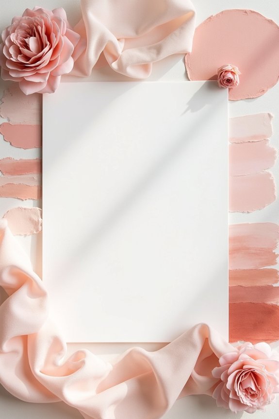
We’ll scream it from the rooftops: create a visual mood board with actual fabric swatches, paint samples, and photos. Share specific color codes (hex or Pantone numbers) with your florist and vendors so everyone’s literally speaking the same language.
Can I Use Blush Pink for a Winter Wedding, or Is It Seasonal?
Absolutely—we can use blush pink for winter weddings! Pair it with deep jewel tones, metallics, or rich burgundy to ground the palette seasonally. Layering textures like velvet and faux fur keeps it winter-appropriate while maintaining elegance.
How Much Blush Should I Use Versus Complementary Colors in My Overall Design?
We recommend blush as your dominant color—aim for 60% of your palette. Use complementary shades like ivory, gold, or sage for 40%, which prevents your design from feeling one-note while maintaining that sophisticated aesthetic.
What Undertones Should I Look for When Selecting Blush Pink Fabrics and Flowers?
Think of blush pink as a chameleon—we’ll want warm, peachy undertones in fabrics and roses, while peonies often carry cooler, mauve-leaning hues. You’ll balance both for visual depth.