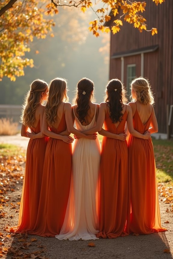
Burnt orange creates sophisticated wedding magic when paired thoughtfully with complementary hues. We’ve discovered five stunning palettes: classic burnt orange and cream for timeless elegance, jewel tones with emerald and navy for bold luxury, blush and terracotta for soft romance, gold and copper metallics for warmth, and modern minimalist designs with crisp whites and clean lines. Each palette transforms burnt orange into something uniquely beautiful, and each carries distinct seasonal advantages and styling opportunities that we’ll explore in detail.
At a Glance
- Burnt orange and cream create timeless elegance suitable for spring, autumn, and winter ceremonies with sophisticated contrast.
- Jewel tones like emerald and navy paired with burnt orange deliver luxurious, bold aesthetics perfect for fall weddings.
- Blush and terracotta soften burnt orange’s boldness while creating romantic, inviting atmospheres for intimate celebrations.
- Gold and copper metallics layered throughout enhance sophistication via chargers, candleholders, jewelry, and stationery elements.
- Minimalist burnt orange designs with crisp whites, grays, and natural wood maintain elegance through clean, simple lines.
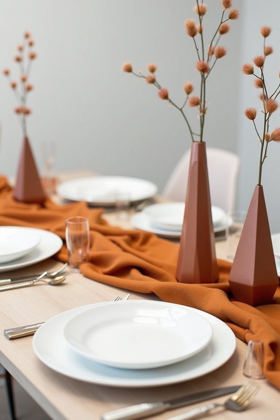
Burnt Orange + Cream: Timeless Elegance for Every Season
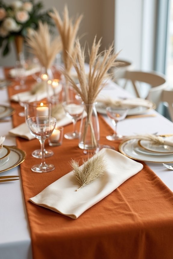
There’s something genuinely special about pairing burnt orange with cream, and we’re excited to share why this combination works beautifully for virtually any wedding setting.
The warmth of burnt orange brings richness and sophistication, while cream softens the palette into something approachable and timeless. Together, they create an elegant contrast that feels both modern and classic.
You’ll find this duo works perfectly for spring gardens, autumn celebrations, or even winter ceremonies. The neutrality of cream lets burnt orange shine without overwhelming your space, making it an ideal choice for couples wanting impact without intensity. Complete your burnt orange and cream wedding look with timeless bridal jewelry that complements both the warmth and elegance of your color palette.
Jewel Tones: Go Bold With Emerald and Navy
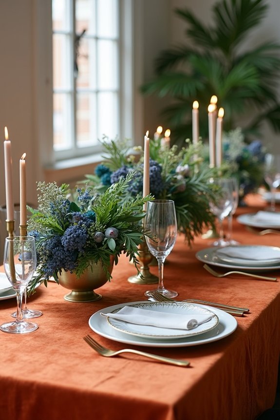
If you’re ready to embrace drama and depth, jewel tones like emerald and navy offer us the perfect way to create a wedding palette that feels luxurious and intentional.
Pairing burnt orange with these rich colors creates stunning visual contrast while maintaining sophistication.
Emerald brings natural elegance and pairs beautifully with gold accents, while navy adds depth and formality.
We can layer these tones through bridesmaid dresses, florals, and linens to build a cohesive look.
This combination works wonderfully for fall and winter weddings, though it’s stunning any season.
Consider complementing your jewel-tone palette with outdoor décor featuring galvanized steel frames that provide durability and weather protection for your celebration.
The result? A bold, magazine-worthy palette that feels uniquely yours.
Blush and Terracotta: Soft Romanticism
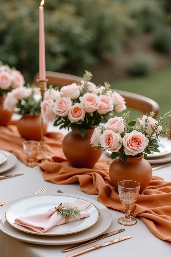
Warmth and grace—that’s what we get when we blend blush with terracotta in a burnt orange palette. This combination softens the boldness of burnt orange while maintaining its earthy richness.
Blush adds romantic femininity, creating an inviting atmosphere that feels both modern and timeless. Terracotta bridges the gap beautifully, echoing natural clay tones that ground the palette.
We can layer these shades through florals, linens, and décor to build depth and sophistication. This approach works wonderfully for intimate ceremonies and receptions alike, offering elegance without feeling overdone.
To complete your bridal look, consider adding rose gold hair vines that echo the warm tones of your burnt orange palette while providing a delicate finishing touch to your hairstyle.
Gold and Copper Accents: Warm Metallics That Elevate
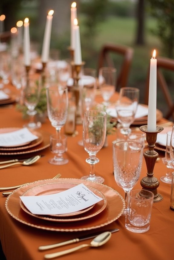
When we layer metallics into a burnt orange palette, we reveal a whole new dimension of elegance and sophistication.
Gold brings warmth and luxury, while copper adds an earthy, modern edge. Together, they transform your wedding into something truly special.
Consider gold charger plates beneath cream linens, copper candleholders scattered throughout, and metallic thread in your bridesmaid bouquets.
Gold jewelry complements skin tones beautifully and photographs wonderfully. Copper accents work gorgeously on invitations, signage, and table numbers.
For bridal jewelry, consider sets featuring gold plating and pearls to seamlessly coordinate with your warm metallic color scheme.
These warm metallics don’t compete with burnt orange—they amplify it.
The result is a cohesive, refined aesthetic that feels intentional and magazine-worthy.
Modern Minimalist: Clean Lines With Burnt Orange
Burnt orange doesn’t require ornate details or layered textures to shine—it thrives when we strip away the excess and let clean lines do the talking.
We can embrace a modern minimalist approach by pairing burnt orange with crisp whites, soft grays, and natural wood elements.
Think sleek geometric centerpieces, simple linens, and understated florals in complementary tones.
This aesthetic feels intentional and sophisticated, letting the color’s warmth anchor the design without competing embellishments.
We’re creating visual breathing room while maintaining elegance, proving that sometimes the most stunning weddings whisper rather than shout.
To enhance the ambiance of a minimalist burnt orange wedding, consider incorporating vintage Edison string lights to add warmth and a subtle glow to your outdoor venue or reception space.
Frequently Asked Questions
What Wedding Seasons Work Best for Burnt Orange Color Palettes?
We find burnt orange works beautifully in fall and spring weddings. It’s perfect for September through November when natural foliage complements the warmth, though you’ll create stunning spring celebrations pairing it with fresh florals and lighter accents.
How Do I Incorporate Burnt Orange if My Venue Already Has Strong Colors?
We’d suggest letting your venue’s existing colors anchor the palette, then layer burnt orange as an accent through florals, linens, or stationery. This approach complements rather than competes with what’s already there.
Which Fabrics and Textures Photograph Best With Burnt Orange Wedding Themes?
We’ve found that velvet and silk photograph beautifully with burnt orange—they capture rich depth and dimension. Linen adds texture, while satin creates elegant contrast. Layering these fabrics together gives you magazine-quality shots that really make burnt orange pop.
Can Burnt Orange Work for Winter Weddings, or Is It Only Fall?
Burnt orange glows like embers against winter’s frost—absolutely stunning for cold-season weddings. We’ve found it works beautifully paired with jewel tones, metallics, and rich textures that elevate the palette beyond autumn’s grasp.
How Do I Balance Burnt Orange so It Doesn’t Feel Too Dark or Heavy?
We balance burnt orange by pairing it with lighter neutrals like cream, ivory, or soft gold. Add metallics, white florals, and plenty of negative space throughout your design to keep everything feeling fresh and elegant.