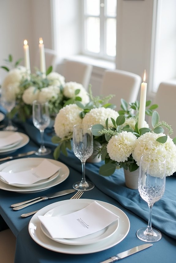
Slate blue creates an elegant, timeless foundation for your wedding tables that resists trend fatigue and photographs beautifully year-round. We recommend pairing it with ivory or cream linens for classic sophistication, then layering in gold or silver accents for luxury. Mix centerpieces featuring soft florals, greenery, and varied candlestick heights to add dimension and warmth. Lighting plays a significant role—warm light deepens slate blue‘s richness while cool light brightens it. As you explore seasonal adaptations and metallic combinations, you’ll discover how this versatile color transforms your entire celebration.
At a Glance
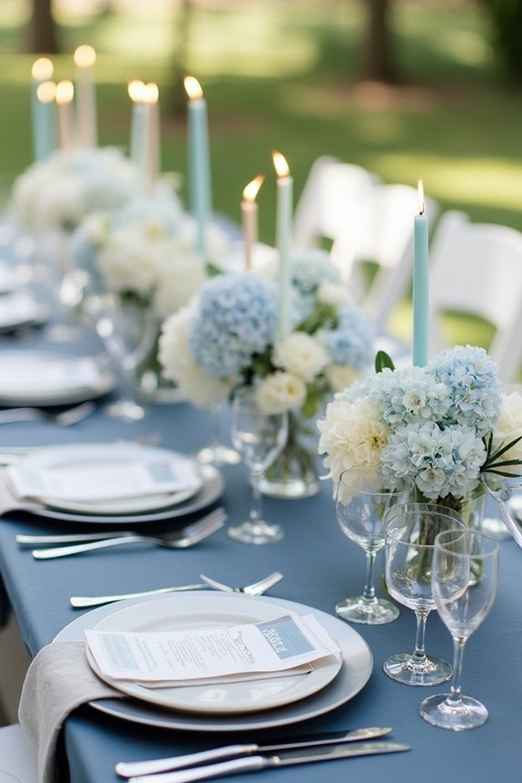
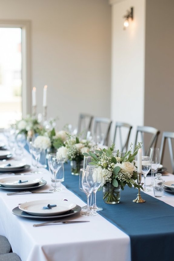
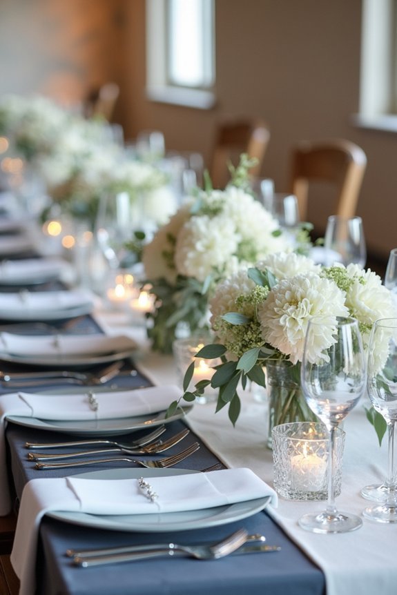
- Pair slate blue linens with ivory, cream, or crisp white base linens, enhanced by deep charcoal or champagne runners for visual depth.
- Layer textured linens and mixed-height candlesticks to create dimension and ambient lighting while maintaining cohesive, sophisticated table design.
- Combine slate blue with gold or bronze metallics, ivory flowers, and silver-accented greenery for elegant, personalized centerpieces.
- Adjust lighting strategically—warm lighting deepens slate blue tones, while cool lighting brightens them for seasonal aesthetic adaptation.
- Incorporate meaningful centerpiece details with thoughtful tableware arrangement to create visually harmonious, elegant settings that enhance the celebration.
Why Slate Blue Works as a Wedding Color
Slate blue—that sophisticated blend of gray and blue—offers a rare combination of elegance and versatility that we find incredibly valuable for wedding design.
This muted tone works beautifully across seasons and times of day, adapting seamlessly to different lighting conditions. Unlike brighter blues, slate blue feels refined and timeless, resisting trend fatigue.
It pairs effortlessly with metallics like gold and silver, neutrals including ivory and taupe, and deeper jewel tones. For bridal accessory coordination, consider pairing your slate blue table settings with pearl jewelry sets that feature silver or gold plating to create a cohesive aesthetic throughout your celebration.
Whether you’re planning an intimate gathering or grand celebration, slate blue creates a calming, luxurious atmosphere that feels both modern and classic, making your table settings feel intentionally designed.
Does Slate Blue Fit Your Wedding Aesthetic?
Before you commit to a color palette, it’s worth asking yourself what atmosphere you’re actually trying to create—and whether this particular shade aligns with your vision.
Slate blue works beautifully for couples seeking:
- Modern elegance with a sophisticated edge
- Timeless appeal that photographs gorgeously in any season
- Versatility to pair with gold, silver, or copper accents
- Depth and richness without feeling heavy or formal
- Calm, refined energy that feels intentional and curated
If you’re drawn to understated luxury, collected aesthetics, and refined simplicity, slate blue genuinely complements your style. Consider complementing your table settings with bridal jewelry sets that echo the same sophisticated aesthetic for a cohesive wedding look.
This shade feels neither trendy nor outdated—it’s simply classic with contemporary flair.
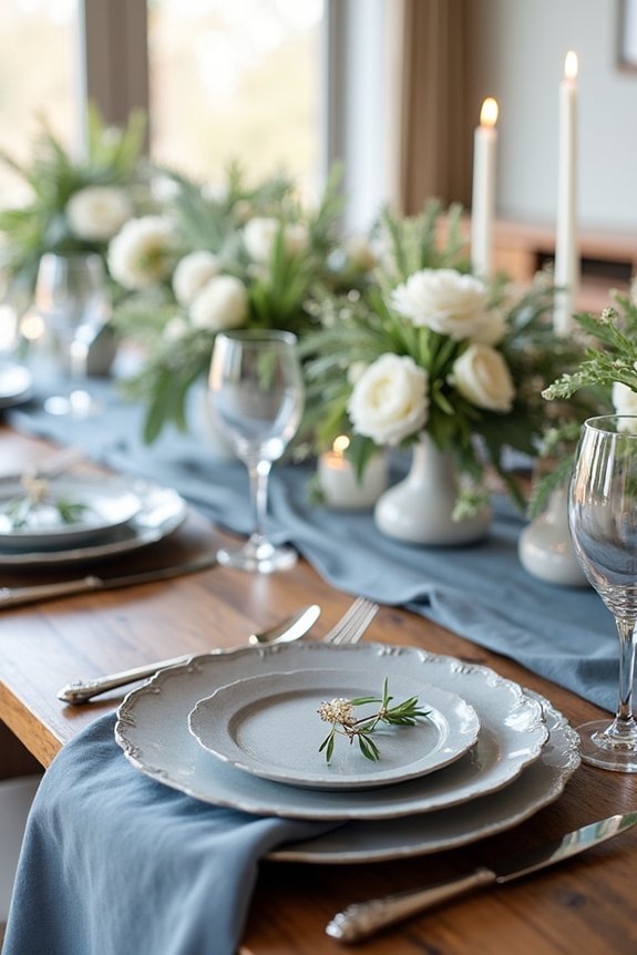
Pairing Slate Blue With Complementary Linens and Runners
Once you’ve decided that slate blue is the right foundation for your tables, the real magic happens when you layer in linens and runners that enhance—rather than compete with—this sophisticated hue.
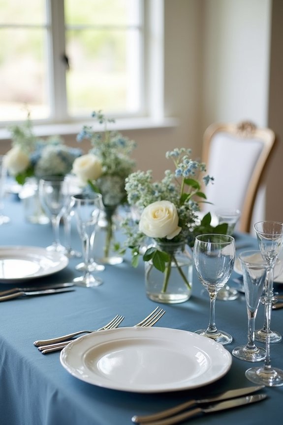
We recommend pairing slate blue with ivory or cream linens for timeless elegance, or choosing white for crisp contrast.
Consider a blush or champagne runner to add warmth without clashing. For bolder aesthetics, a deep charcoal runner creates stunning depth.
These combinations let slate blue shine while adding visual interest and dimension to your tablescape without overwhelming the eye. Your table settings can be further elevated by incorporating climbing plants and greenery around your pergola structure, which creates a cohesive outdoor wedding aesthetic that ties your centerpieces to the ceremony backdrop.
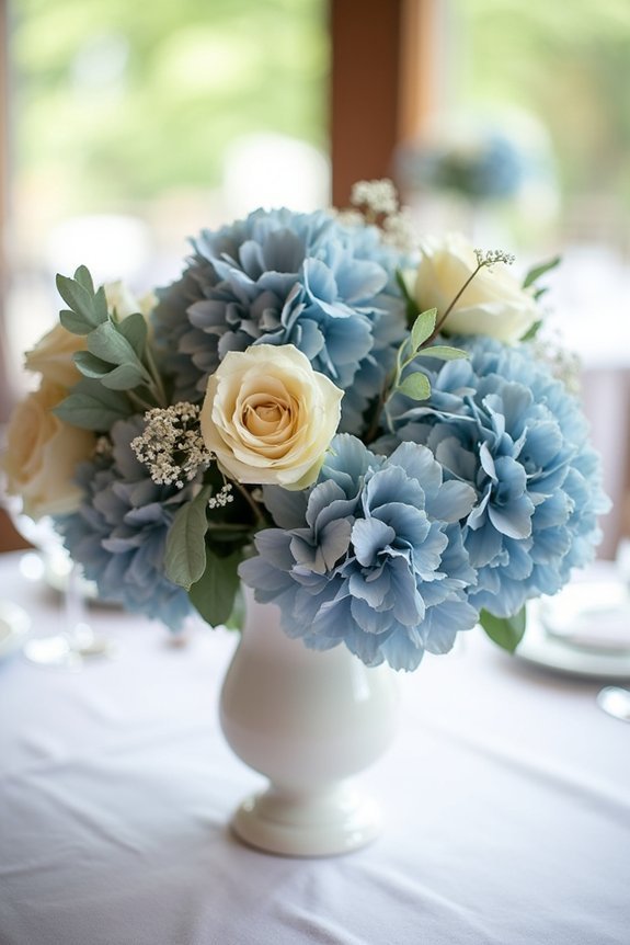
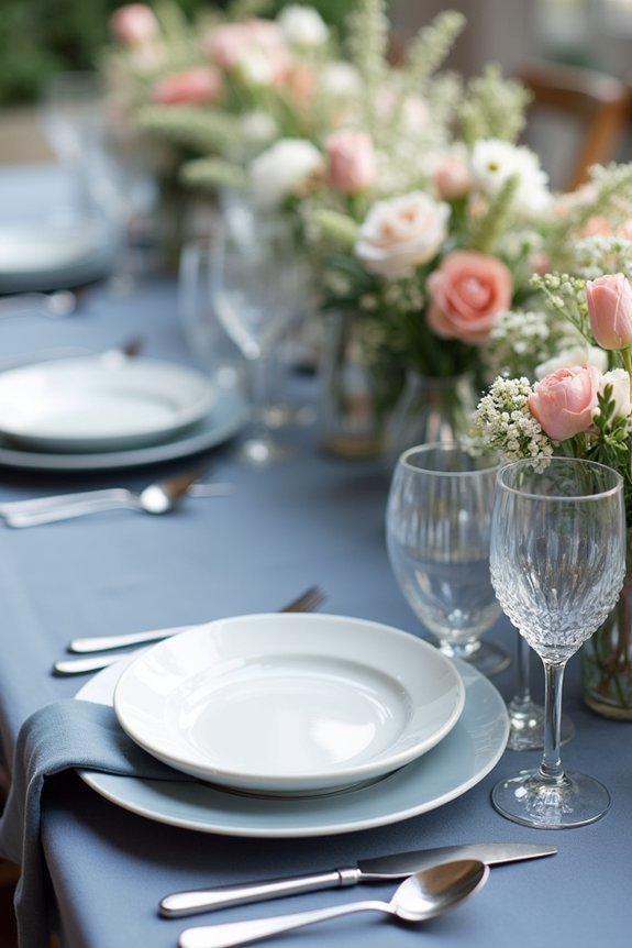
Centerpiece Ideas That Elevate Slate Blue Tables
With your linens and runners creating a sophisticated foundation, centerpieces become the moment where your tablescape truly comes alive.
We love pairing slate blue with arrangements that enhance rather than compete:
- Ivory and cream flowers for timeless elegance
- Greenery with silver accents for modern polish
- Tall candlesticks creating ambient light and drama
- Mixed heights preventing visual monotony across tables
- Minimal vessels letting flowers shine without distraction
These centerpiece choices work beautifully because they respect the slate blue’s depth while adding dimension. Consider complementing your table design with bridal hair vine accessories featuring silver and crystal elements to create a cohesive aesthetic throughout your wedding day.
You’re creating tablescapes that feel intentional and curated, exactly the sophisticated look you deserve for your special day.
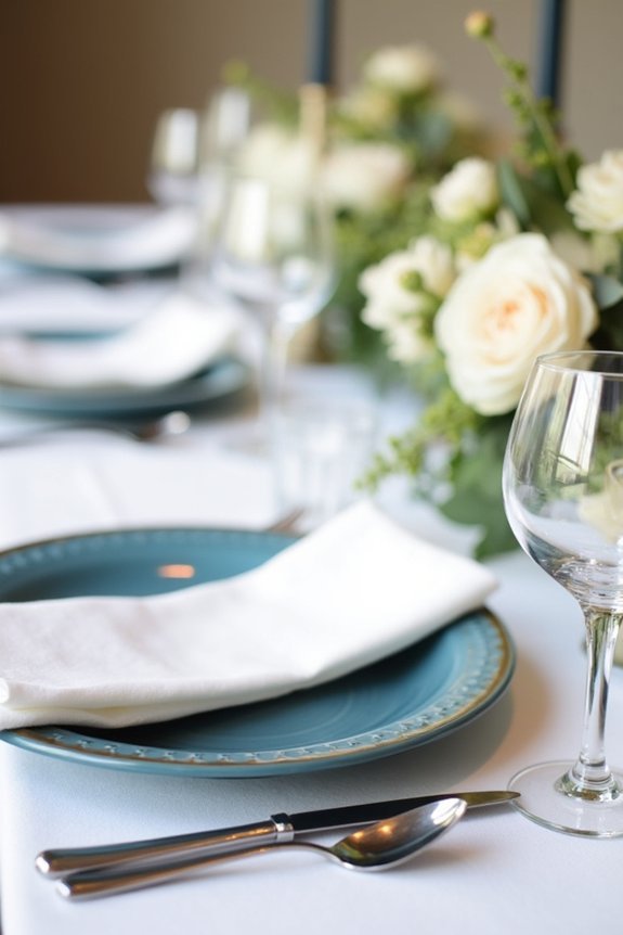
Charger Plates, Dinnerware, and Glassware Combinations
Now that your centerpieces are creating that perfect focal point, it’s time to build the foundation of your tablescape with charger plates, dinnerware, and glassware—the elements your guests will interact with most directly.
We recommend pairing slate blue with warm metallics like gold or rose gold chargers for sophistication. Layer crisp white or ivory dinnerware on top for contrast and elegance.
For glassware, clear crystal catches light beautifully against the blue backdrop. Consider adding a delicate rim or subtle pattern to your plates for visual interest.
To complete your refined table design, consider incorporating Austrian crystals into your table accents for an extra touch of sparkle and luxury. These thoughtful combinations transform your table into a cohesive, magazine-worthy design that feels intentional and refined.
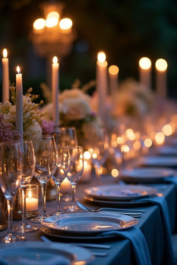
How Warm and Cool Lighting Change Slate Blue’s Mood
Your charger plates, dinnerware, and glassware create the visual foundation of your table, but here’s what really brings that foundation to life: lighting.
Slate blue transforms dramatically depending on how light touches it. We want you to understand these shifts so you can intentionally design your atmosphere:
- Warm lighting deepens slate blue into rich, moody jewel tones that feel intimate and luxurious.
- Cool lighting brightens it into crisp, sophisticated tones that feel fresh and modern.
- Golden hour light creates romantic, dimensional depth across your linens.
- Bright overhead light can wash out blue, so layer lighting instead.
- Candlelight adds elegance while softening slate blue’s edges beautifully.
Strategic lighting elevates your entire table design.
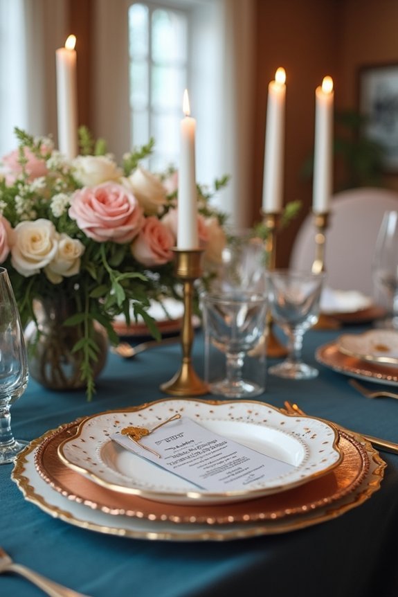
Choosing Between Gold, Silver, and Copper Accents
Once you’ve settled on slate blue as your color foundation, the metallic accents you choose will either amplify its elegance or soften its edge—and that decision shapes how guests experience your entire table.
Gold brings warmth and richness, creating an inviting, luxurious feel that flatters slate blue beautifully. Silver offers crisp sophistication and modern appeal, emphasizing the blue’s cool undertones.
Copper adds unexpected personality and contemporary flair, bridging warm and cool tones seamlessly.
Consider your venue’s lighting and overall aesthetic. Gold suits romantic, traditional settings. Silver complements minimalist designs. Copper works wonderfully for eclectic, fashion-forward celebrations.
You’ll find your perfect match.
Adapting Slate Blue Tables for Every Season
The beauty of slate blue is its remarkable versatility across seasons—it deepens autumn’s richness, brightens spring’s renewal, complements summer’s warmth, and anchors winter’s coolness.
We can adapt slate blue tablescapes by layering seasonal elements:
- Spring: Pair soft blush linens with pale green accents and delicate florals
- Summer: Combine crisp white napkins with gold chargers and citrus garnishes
- Fall: Layer burgundy runners with copper candleholders and harvest textures
- Winter: Add silver accents, white blooms, and frosted glassware for elegance
- Year-round: Use slate blue as your foundation, shifting supporting colors seasonally
This approach keeps your design cohesive while honoring each season’s unique character and mood beautifully.
Real Weddings: How Designers Style Slate Blue Tables
Now that we’ve explored how to shift slate blue across seasons, let’s see what happens when real couples and their designers bring these ideas to life.
We witness stunning transformations—gold accents paired with slate blue linens for glamorous winter affairs, soft florals and greenery creating romantic spring tables, and bronze metallics complementing the richness of slate in autumn celebrations.
These real weddings show us that slate blue’s versatility shines brightest when combined with thoughtful details.
We notice how couples personalize their tables through meaningful centerpieces, strategic lighting, and intentional color pairings that reflect their unique love stories while maintaining that sophisticated elegance we’re after.
Frequently Asked Questions
What’s the Minimum Number of Slate Blue Table Settings Needed for Impact?
We’d say ten to twelve settings create real visual punch—that’s your sweet spot. Think of them as anchors throughout your space, drawing guests’ eyes naturally. Fewer feels scattered; more becomes overwhelming without adding impact.
Can I Use Slate Blue Tables for a Small, Intimate Wedding?
Absolutely—we’d actually recommend slate blue for intimate weddings. It’s sophisticated enough for just twenty guests and creates dramatic impact in smaller spaces. You’ll achieve that magazine-quality aesthetic without overwhelming your venue.
How Do I Prevent Slate Blue Linens From Looking Too Formal or Stuffy?
We’ve cracked the code: mix slate blue with unexpected textures—think linen napkins, wooden chargers, and wildflower centerpieces. We soften formality through layering casual elements that whisper sophistication instead of shouting it.
What’s the Best Way to Incorporate Slate Blue if I’m Renting Tables?
We’d recommend layering slate blue through linens you bring—runners, napkins, or overlays—rather than renting colored tables. This keeps costs down and lets you swap in complementary textures like linen or velvet for visual interest.
How Much Slate Blue Should I Use Versus Other Neutral Colors?
We’d recommend using slate blue for 40-50% of your table’s visual impact—pair it with ivory, cream, or soft gray linens. This balance keeps things sophisticated while letting slate blue be your statement color without overwhelming the space.