We can create stunning white wedding palettes by selecting the right white shade—warm ivory pairs beautifully with gold, while cool whites complement silver. Layering different cream and eggshell tones adds visual depth, and mixing matte with subtle shine brings sophistication. Two or three accent colors like dusty blue, sage green, or blush enhance white without overwhelming. We’ll weave these colors through flowers, linens, and thoughtful details to craft a cohesive, timeless celebration that photographs gorgeously. Each seasonal variation offers unique possibilities to explore.
At a Glance
- Choose warm whites (ivory, cream) for romance or cool whites for modern elegance based on personal style.
- Layer varying shades and textures like matte and subtle sheen to create visual depth and sophistication.
- Incorporate two to three accent colors such as soft metallics or muted jewel tones to enhance white.
- Apply the palette intentionally through flowers, linens, chair sashes, and accessories for cohesive design throughout.
- Match whites to seasons: pastels for spring, bright accents for summer, warm tones for fall, jewel tones for winter.
Why White Is the Perfect Wedding Palette
A blank canvas—that’s what an all-white wedding palette gives you, and it’s honestly one of the most elegant decisions you can make.
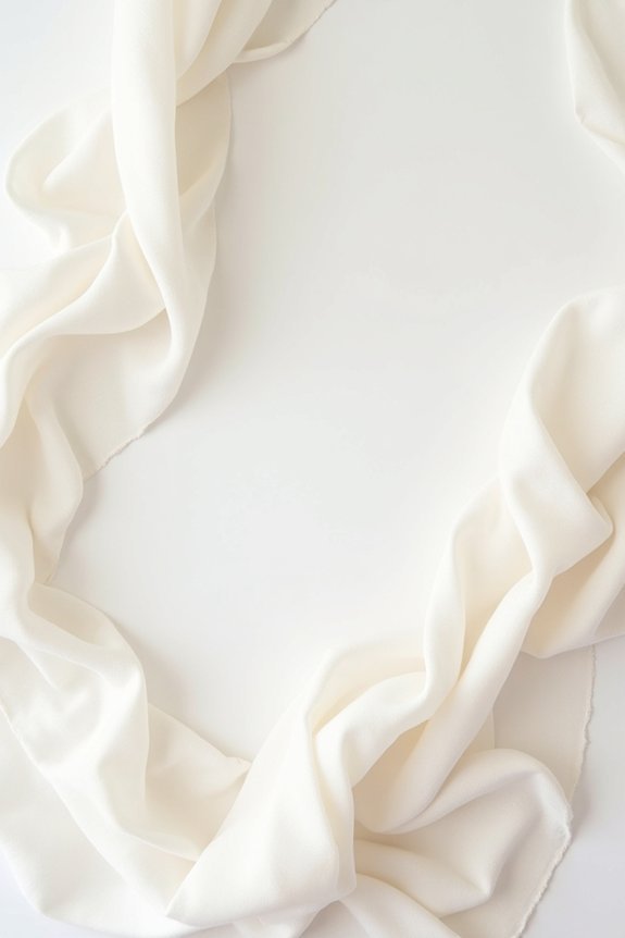
White feels timeless, sophisticated, and utterly versatile. You can layer in different textures—ivory linens, crisp whites, creamy off-whites—to create depth without introducing new colors.
This simplicity lets other details shine: your flowers, your dress, your venue’s architecture.
White weddings photograph beautifully in any lighting, creating those magazine-quality images you’re after. Plus, you’ll never worry about color clashing or trends dating your photos.
It’s the foundation for intentional, stress-free design. A white wedding color palette also makes it easier to track your design expenses and maintain financial clarity throughout your planning process.
Choose Your White: Warm, Cool, or Neutral
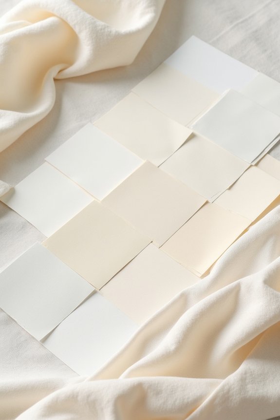
While white might seem like a simple, one-note choice, the truth is that white comes in many beautiful variations, and selecting the right undertone for your wedding transforms your entire aesthetic.
Warm whites—like ivory and cream—evoke romance and timelessness, pairing beautifully with gold accents and soft textures.
Cool whites feel crisp and modern, complementing silver and contemporary designs.
Neutral whites offer versatility, working seamlessly with almost any secondary color you choose.
Consider pairing your white palette with hair vine accessories that complement your chosen undertone for a cohesive bridal look.
We recommend considering your venue’s lighting, your personal style, and your supporting palette when deciding.
This thoughtful choice guarantees every element coheres into one stunning vision.
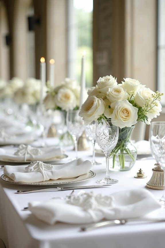
Layer Textures and Shades for Visual Depth
Once you’ve selected your white, the magic happens when you layer in varying shades and textures—and we’re excited to show you how this transforms a flat, one-dimensional palette into something truly dimensional and memorable.
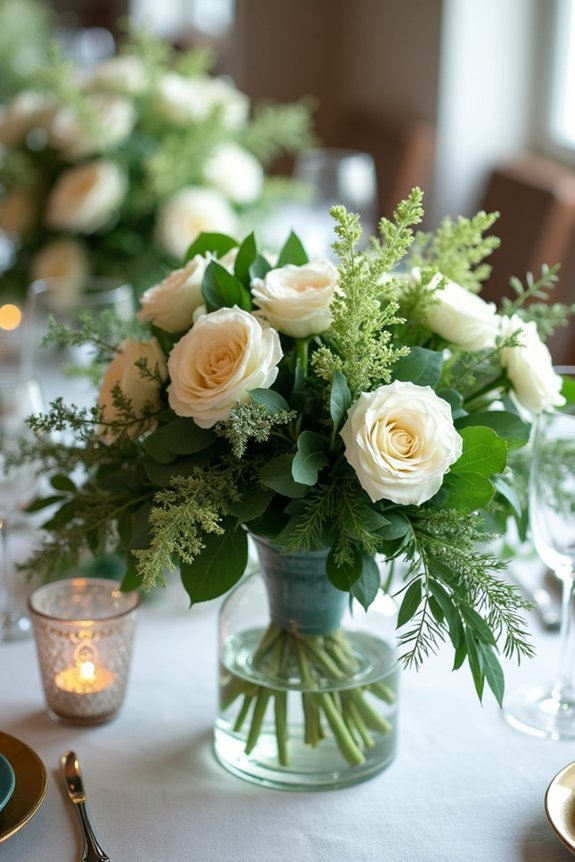
Think cream, ivory, and eggshell working together beautifully. Mix matte finishes with subtle sheen, combining velvet linens with satin ribbons or delicate lace. These contrasts catch light differently, creating visual interest that photographs gorgeously.
Layering shades and textures adds sophistication without feeling busy, letting your wedding feel cohesive yet rich. For an extra touch of elegance, consider incorporating bridal belt embellishments like rhinestones that catch and reflect light to enhance your layered color palette. Your monochromatic palette becomes an elegant, intentional design statement that feels effortlessly luxe.
Pick Accent Colors That Elevate White
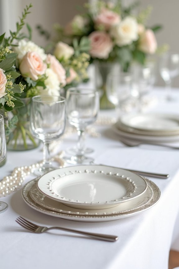
Your white canvas is stunning on its own, but introducing thoughtfully chosen accent colors is where your palette truly comes alive.
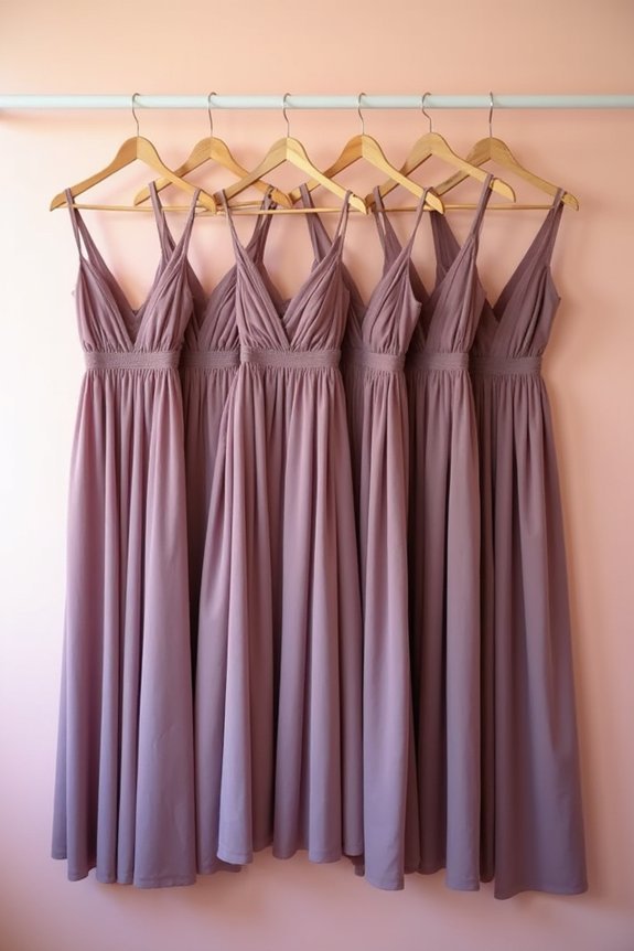
We recommend selecting two to three accent colors that complement white without overwhelming it. Soft metallics like gold or rose gold add warmth and sophistication. Muted jewel tones such as sage green or dusty blue bring elegance and depth. Blush or champagne tones create romantic, cohesive moments.
The key is choosing colors that feel personal to you while maintaining the serene quality white provides. These accents should enhance your vision, appearing in florals, linens, and design details throughout your celebration. Pairing your color palette with complementary bridal accessories like rhinestone tiaras and pearl headpieces can further elevate your wedding’s cohesive aesthetic.
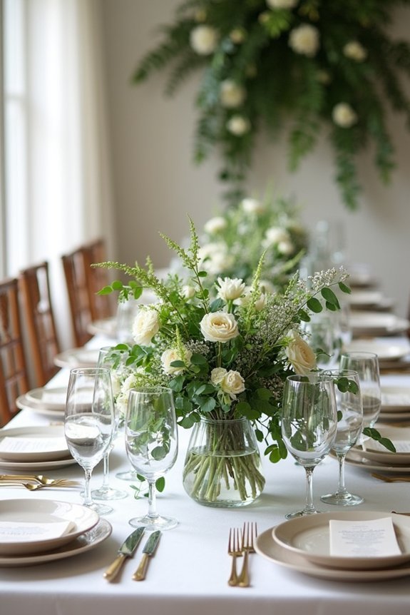
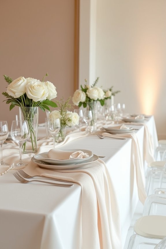
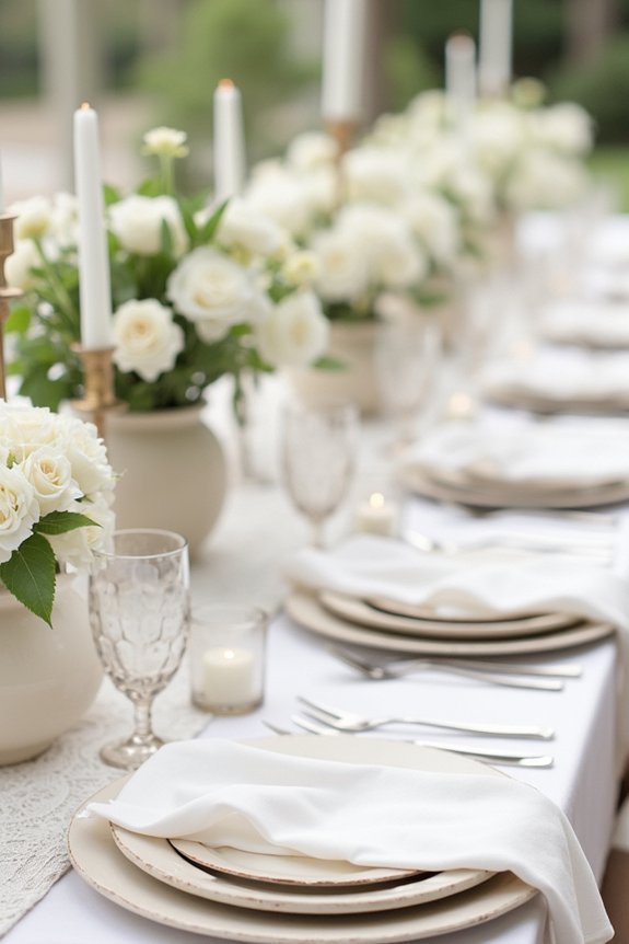
Execute Your Palette: Flowers, Linens, and Details
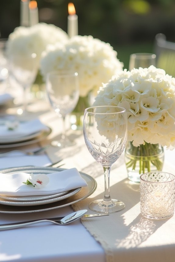
Now comes the exciting part—bringing your carefully chosen palette to life through the elements guests will actually see and experience.
We recommend starting with flowers, which set your wedding’s mood beautifully. Select blooms in your accent colors alongside white varieties for balance.
Linens deserve equal attention; ivory or white tablecloths create a clean canvas for colored napkins or runners. Layer your palette through details: chair sashes, place cards, and centerpiece vessels.
These thoughtful touches reinforce your color story without overwhelming the space. For added depth and visual interest, consider incorporating greenery wall backdrops as a stunning focal point that complements your floral arrangements and enhances the overall aesthetic of your reception space.
Each element should feel intentional, creating a cohesive, sophisticated atmosphere that reflects your vision perfectly.
Adapt Your White Palette by Season
Because the season you choose for your wedding naturally influences the light, florals, and overall atmosphere, we can’t overlook how it shapes your color palette.
Spring whites feel fresh and delicate alongside pastels and soft greens.
Summer whites benefit from bright, saturated accents like coral or navy.
Fall whites deepen beautifully with warm golds, burgundy, and terracotta tones.
Winter whites shine brilliantly with jewel tones, metallics, and crisp silvers.
We recommend visiting your venue during your planned season to see how natural light transforms your chosen whites.
This guarantees your palette looks stunning in actual conditions, not just inspiration photos.
Frequently Asked Questions
How Do I Prevent an All-White Wedding From Looking Sterile or Boring?
As they say, it’s all in the details. We’ll layer in ivory, cream, and soft neutrals alongside pure white, then add dimension with varied textures—lace, velvet, wood, and metal—so your wedding feels rich and intentional, not cold.
What’s the Best White Shade for Different Skin Tones in Wedding Photos?
We recommend warm whites like ivory or cream for deeper skin tones—they’ll photograph beautifully against your complexion. Cooler, brighter whites work wonderfully for fair skin. Test swatches in natural light before deciding.
Can I Use White as a Palette if My Venue Already Has White Walls?
We’d layer whites with ivory, cream, and off-white tones to create depth and visual interest. You’ll add texture through fabrics, florals, and metallic accents so your all-white palette doesn’t feel flat or monochromatic against those walls.
How Do I Incorporate Patterns Without Clashing With a White Color Scheme?
Studies show 73% of elegant weddings use layered patterns successfully. We recommend pairing one bold geometric print with delicate florals, then grounding everything with solid neutrals like cream and soft gray for visual harmony.
Which White Shades Photograph Best Under Different Lighting Conditions?
We’ve found that warm whites photograph beautifully in golden hour light, while cool whites shine in bright daylight. Ivory flatters indoor venues, and cream looks gorgeous in soft, diffused lighting. Test your chosen shade in your actual venue’s lighting.