We can craft a winter wedding that truly reflects who you are by choosing colors that set your desired mood. Consider icy silvers and pale blues for serene elegance, rich emeralds and burgundies for romantic sophistication, or crisp whites for timeless minimalism. Deep jewel tones paired with gold create festive glamour. Each palette works beautifully with winter’s natural textures and lighting. The right colors transform your celebration into something uniquely magical, and there’s so much more to discover about bringing your vision to life.
At a Glance
- Select winter colors that reflect your personal style and desired mood—romantic, bold, or serene.
- Cool-toned palettes with silver, pale blue, and frosted white create timeless, modern elegance.
- Rich jewel tones like emerald, sapphire, and burgundy photograph beautifully in winter lighting.
- Crisp whites and soft neutrals offer understated elegance that allows personal style to shine.
- Deep jewel tones paired with gold accents and candlelight create festive, sophisticated atmospheres.
Choose Your Winter Palette: Finding Your Style First
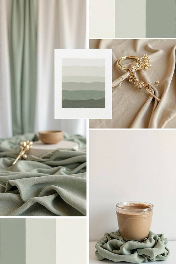
Before you immerse yourself in selecting colors for your winter wedding, it’s worth taking a moment to contemplate what truly resonates with you—because your palette should feel like an extension of who you are, not just what’s trending on Instagram.
We encourage you to reflect on the mood you want to create. Do you envision something romantic and soft, or bold and dramatic?
Consider your personal style, your venue’s natural aesthetic, and the emotions you want your guests to feel. Your color choices matter because they set the entire tone for your celebration. Taking time to organize your color decisions within a comprehensive planning checklist will help ensure your palette choices align seamlessly with all other wedding details.
Icy Elegance: Cool-Toned Wedding Palettes That Feel Timeless
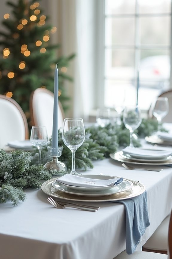
Now that you’ve identified what resonates with you personally, it’s time to explore cool-toned palettes—and there’s something undeniably sophisticated about icy elegance in winter.
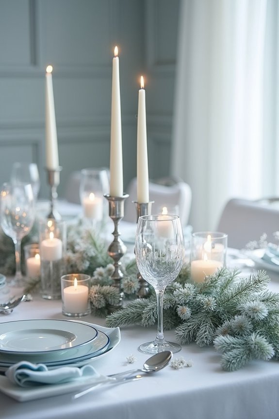
Silver, pale blue, and frosted white create a serene, timeless atmosphere that photographs beautifully. These hues feel modern yet classic, ensuring your wedding won’t look dated in years to come.
Consider adding dusty sage or soft gray for warmth without sacrificing that cool, refined aesthetic.
Cool-toned palettes work exceptionally well with metallic accents like silver and platinum, elevating the overall luxury feel. A metal pergola structure with silvery finishes can anchor your ceremony space while complementing these elegant color choices.
This approach delivers the magazine-quality sophistication you’re seeking, making every detail feel intentional and cohesive.
Jewel Box Romance: Rich Tones for Sophisticated Winter Weddings
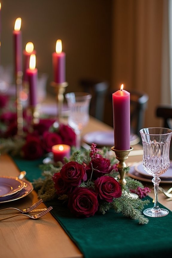
If cool silvers and pale blues feel too understated for your vision, jewel-tone palettes offer an equally elegant alternative that radiates warmth and luxury.
Deep emeralds, sapphires, and burgundies create a sophisticated atmosphere that feels both timeless and rich. These colors pair beautifully with gold accents, creating a romantic, luxurious aesthetic.
Jewel tones work wonderfully for winter ceremonies because they complement natural lighting and photograph gorgeously. We recommend incorporating these hues through florals, linens, and décor details.
They’re particularly stunning against winter’s natural backdrop, making your celebration feel intentional and magazine-worthy without requiring excessive styling or elaborate installations. Complete your jewel-tone aesthetic with Austrian crystal tiaras that echo the richness of your color palette and catch the winter light beautifully.
Modern Minimalist: Crisp Whites and Soft Neutrals
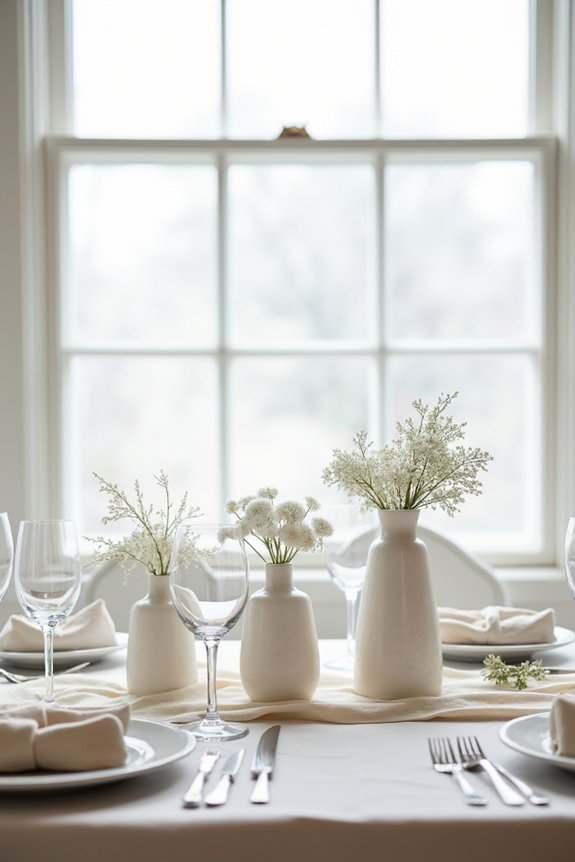
Sometimes the most striking winter weddings embrace simplicity rather than saturation, letting crisp whites and soft neutrals take center stage.
We love how this approach creates an elegant, timeless feeling that photographs beautifully. Pair ivory with warm beiges, soft grays, and creamy taupes for depth without drama.
These palettes work wonderfully with natural winter textures—bare branches, metallic accents, and luxe fabrics like velvet and silk. The minimalist aesthetic feels modern yet romantic, giving you a sophisticated backdrop that lets your personal style shine through. Consider complementing your neutral palette with pearl jewelry sets that feature high-quality cultured pearls and subtle metallic finishes to enhance your understated elegance.
This direction feels especially freeing when you’re seeking understated elegance that won’t feel dated in years to come.
Festive Glamour: Deep Emeralds, Golds, and Burgundy
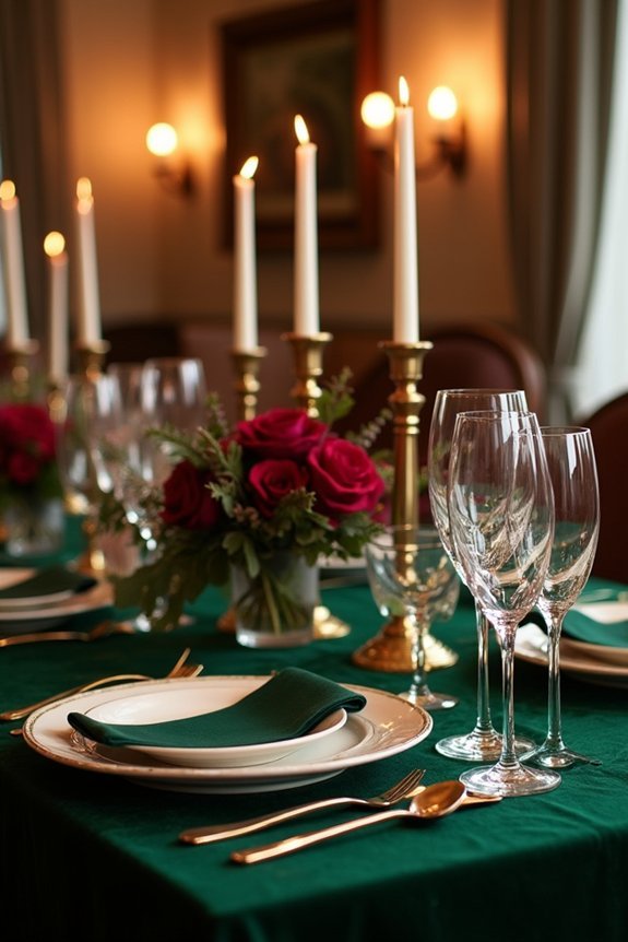
When you’re ready to embrace the richness that winter naturally offers, deep jewel tones create a wedding that feels both celebratory and sophisticated.
Emerald green brings elegance and depth, while gold accents add warmth and glamour. Burgundy grounds the palette with romance and richness. Together, these colors evoke holiday magic without feeling kitschy.
We love pairing them with ivory linens, candlelight, and metallic details that catch the glow. This combination works beautifully for winter venues—think historic estates, cozy venues, or anywhere with natural architectural details. Consider pairing these jewel tones with metal arch backdrop frames in gold to create a cohesive and luxurious focal point for your ceremony.
Your guests will feel the festive energy while enjoying the refined aesthetic you’ve created.
Frequently Asked Questions
How Do I Choose a Winter Palette That Photographs Well in Natural Light?
We recommend choosing jewel tones, metallics, and soft neutrals that reflect natural light beautifully. Test your palette outdoors during golden hour—you’ll see how colors truly photograph. Avoid overly muted shades that’ll disappear in winter’s flat lighting.
What’s the Best Way to Incorporate Winter Colors Into My Wedding Invitations?
We recommend layering your winter palette across cardstock, typography, and accents. Choose one bold color as your hero, then weave complementary shades through borders, text, or watercolor washes for sophisticated depth.
Can I Mix Multiple Color Palettes Together Without Looking Chaotic or Overwhelming?
Absolutely, we can artfully blend multiple palettes by choosing one dominant color, then thoughtfully layering complementary hues. We’ll keep it cohesive by limiting ourselves to three colors maximum and repeating them throughout your design.
How Do Seasonal Flowers and Greenery Affect My Chosen Winter Color Scheme?
Seasonal winter blooms like white roses, burgundy dahlias, and eucalyptus naturally complement cool palettes, while amaranthus and hypericum berries add depth. We’ll help you select florals that enhance rather than compete with your chosen colors.
What Are Affordable Ways to Achieve Expensive-Looking Winter Color Palettes on a Budget?
Studies show 68% of couples overspend on florals. We’ll help you maximize impact with strategic greenery, affordable accent flowers, and luxe lighting that creates that high-end aesthetic you’re craving without breaking the bank.